
Stylist Guide › Section 2: Colour & Visual Impact › Rule #42
One colour, seen three times, does more for a room than five colours seen once each.
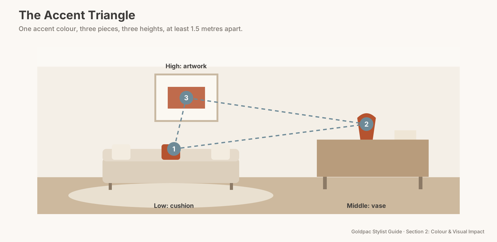
The rule in one minute. Choose one accent colour and repeat it in at least three accessories placed apart across the room: a cushion, a vase, a book spine, an artwork, a throw. The repeats form a triangle that pulls the eye around the space and makes unrelated furniture look chosen together. Keep the accent to about a tenth of the view, and place the three repeats at different heights and at least 1.5 metres apart.
Why repetition creates cohesion
The brain groups things that share a colour. Perception researchers call it the Gestalt principle of similarity: things that look alike are read as belonging together, even when they're far apart. A rust cushion on the sofa, a rust vase on the sideboard and a rust stripe in an artwork become one idea, not three objects.
That grouping does the styling for you. A room with a mismatched sofa, an old timber table and a new rug can still look planned, because the accent is the thread running through it. For the cushion side of this problem, where the sofas themselves don't match, Rule #294 builds one cushion palette for the whole room.
A single accent, used once, does the opposite. One yellow cushion in a grey room looks like it wandered in from somewhere else. Twice is a coincidence. Three times is a scheme.
How many times should you repeat an accent colour?
At least three times in each room, and rarely more than five. Three repeats are the minimum that the eye reads as a pattern. Beyond five, the accent stops being an accent and starts becoming a second main colour, and the room loses its calm.
The numbers
Three repeats. The minimum for a pattern. One is an object, two is a pair, three is a scheme.
At least 1.5 metres apart. Clustered repeats (three blue things on one shelf) read as a single blue patch. Spread them so the eye has to travel.
Three heights. Low (a cushion, a basket, a rug stripe), middle (a vase, a lamp, books on a sideboard) and high (artwork, a print, a pendant shade). The triangle should tilt, not lie flat.
About 10 per cent of the view. The accent is the smallest of the three parts in the 60-30-10 split (Rule #32). In practice, that's a handful of small things, not one big one.
One accent per room, ideally one per home. Repeating the same accent in the next room as well, in one or two small pieces, helps the whole home feel like it belongs to one story when buyers walk through.
The Accent Triangle
- Choose the accent from something fixed. A colour already in the rug, the artwork, a tile or the view: sage from the garden, blue from the harbour glimpse, terracotta from the brickwork.
- Find three places at three heights. Low, middle and high, at least 1.5 metres apart.
- Place one piece in each. Use small, movable things: cushions, a throw, a vase, books, a print.
- Stand in the doorway and trace the triangle. Your eye should move from one point to the next without stopping in a corner.
- Remove any other accent. If a stray red mug or a bright green tub is in view, it breaks the pattern. Store it.
- Echo once in the next room. One small piece of the same colour, visible through the doorway if possible.
The Accent Triangle: one accent colour, three pieces, three heights, at least 1.5 metres apart.
Where the repeats work best
Living room. A cushion on the sofa, a vase or bowl on the coffee table or sideboard, and the accent picked up in the artwork above. A throw on an armchair can stand in for any one of the three.
Bedroom. Two small cushions on the bed, a book or small vase on the bedside table, and a print on the opposite wall, so the accent is visible from the bed and from the door.
Dining area. Napkins or a runner on the table, a jug or bowl on the sideboard, and a print or a few books nearby.
Kitchen. Keep it tiny. A tea towel, a bowl of lemons or a small plant pot. Benchtops are for space, not for colour.
Do this Sunday
Pick the room the agent will lead with in the photos. Choose one accent colour from something that can't move. Gather everything in the house in that colour: cushions, books, vases, throws, prints. Place three of them in a triangle, and store the rest. Then take a photo from the doorway and look at it on your phone. If your eye lands on all three points, you're done.
The blind spot: you see objects, not colours
At home, you see each piece for what it is. The cushion from the market, the vase from your sister, the book you're halfway through. Each has a story, so the colours don't register as a pattern or a clash.
A buyer has no stories attached. They only see the colours and where they sit. Squint at the room from the doorway: the objects blur, and you see what the buyer sees, a scatter of colours or a deliberate thread.
What if…
You don't own three things in one colour. Books are the easiest source: stack a few with matching spines. Fresh flowers and fruit work too: lemons, oranges, green apples, a bunch of eucalyptus.
Your rug or artwork has several colours. Pick the one that appears in the smallest amount and repeat that. It makes the rug or artwork look like the starting point of a plan.
The room is a studio or a small unit. Use three repeats but make them smaller: a cushion, a mug on a tray, a postcard-size print. The triangle still works at 1.5 metres.
FAQ
What is an accent colour in interior design? An accent colour is the smallest, brightest or deepest colour in a room, used in small pieces to add life to a neutral base. It usually makes up about a tenth of what you see.
Repeating one colour is simple. Choosing the right one in a home full of your own things is harder. A Photo Ready Consultation picks the accent for each room from what you already own and maps where each piece goes, in a written room-by-room plan within 48 hours of the visit. If you'd rather not do it yourself, Photo Ready Styling means our stylist styles your home with your own furniture and accessories before the photos. See current prices.
Keep reading: Rule #294: Unify mismatched furniture with one cushion palette (one cushion palette for mismatched furniture) · Rule #34: Neutrals plus one accent make timeless staging (neutral plus one accent) · Rule #45: Choose kitchen colours that make food look good (kitchen colours that flatter food) · Rule #47: Echo accent colours with flowers and books (echoing the accent with flowers and books) · Rule #107: Let the artwork echo the textiles (letting the artwork echo the textiles)
◀ Previous: Rule #41: Use dark colours only in small doses · Section 2 contents · Next: Rule #43: Black adds contrast and polish when used sparingly ▶
Part of the Goldpac Stylist Guide: 300+ home staging rules from Goldpac's Sydney styling team.