
Stylist Guide › Section 2: Colour & Visual Impact › Rule #34
Picture a Saturday open home in an inner-west semi: white walls, pale oak floor, an oatmeal sofa, a jute rug, linen curtains the colour of sand. Then, on the sofa, two cushions in deep olive. On the dining table, a ceramic jug in the same olive. On the bedside table upstairs, a small olive vase. Nobody comments on the colour. Everyone leaves saying the home felt "put together".
The rule in one minute. A neutral base with one accent colour is the most reliable palette for selling a home, because it suits the widest range of buyers and never looks dated in photos. Build the base from three layered neutrals (a white, a warm mid-tone and natural timber), then choose one accent and repeat it in small doses through the home. The neutrals make the space; the accent makes it memorable.
The recipe
Neutral-Plus-One, for a whole home. Neutrals: 3 (a white, a warm mid-tone, natural timber) · Accent: 1 colour, used in 2 or 3 places per room · Accent share: about 10% of what you see · Pattern: 1 subtle pattern per room at most · Metals: 1 finish throughout
The ingredients
- A white for walls and ceilings. A warm white for most Sydney homes; a softer, slightly greyer white for very bright north-facing rooms.
- A warm mid-tone neutral for the big soft pieces. Oatmeal, sand, stone or soft greige for sofas, rugs, bedheads and curtains.
- Natural timber. Floors, a dining table, a side table or picture frames. Timber keeps a neutral scheme from feeling cold (Rule #60).
- One accent colour, chosen for the home: olive, terracotta, navy, sage, mustard or dusty pink.
- Greenery. Plants count as nature, not as a second accent.
- One metal finish. Brushed brass, black or chrome, used consistently for lamps, frames and hardware.
The method
- Clear the colour that isn't in the recipe. Bright throws, mismatched cushions, coloured kitchen gadgets, bold artwork.
- Set the neutrals. Pale walls, mid-tone soft furnishings, timber where it already exists.
- Choose the accent from something in the home or the view: the terracotta tiles on the back step, the olive tree outside, a navy front door.
- Place the accent in two or three spots per room, at different heights: a cushion, a vase, an artwork.
- Carry the same accent through the home. Every room speaks the same colour language, so buyers feel a single, considered home rather than a set of separate rooms.
Neutral-Plus-One: three layered neutrals (white, warm mid-tone, timber) and a single accent repeated two or three times in every room, about 10% of what buyers see.
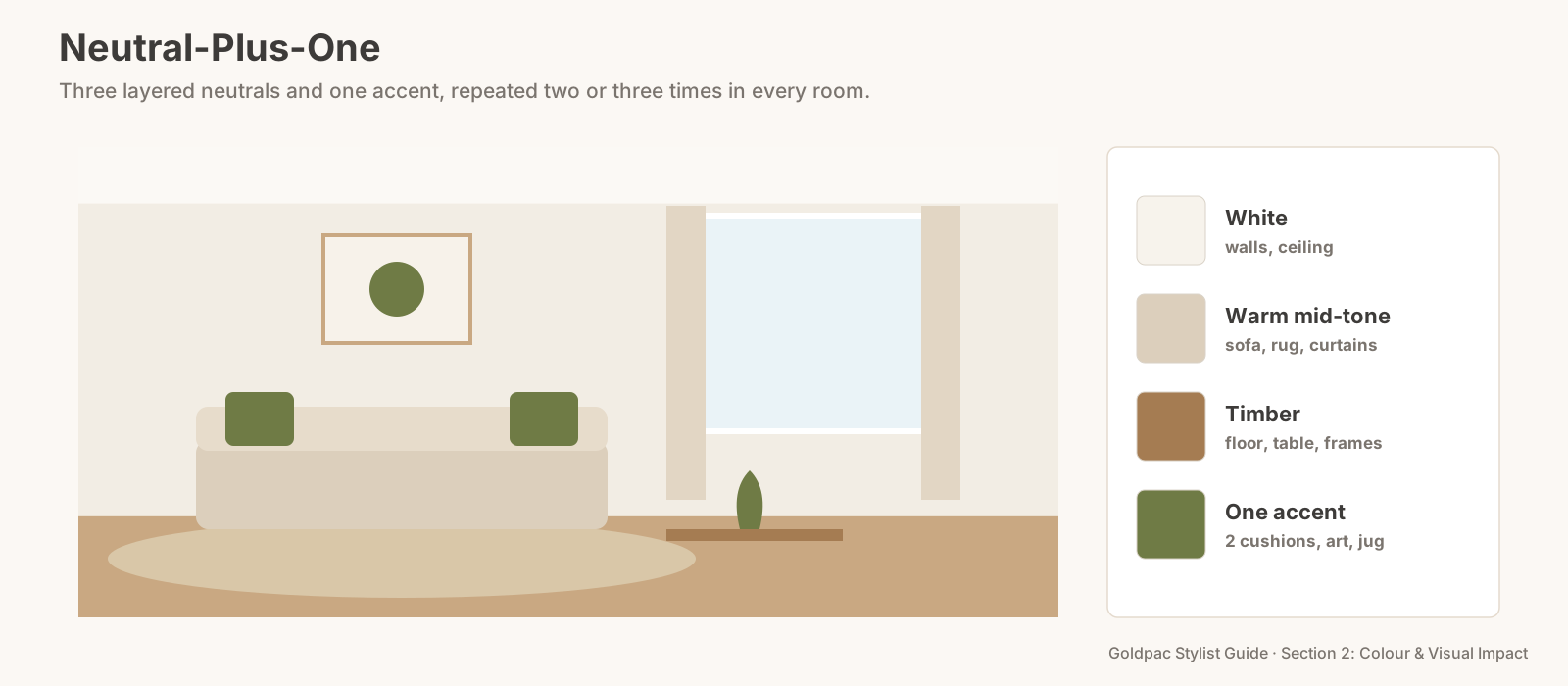
Where the accent goes, room by room
Living room: two cushions on the sofa, one artwork or print that carries the colour, and a vase or bowl on the coffee table. Three touches at three heights.
Dining area: a centrepiece (a jug of stems, a bowl, a runner) and nothing else in the accent colour. The table should look ready for a meal, not dressed for a party.
Kitchen: one or two objects on the bench: a tea towel folded over the oven handle, a ceramic canister, a bowl of fruit that happens to match. Keep appliances neutral.
Main bedroom: a throw folded at the foot of the bed or a pair of cushions, plus one small object on a bedside table. Bedrooms want the accent at its softest.
Bathroom: a hand towel or a small plant pot. White towels everywhere else.
Outdoor area: two cushions on the outdoor chairs or a large pot. Outdoors is where the accent can be a shade stronger, because the sky and garden balance it.
Choosing the right accent for your home
Look outside first. The best accent usually already exists in the home's setting: the terracotta of a tiled roof, the olive of the street trees, the blue of a harbour glimpse, the sandstone of an old wall. An accent that echoes the view makes the inside and the outside feel like one place.
Then check the floor. Orange-toned timber suits olive, navy and terracotta; pale grey floors suit sage, dusty pink and navy; dark floors take mustard and warm terracotta well.
Avoid the colour of the year. A trending colour dates a listing quickly, sometimes within a single campaign season, and buyers who see the same accent in every display home start to read it as a formula.
Why "timeless" sells
Buyers are buying for years, not for a season. A home dressed in this year's trending colour can look dated in the photos by the time it settles. A neutral home with one accent looks fresh now and still looks right when buyers picture it in five years.
Neutrals suit the widest range of buyers. Few people dislike warm white, oatmeal and oak. Many people dislike a particular bold colour. The accent adds personality without asking buyers to share a taste.
And it's the easiest palette to imagine changing. A buyer who prefers blue can picture swapping two cushions and a vase. A buyer facing a blue living room has to picture repainting.
"Won't a neutral home look like every other listing?"
Not with a good accent and real texture. Bland neutral homes are flat: one beige, no texture, no accent. A layered neutral home has white, oatmeal and timber, linen and wool and jute, and one colour that ties it all together. It looks considered, not generic, and buyers remember the colour: "the one with the olive" (Rule #263).
The blind spot: you see the accent everywhere
Living with colour makes you blind to how much of it there is. The red kettle, the blue fruit bowl, the purple throw, the green tea towels: individually small, together a rainbow. Choosing one accent forces you to see all the colours you'd stopped noticing, and once you see them, the edit takes an afternoon.
What if…
You already have a bold sofa. Make its colour the accent and keep everything else neutral, or soften it with a large natural throw.
You're living there with young children. Colourful toys don't need to disappear; they need a home. Store them in two or three baskets in the room's neutral, and let one favourite toy in the accent colour sit out as part of the scheme.
The home has strong original features (a red brick fireplace, coloured tiles). Let the feature set the accent, and choose a neutral base that sits comfortably with it.
FAQ
What accent colours look best in real estate photos? Soft, natural accents photograph well: olive, sage, terracotta, navy, mustard and dusty pink. One per home, repeated in small doses.
Is beige or grey better for selling a house? Either can work as part of a layered neutral base. Warm neutrals like beige and greige usually feel more welcoming in Sydney homes; cool greys suit very bright rooms and modern apartments.
Choosing one accent is easy; seeing every other colour in your own home is the hard part. A Photo Ready Consultation builds a Neutral-Plus-One palette around your own furniture, room by room, and leaves a written plan within 48 hours of the visit. For empty homes, Goldpac stages with our own furniture in a layered neutral palette: send us the address and a fixed styling quote lands within two hours, through our home staging page. See current prices.
Keep reading: Rule #32: Use no more than three main colours in a room (the 60-30-10 Check) · Rule #263: Buyers remember one standout detail, so create it (the one detail buyers remember) · Rule #39: Tone-on-tone combinations feel elegant (tone-on-tone rooms) · Rule #42: Repeat one accent colour to tie a room together (the Accent Triangle)
◀ Previous: Rule #33: Cool tones open a room up; warm tones draw it in · Section 2 contents · Next: Rule #35: Avoid bright or clashing wall colours ▶
Part of the Goldpac Stylist Guide: 300+ home staging rules from Goldpac's Sydney styling team.