
Stylist Guide › Section 2: Colour & Visual Impact › Rule #39
The bedroom door opens and the whole room is one colour. The walls are a soft, warm greige. The bedhead is a shade deeper. The linen is a shade lighter. The throw at the foot of the bed is darker again, close to mushroom. The lampshades are pale stone, the curtains a near-white version of the walls. Nothing matches exactly, and nothing clashes. A buyer stands in the doorway for a second longer than she meant to and says, "Oh, this is lovely."
The rule in one minute. Tone-on-tone means using one colour in several lighter and darker shades: pale walls, mid-tone bedhead, lighter linen, deeper throw. It looks calm, expensive and deliberate, because the eye moves smoothly between shades instead of jumping between colours. Use at least three shades of the one hue, spread from light to dark, and add texture so the room doesn't flatten out.
What buyers see when a room is tone-on-tone
At the door, the room reads as one calm picture. There's no single object pulling attention, so the eye takes in the whole space first: its size, its light, its shape. That's exactly what you want buyers to notice.
Walking in, the details reward a closer look. The bedhead is slightly deeper than the wall. The throw is slightly deeper again. The lamp is slightly paler. Small steps in shade give the room quiet structure, the kind buyers describe as "elegant" without being able to say why.
In the photos, the room looks like it was designed. Tone-on-tone rooms photograph beautifully because there's no clash for the camera to exaggerate. They read as hotel suites or display homes, in a good way.
What does tone-on-tone mean in interior design?
It means decorating a room in several shades and tints of a single colour, from light to dark, instead of mixing different colours. A tone-on-tone bedroom might use five versions of a warm sand; a tone-on-tone living room might use five versions of soft grey-green. The variety comes from depth of shade and texture, not from hue.
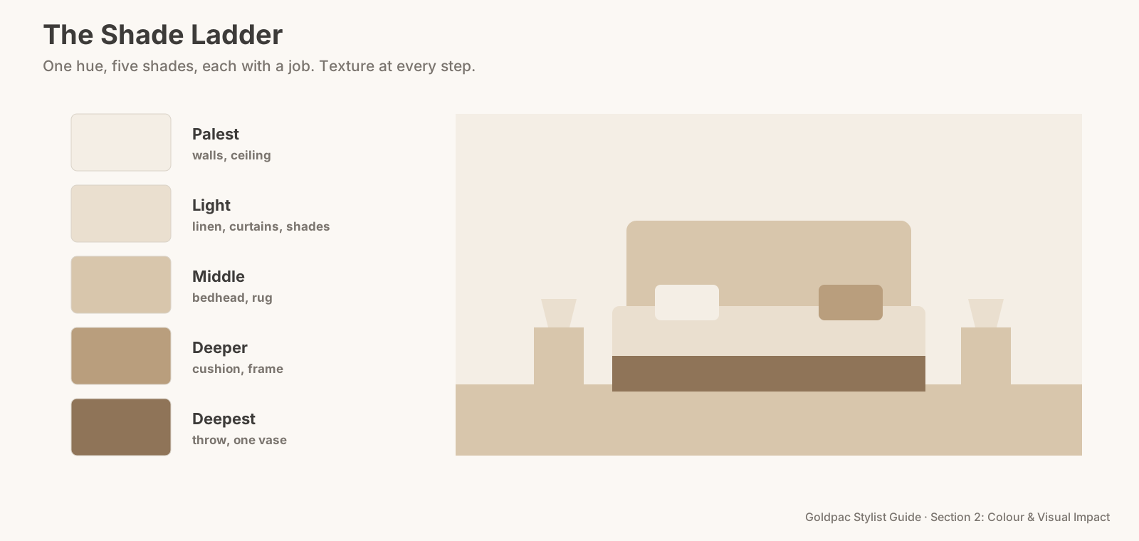
The Shade Ladder
Think of the colour as a ladder from pale to deep, and give each step a job.
- Choose one hue that suits the room's light: warm sand, greige, soft sage, pale blue-grey or blush.
- Palest step: walls and ceiling. Or a near-white version of the hue.
- Light step: bedding, curtains, lampshades. A shade or two deeper than the walls, or slightly paler, so they read against them.
- Middle step: the big soft piece. Bedhead, sofa or rug.
- Deep step: small accents. A throw, one cushion, a vase, a picture frame. The darkest shade gives the room an anchor.
- Add texture at every step (Rule #38), so pale on pale still has depth.
The Shade Ladder: one hue in at least three shades (pale walls, mid-tone big pieces, a deep accent), with texture at every step.
Where tone-on-tone works best
Main bedrooms. The calmest room in the house should feel the calmest in the photos. Tone-on-tone makes a bedroom feel like rest.
Ensuites and bathrooms. Tiles, towels, a stool and a soap dish in shades of one stone colour look like a spa.
Formal living rooms. A single family of greiges or sands makes a living room feel quietly upmarket.
Small apartments. One hue throughout, shifting gently room to room, makes a small home feel larger and more cohesive.
"Isn't that just a boring beige room?"
A boring beige room uses one shade, one texture and nothing deeper. Tone-on-tone uses several shades from pale to deep, mixed textures, and a darker anchor. The difference is the range: a beige room is a flat line; a tone-on-tone room is a ladder.
The blind spot: you think rooms need contrast to be interesting
Most people decorate by contrast: dark sofa, light walls, bright cushions. It's what we're used to seeing. A room built from one hue can feel like it's missing something until you see it finished.
Try it in one room first, usually the main bedroom. Most sellers who do are surprised by how calm and expensive it looks in the photos.
What if…
Your furniture is a different colour. Choose the hue to match your biggest piece (the bedhead or sofa) and build the ladder around it.
The room is dark. Choose a warm hue and keep the steps on the paler side, with only one deep accent.
It's a child's room. Tone-on-tone can work with a soft, friendly hue like pale sage or blush, with toys stored in baskets of the same family. It reads as calm without feeling like a grown-up's room.
FAQ
What colours work best for tone-on-tone? Soft, natural hues: warm sand, greige, sage, blue-grey, blush and stone. Very saturated colours are hard to use tone-on-tone without the room feeling heavy.
How many shades should a tone-on-tone room have? At least three, from pale to deep, and usually four or five once you count small accents.
Tone-on-tone rooms look effortless and take a careful eye. A Photo Ready Consultation builds a shade ladder around your own furniture and tells you which pieces to add or swap, in a written plan within 48 hours of the visit. For empty homes, Goldpac stages with our own furniture and linen in calm, layered tones: send us the address and a fixed styling quote lands within two hours, through our home staging page. See current prices.
Keep reading: Rule #38: Use the same colour in different textures for depth (three textures in one colour) · Rule #262: Minimalism feels trustworthy (the Rule of Small Numbers) · Rule #44: Soft, pale colours help bedrooms feel restful (calm, pale bedroom colours)
◀ Previous: Rule #38: Use the same colour in different textures for depth · Section 2 contents · Next: Rule #40: Skip strong red-and-green combinations, unless it's Christmas ▶
Part of the Goldpac Stylist Guide: 300+ home staging rules from Goldpac's Sydney styling team.