
Stylist Guide › Section 2: Colour & Visual Impact › Rule #40
Why does a red cushion on a green sofa look like a shopping centre in December?
The rule in one minute. Bright red and bright green are opposites on the colour wheel. Put them side by side at full strength and they fight: edges seem to shimmer, the room reads as festive, and the photos look busy. Unless you're decorating for Christmas, keep strong red-and-green pairs out of staged rooms. If you love both, mute them to terracotta and sage, let one lead, and keep the other to a few small touches.
The myth: opposite colours always work
Every colour wheel says it. Complementary colours make each other look brighter. Red and green. Blue and orange. Purple and yellow.
That's true. It's also the problem.
"Brighter" is good on a poster. In a living room, two full-strength opposites at equal size don't support each other. They compete for the same glance.
Why it feels right
Because the theory is real. Complementary pairs do create maximum contrast, and designers use them on purpose, in small amounts.
And because both colours are lovely alone. A red armchair is a statement. A green velvet sofa is a statement. The mistake is putting two statements in one sentence.
Why it backfires in a sale
It looks seasonal. Bright red plus bright green is the Christmas palette in almost every buyer's head, so outside December the decorations seem to have stayed up.
It vibrates in photos. When a red and a green have similar lightness, the border between them seems to flicker. The eye can't settle. On a phone screen, that reads as clutter even in a tidy room, and it pulls the eye away from the light and space you're actually selling.
It doesn't work for everyone. Red-green colour vision deficiency is common: it affects about one in 12 men and one in 200 women (nidirect, Northern Ireland health guidance). For those buyers, your carefully opposed pair can blur into two similar muddy tones. The contrast you paid for simply isn't there.
Do red and green go together in a room?
Yes, but only when they're muted and unequal. Terracotta with sage, rust with olive, dusty rose with eucalyptus: these are red-and-green families too, and they look calm and natural. Strong red with strong green, at similar sizes, is the version to avoid when you're selling.
The Mute-and-Split
A five-step fix. Most rooms take 20 minutes.
- Spot the pair. Stand in the doorway. Is there a bright red and a bright green in the same view? Cushions, art, a rug, a vase, a kitchen appliance.
- Pick a winner. One colour stays as the accent. The other goes, or shrinks.
- Mute what stays. Swap fire-engine red for terracotta or brick. Swap kelly green for sage, olive or eucalyptus.
- Split them with neutral. If both stay, put white, cream, timber or linen between them. Never touching. Never the same size.
- Check the ratio. The second colour should be the smallest part of the room, a 10 per cent touch at most (Rule #32 has the 60-30-10 split).
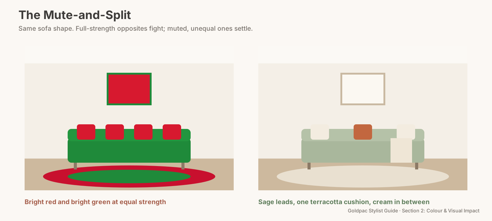
The Mute-and-Split: one muted colour leads, the other stays under 10 per cent of the view, with neutral between them.
Mistake and fix
Mistake: green sofa, red cushions, red-and-green rug. Fix: keep the green sofa. Swap the cushions for cream and oatmeal, with one rust cushion. Store the rug, or replace it with jute.
Mistake: red feature wall, green indoor plants in front. Fix: the wall is the problem, not the plants. Repaint, or move the plants and add a large pale artwork to break the red up.
Plants don't count
Leaf green reads as nature, not as a colour choice. A fiddle-leaf fig next to a terracotta pot is fine. Living plants rarely clash with anything, and neither does a red brick home behind a green lawn. The trouble starts with green you chose from a paint chart or a fabric shop, at full saturation, next to red you chose the same way.
The phone-camera test
Take a photo of the room. Then turn your phone's display to greyscale (it's in the accessibility settings) and look again.
If the red and the green turn into the same grey, they have the same lightness. That's the combination that vibrates. Make one of them clearly lighter or darker, or take one out.
The blind spot: you bought them years apart
Nobody plans a red-and-green room. The green sofa came first. The red cushions were a gift, or a sale, or a different season. Each piece made sense on the day it arrived.
You see two things you like. A buyer walking in for the first time sees both at once, and sees the pair.
What if…
You're selling in December. A small, simple tree for open homes is fine. Take it out for the photos. Listing photos taken in early December are still working in late January, and tinsel in a January listing looks like a home that's been on the market too long.
The red or green is fixed. A green kitchen, red brick fireplace, coloured tiles. Don't fight it. Keep everything else around it neutral so the fixed colour is the only one, and don't add its opposite.
FAQ
Is it okay to use Christmas decorations when selling a house? For inspections, a little is fine and can feel welcoming. Keep it to one or two pieces, and remove everything before the photographer arrives.
What colours go with a green sofa? Cream, oatmeal, warm white and natural timber first. For an accent, rust or terracotta in small amounts, or soft blush. Avoid bright red.
A red-and-green clash is easy to miss when you've lived with every piece for years. A Photo Ready Consultation walks your rooms and leaves a written, room-by-room plan within 48 hours of the visit, including which colours to keep and which to store. Selling an empty home instead? Send us the address and a fixed styling quote lands within two hours, through our home staging page. See current prices.
Keep reading: Rule #35: Avoid bright or clashing wall colours (the Loud Wall Hunt) · Rule #42: Repeat one accent colour to tie a room together (one accent colour, repeated)
◀ Previous: Rule #39: Tone-on-tone combinations feel elegant · Section 2 contents · Next: Rule #41: Use dark colours only in small doses ▶
Part of the Goldpac Stylist Guide: 220+ home staging rules from Goldpac's Sydney styling team.