
Stylist Guide › Section 2: Colour & Visual Impact › Rule #32
How many colours can a buyer see in your living room right now? Count them, honestly: the walls, the sofa, the rug, the cushions, the curtains, the artwork, the throw, the books, the toys in the corner. Most lived-in rooms land somewhere between eight and twelve. A room that photographs calmly usually has three.
The rule in one minute. Limit each room to three main colours: one dominant base (walls and large surfaces, about 60% of what you see), one secondary colour (sofa, rug, curtains, about 30%) and one accent (cushions, a vase, art, about 10%). Designers call it the 60-30-10 rule. Everything else stays neutral: white, timber, green from plants. Three colours read as a plan; ten read as a lot of stuff.
Why three is the magic number
Three colours give a room structure the eye can read at a glance. The base sets the mood, the secondary colour gives it weight, and the accent gives it life. Buyers don't consciously count, but they feel the difference between a room that hangs together and one that doesn't.
More colours split attention. Every extra colour is another place for the eye to land. In a busy room, buyers spend their few seconds in the doorway sorting objects instead of seeing the space. In a three-colour room, the eye moves straight past the decor to the light, the size and the view.
Three colours also photograph better. Cameras exaggerate colour clashes, and a listing photo of a room with ten colours looks cluttered even when the room is tidy.
How many colours should be in one room?
Three main colours, with neutrals and natural materials in between. White ceilings, timber floors, glass, metal and green plants don't count against the three; they're the background that holds the scheme together. If you can name more than three colours in a room without counting the neutrals, simplify.
The 60-30-10 Check
Stand in the doorway with your phone and do this room by room.
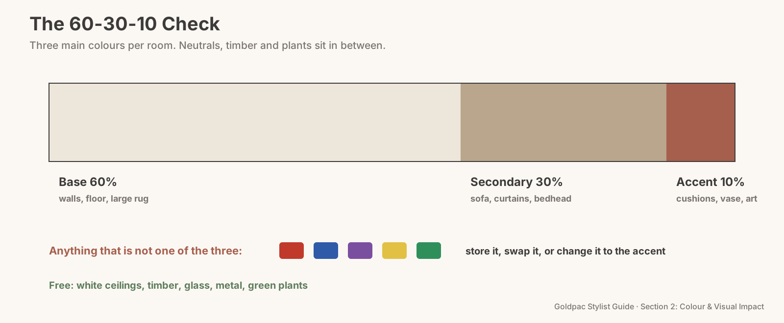
- Name the base colour (about 60%). Usually the walls, plus the floor or a large rug. For a sale, this should be a pale neutral (Rule #31).
- Name the secondary colour (about 30%). Usually the sofa, the bedhead, the curtains or a large rug. A mid-tone works best: oatmeal, soft grey, sage, sand.
- Choose one accent (about 10%). Terracotta, olive, navy, mustard or blush. It appears in two or three small places: cushions, a throw, a vase, an artwork.
- List everything that isn't one of the three. A red lamp, a blue rug, a purple throw, the bright plastic toy box.
- Remove or swap each one. Store it, replace it with a neutral, or change it to the accent colour.
- Check the photo. Take a picture from the doorway. If your eye bounces around the frame, there's still a colour too many.
The 60-30-10 Check: one base at about 60%, one secondary at about 30%, one accent at about 10%, and anything else stored or swapped before the photos.
Choosing the accent colour
The accent should come from something already in the home or the view. A terracotta roof outside the window, olive trees in the garden, a navy front door, the pink of a jacaranda in November. An accent that echoes something real makes the scheme feel natural rather than decorated.
Then repeat it two or three times, at different heights. A cushion on the sofa, a vase on the coffee table, a small artwork on the wall. Three appearances at three heights lead the eye around the room. One appearance looks like an accident; six look like a theme.
Keep the same accent in rooms that open onto each other. In an open-plan home, one accent carried through the living, dining and kitchen areas ties the whole space together in photos taken from any angle.
Avoid accents that fight the floor. Orange-toned timber floors clash with strong pinks and reds; pale grey floors can look cold with icy blues. Hold the accent sample against the floor before you commit.
A living room, before and after
Before: pale grey walls, a brown leather sofa, a red rug, blue curtains, green and purple cushions, a yellow lamp and a colourful bookshelf. Eight colours. In the photo, nothing stands out because everything does.
After: the same pale grey walls, the same sofa under a natural linen throw, a sand-coloured rug, white sheer curtains, two terracotta cushions, a terracotta vase on the coffee table and the bookshelf edited to white and neutral spines. Three colours plus timber and greenery. The furniture didn't change; half an afternoon did the rest.
"Won't three colours look boring?"
Not if you use texture and pattern within those colours. A wool throw, a linen cushion, a jute rug and a velvet accent can all sit in the same colour family and still feel rich (Rule #38 shows how). Boring comes from flat, identical surfaces, not from a small palette.
The blind spot: colours arrive one at a time
No one decorates a room with ten colours on purpose. The sofa came first, then a rug that was on sale, then cushions as gifts, then the kids' things. Each addition made sense on its own day. Together, they made a room with no plan.
Because the colours arrived slowly, you never saw them all appear at once. Buyers do, in a single glance. Count them once, as a stranger would.
What if…
The sofa is a strong colour you can't change. Make it the secondary colour and build around it: pick an accent that works with it and keep everything else neutral. A slipcover or a large throw can also tone it down.
It's a child's bedroom. Children's rooms can be a little brighter, but the rule still helps: one base, one main colour, one accent, with toys stored in matching baskets.
You love colour and your home shows it. That's fine for living; for selling, pack the extra colours with the rest of the personal items and bring them out again after the sale. A calm three-colour home photographs better, and you'll unpack your favourite things in the next place.
It's an open-plan space. Treat it as one room with one palette, so the kitchen, dining and living areas read as one generous space.
FAQ
What is the 60-30-10 rule in interior design? A rule of thumb for balancing colour: about 60% of a room in a dominant base colour, 30% in a secondary colour and 10% in an accent. Neutrals like white, timber and plants sit in between.
Do neutrals count as one of the three colours? The main neutral usually is the base colour. Natural materials like timber, stone, glass and green plants don't count; they act as background.
Which accent colours work best for selling a home? Soft, natural accents photograph well: terracotta, olive, sage, navy, mustard or blush. One per room, repeated two or three times.
Colour builds up slowly in a lived-in home, which is why it's so hard to see. A Photo Ready Consultation gives every room a three-colour plan with your own furniture, and a written list of what to store, swap or keep, within 48 hours of the visit. For empty homes, Goldpac stages with our own furniture in one calm palette: send us the address and a fixed styling quote lands within two hours, through our home staging page. See current prices.
Keep reading: Rule #31: Light walls make a space feel bigger (pale walls that make rooms bigger) · Rule #262: Minimalism feels trustworthy (the Rule of Small Numbers) · Rule #38: Use the same colour in different textures for depth (adding depth with texture)
◀ Previous: Rule #31: Light walls make a space feel bigger · Section 2 contents · Next: Rule #33: Cool tones open a room up; warm tones draw it in ▶
Part of the Goldpac Stylist Guide: 300+ home staging rules from Goldpac's Sydney styling team.