
Stylist Guide › Section 2: Colour & Visual Impact › Rule #44
It's 10:40 on a Saturday. The open home has been running for ten minutes. A couple walks into the main bedroom, and the voices drop. Pale walls, a bed made up in soft white and misty blue, two lamps glowing on matching tables, the blind half-raised on a strip of sky. One of them sits on the edge of the bed for a second. That's the moment you're styling for.
The rule in one minute. Bedrooms sell rest, and soft, pale colours read as restful: misty blue, soft sage, warm white, oatmeal, pale stone. Keep the walls light, dress the bed in two or three pale tones from one family, and hold strong or dark colours to one small accent. In cooler south-facing rooms, lean warm (oat, stone, warm white) rather than blue, so the room feels calm instead of cold.
What colours make a bedroom feel calm?
Soft, pale colours with low saturation: misty blues, sage and eucalyptus greens, warm whites, oatmeal and pale stone. They reflect plenty of light and ask nothing of the eye. Bright, saturated colours (hot pink, lime, strong red) do the opposite: they wake the room up, which is the wrong message in a space sold for sleep.
Pale blue is the classic choice for a reason. It's the colour of a clear sky and of distance, and it reads as quiet. But it isn't the only option, and in some Sydney bedrooms it isn't the best one.
The orientation check
In the southern hemisphere, south-facing rooms get little or no direct sun. They're the cool rooms of the house. A pale blue that looks fresh in a bright north-facing bedroom can look grey and chilly in a south-facing one, especially on a winter inspection.
- North or east-facing, bright: pale blue, soft grey-blue, sage. The sun warms them.
- South-facing or shaded: warm white, oatmeal, pale stone, a sage with a yellow lean. They supply the warmth the light doesn't.
- West-facing: afternoon light runs warm and strong. Cooler pales, like soft blue or grey-green, balance it.
The Quiet Bedroom Recipe
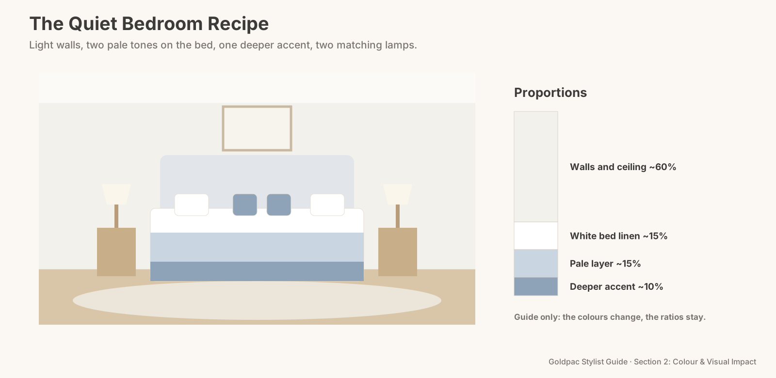
Think of it as a recipe with fixed proportions. The colours can change; the ratios stay.
Ingredients
- Walls and ceiling: one light, soft colour, the largest share of the room. Warm white or a very pale version of your main hue.
- Bed linen: two pale tones from one family. White sheets and quilt cover with a misty blue or oat layer, or the reverse.
- One deeper shade of the same colour: a throw or two small cushions. This is the accent, roughly a tenth of what you see.
- Natural texture: a linen quilt cover, a knitted throw, a timber bedside table, a woven basket.
- Two matching lamps with pale shades, one each side.
- A pale rug, large enough to sit under the lower two-thirds of the bed and show at least 60 cm on each side.
- One piece of art, soft and quiet, hung centred above the bedhead.
Assembly
- Strip the bed and remove anything bright or patterned: novelty prints, sports teams, saturated colours.
- Make it with white first. A white or near-white base is the most forgiving colour for photos.
- Add the pale layer. A misty blue, sage or oat coverlet or quilt, folded back so the white shows at the top.
- Finish with the accent. A throw across the bottom third of the bed and two small cushions in the deeper shade. No more than four cushions in total.
- Match the bedsides. Two tables, two lamps, the same height. One book or a small plant on each, nothing else.
- Clear every other colour. Clothes, charging cables, laundry baskets, toys, bright book covers.
The Quiet Bedroom Recipe: light walls, two pale tones on the bed, one deeper accent at about a tenth of the view, and two matching lamps.
Two terms worth knowing
Saturation. How pure or intense a colour is. A misty blue and a royal blue can be the same hue; the misty one has low saturation, which is what makes it calm.
Warm and cool whites. Whites with a yellow or red undertone read warm; whites with a blue or grey undertone read cool. In a shaded bedroom, a warm white feels softer. In a sunny one, a cool white stays crisp.
If this, then that
- If the walls are a strong colour and you can't repaint: go all-white on the bed and keep everything else pale, so the wall becomes the only colour.
- If the bedhead is dark: lean pale linen and a light throw against it, and choose a pale rug.
- If the room is small: skip the patterned throw and keep the bed in one or two plain tones. Fewer colours make a small room read bigger.
- If the bedroom has a strong view or a garden outlook: pick the bedroom accent from it, like sage from the trees or blue from the water.
The objection: "Pale blue is boring"
It can be, if it's the only thing in the room. That's why the recipe adds texture and a deeper accent. A bedroom in three blues with a linen cover, a knitted throw and a timber table doesn't look boring; it looks considered.
And remember who it's for. You're not decorating to your own taste for the next ten years. You're giving dozens of buyers a room they can picture themselves sleeping in, and calm suits almost everyone.
The blind spot: your bedroom is the most-used room
Bedrooms collect life. Clothes on the chair, a charger on each side, a stack of books, the laundry basket, a gym bag, the cat's bed. Each one adds a colour. You see the room you sleep in; buyers see a room with fifteen colours in it.
It's also the room guests never see, so it's the room that gets styled last, and the room styled last is the one most likely to be rushed on photo day.
What if…
It's a child's bedroom. Keep the walls pale and let the bed carry the child's colour in one soft version: a pale yellow, a soft green. Store the bright plastic toys in baskets.
The bedroom doubles as a study. Clear the desk to a lamp and one notebook, push the chair in, and hide cables. A desk is fine; a working desk isn't.
You need the bedroom every night during the campaign. Keep the styled linen in a bag. Use your everyday set at night, and swap back to the styled set before each inspection. It takes about five minutes once you've done it twice.
FAQ
What is the most relaxing colour for a bedroom? Soft, low-saturation colours: misty blue, sage, warm white and oatmeal are the most reliable. In a cool, south-facing room, warmer pales usually feel more relaxing than blue.
Should bedding be white for a house sale? White or near-white is the safest base for photos. Add one pale colour layer and a slightly deeper throw so the bed doesn't look bare.
How many cushions should be on a staged bed? Two to four. Two pillows in white, plus two small cushions in the accent shade, is plenty for most beds.
The bedroom is the room sellers style last and buyers judge slowly. A Photo Ready Consultation sets the colours for every bedroom, from the walls to the throw, using the linen you already own where it works, in a written room-by-room plan within 48 hours of the visit. Rather not do it yourself? With Photo Ready Styling, our stylist styles your bedrooms with your own furniture before the photos. See current prices.
Keep reading: Rule #39: Tone-on-tone combinations feel elegant (tone-on-tone bedrooms) · Rule #33: Cool tones open a room up; warm tones draw it in (cool walls, warm details) · Rule #54: Use soft pastels for calm, airy rooms (grown-up pastels)
◀ Previous: Rule #43: Black adds contrast and polish when used sparingly · Section 2 contents · Next: Rule #45: Choose kitchen colours that make food look good ▶
Part of the Goldpac Stylist Guide: 300+ home staging rules from Goldpac's Sydney styling team.