
Stylist Guide › Section 4: Accessories & Styling › Rule #107
Three points. That's all it takes for a colour to stop being an accident and start being a decision.
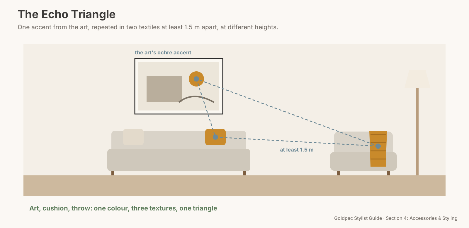
The rule in one minute. Use artwork to echo colours in textiles. Pick one accent colour from the art and repeat it in two textiles, such as a cushion and a throw, at least 1.5 m apart. The art and the two textiles form a triangle the eye follows, and the room reads as planned. Echo the colour; don't copy the pattern.
Why three points work
- One spot of colour is an accident. A terracotta stroke in a painting, alone, is just part of the painting.
- Two spots are a coincidence. The same terracotta in one cushion might be luck.
- Three spots are a plan. Art, cushion, throw: the eye connects them and reads the room as one composition.
- The triangle moves the eye. When the three points sit in different parts of the room and at different heights, the eye travels across the whole space instead of stopping at the sofa.
- It works in photos. Most listing photos show a room from one corner. A triangle of colour gives that single frame a path to follow.
How do you match cushions to artwork when staging?
Pick one accent colour from the artwork, usually a smaller, distinct colour rather than the background, and repeat it in two textiles such as a cushion and a throw, placed at least 1.5 m apart, so the art and textiles form a triangle across the room. Match the tone within a shade or two; an exact match isn't needed.
Two terms worth knowing
Two-term glossary Accent colour: the small, distinct colour in a room that stands out against the neutrals, used in about a tenth of what you see. Echo: repeating a colour in a different material or texture elsewhere in the room, rather than copying the same object or pattern.
The Echo Triangle, as a checklist
- Read the art. Ignore the background colour. Find the accent: the ochre in an abstract, the sage in a landscape, the rust in a still life.
- Find two textiles that can carry it: cushions, a throw, a rug, a bed runner, a table runner, a tea towel on the oven rail.
- Place them apart. At least 1.5 m from each other and from the art, ideally at different heights: one on the sofa, one at floor level or on a chair.
- Match the tone, not the exact colour. Within a shade or two is close enough.
- Keep it small. The accent should be roughly a tenth of what you see.
- Check from the door. Can you trace the triangle in one glance? If one point is hidden, move it.
The Echo Triangle: one accent colour taken from the art and repeated in two textiles at least 1.5 m apart, at different heights, so the three points form a triangle the eye follows across the room.
Room by room
- Living room: art above the sofa, one cushion on the sofa, a throw on the armchair or the rug's border.
- Main bedroom: art above the bed, a throw at the foot of the bed, and a cushion on a bedside chair or a small vase on the bedside.
- Dining: art on the wall, a table runner or napkins, and one more echo on the sideboard, such as a vase in the same tone.
- Kitchen: if there's art, a tea towel and a bowl of fruit in the accent can carry it (Rule #47 covers echoing accents with flowers and books).
"Isn't that a bit matchy?"
- Matchy is copying. Same pattern, same fabric, same object three times. That looks bought as a set.
- Echo is repeating the colour only. A smooth linen cushion, a chunky knit throw and a painted stroke share a colour but nothing else. That reads as taste.
- The neutrals do the heavy lifting. The accent sits on top of calm walls, floors and sofa. Keep the base quiet and the echo looks deliberate (Rule #42 covers repeating one accent colour).
Do-This-Sunday box Stand in front of your main living room art. Name its smallest distinct colour. Walk through the house with that colour in mind and collect two textiles that come close. Place one on the sofa and one across the room. Stand at the door. If you can see the triangle, you're done.
The blind spot: you chose the art and the cushions years apart
Most rooms grow piece by piece. The art came from one trip, the cushions from a sale, the throw was a gift. Each was a good choice, but nobody chose them together.
You see each one separately because you remember buying each one. A buyer sees them all at once, in one photo, and notices whether they connect. Choosing the art first and then the textiles to suit it closes the gap (Rule #99 covers choosing art by colour palette).
What if…
The art has no clear accent colour. Black-and-white photography or an all-neutral piece. Echo its strongest tone instead, such as charcoal in a cushion and the lamp base, or use the texture: a linen print, a linen throw.
You can't buy new cushions. Swap between rooms. The bedroom throw might be the living room's missing echo.
FAQ
Should cushions match the artwork? They should echo one of its colours, not match exactly: one accent from the art, repeated in two textiles placed apart.
A colour repeated three times makes a room look planned. Rather have someone pull the triangle together for you? With Photo Ready Styling, our stylist styles your home with your own art, cushions and throws before the photos. For empty homes and agent listings, Goldpac stages with our own art and textiles: send us the address and a fixed styling quote lands within two hours, through our home staging page. See current prices.
Keep reading: Rule #99: Choose art by colour palette, not theme (choosing art by colour palette) · Rule #294: Unify mismatched furniture with one cushion palette (one cushion palette for mismatched furniture) · Rule #130: Anchor a room with one statement throw (one statement throw to anchor the room)
◀ Previous: Rule #106: Stick to one metal finish per room · Section 4 contents · Next: Rule #108: One neutral personal touch is enough ▶
Part of the Goldpac Stylist Guide: 220+ home staging rules from Goldpac's Sydney styling team.