
Stylist Guide › Section 4: Accessories & Styling › Rule #99
Three colours. That's usually all a room needs its artwork to share with the rest of the space.
The rule in one minute. Choose art by colour palette, not theme. A print of the beach in a city apartment, a wine-themed canvas in the kitchen or a picture of coffee beans above the coffee machine all try to explain the room. Art chosen for colour, shape and calm instead ties the room together and suits every buyer. Pick pieces that repeat two or three colours already in the cushions, rug, timber or view.
Why theme-led art falls flat
Beach prints in a bedroom.
Wine art in the dining room.
A fork-and-spoon print in the kitchen.
The room is being labelled, not decorated.
Theme art states the obvious. Buyers already know the kitchen is for cooking. A picture of food tells them nothing new and makes the room look like a café.
It dates and narrows the home. Coastal prints, Paris prints and inspirational canvases follow trends. They also suggest a particular lifestyle that not every buyer shares.
It fights the colours of the room. A theme print chosen for its subject often brings in colours that don't belong: bright blue sea in a warm neutral living room, red wine in a sage kitchen.
How do you choose art for a staged home?
Choose art for colour and calm, not subject: pick pieces that repeat two or three colours already in the room's textiles, timber, rug or view, with simple shapes and soft contrast, such as abstract colour fields, landscapes, botanicals or line drawings. Size and placement matter more than what the picture shows.
The Palette Pick
- Name the room's three colours. The main neutral (walls, sofa), the second tone (timber, rug) and one accent (cushions, a throw, a plant).
- Look for art that contains at least two of them. Hold your phone's photo of the room next to the artwork, or next to its online image.
- Prefer soft, abstract or natural subjects: colour fields, landscapes, botanicals, line drawings, textured canvases.
- Avoid labels: food in the kitchen, beaches in the bedroom, wine in the dining room, words anywhere (Rule #98 covers decorative lettering).
- Check the contrast. Calm rooms want soft-contrast art; a very high-contrast piece becomes the only thing anyone sees.
- Size it to the furniture (Rule #92 covers one large artwork over a gallery wall).
The Palette Pick: name the room's three colours, choose art that repeats at least two of them in a calm, abstract or natural subject, and size it to the furniture below.
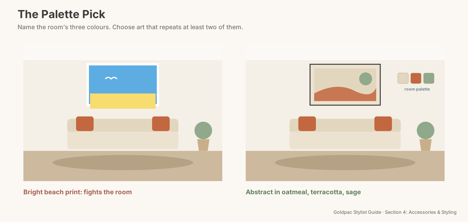
Mini-dialogue: the kitchen print "But it's a kitchen. Shouldn't the art be about food?" "The benchtop already says kitchen. The art's job is to make it feel calm and finished, and a soft botanical in the kitchen's colours does that better than a print of cutlery."
Where the art goes, room by room
- Living room: one large piece above the sofa or the sideboard, in the room's three colours. This is the hero artwork.
- Main bedroom: a soft landscape or abstract above the bed, slightly lighter and calmer than the living room piece. Bedrooms should feel restful.
- Kitchen and dining: a botanical or a simple abstract on a free wall near the table. Not food, not cutlery, not wine.
- Hallway and entry: one tall piece or a pair of matching prints, picking up the accent colour so it carries from room to room.
- Bathroom: usually nothing, or one small print if there's a dry wall away from the shower.
Carry one colour through the whole home. If sage appears in the living room art, let it show again in a bedroom print and an entry piece. Buyers walking through feel the home hangs together, without being able to say why (Rule #107 covers how art can echo the textiles).
The phone-camera test
Photograph the room with the art in place, then switch the photo to black and white on your phone. A good palette pick still sits comfortably in the room in black and white, because its tones match the room's. A theme print often jumps out as the darkest or brightest thing in the frame.
The blind spot: you chose it because it meant something
Theme art is usually bought for a reason: a holiday by the sea, a love of wine, a café you used to visit. You see the memory, not the colours.
Buyers see only the colours and the label. The memory is yours; the palette is what they'll respond to.
What if…
You have only theme art and can't buy new pieces. Remove it and leave the wall clear, or use a mirror. A blank wall beats a mismatched print.
FAQ
What kind of art is best for staging a house? Calm art chosen for colour: abstract colour fields, landscapes, botanicals or line drawings that repeat two or three colours already in the room.
Art that belongs to the room makes the whole space look planned. For empty homes and agent listings, Goldpac stages with our own furniture and art chosen for each room's palette: send us the address and a fixed styling quote lands within two hours, through our home staging page. Living there? A Photo Ready Consultation tells you which pieces work and where, in a written plan within 48 hours of the visit. See current prices.
Keep reading: Rule #92: Choose one large artwork over a gallery wall (one large artwork over a gallery wall) · Rule #171: Create rhythm with repetition and variation (rhythm through repetition) · Rule #103: Hang artwork at eye level (hanging art at eye level)
◀ Previous: Rule #98: Skip decorative lettering and word art · Section 4 contents · Next: Rule #100: Vary heights in decorative groupings ▶
Part of the Goldpac Stylist Guide: 300+ home staging rules from Goldpac's Sydney styling team.