
Stylist Guide › Section 2: Colour & Visual Impact › Rule #46
Four colours do most of the work in almost every well-staged home in Sydney: beige, cream, grey and white. They're not the exciting part of a room. They're the part that lets everything else, including the buyer's imagination, take over.
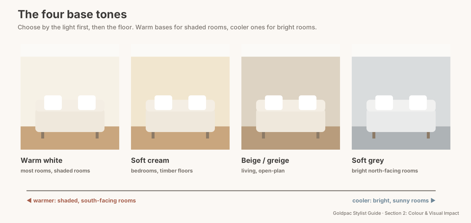
The rule in one minute. Beige, cream, grey and white are the universal base tones for home staging because almost every buyer can picture their own furniture against them. Use one of them, or two that share an undertone, for about 60 per cent of each room: walls, large rugs, sofas and bedding. Choose warm bases (cream, beige, warm white) for shaded rooms and cooler ones (soft grey, crisp white) for bright, sunny rooms.
Why base tones matter more than accent colours
A base tone is the colour a buyer barely notices, and that's its job. It covers the biggest surfaces in the room: walls, ceilings, carpets, large rugs, sofas, beds. Because it covers so much, it sets the mood of the whole room before any cushion or artwork gets a look in.
Get the base right and almost any accent works. Get it wrong (a pink-leaning beige, a cold blue-grey in a dark room, three clashing whites) and no amount of styling on top will fix it. That's why we always start a room with its base, not its accessories.
And a neutral base removes decisions for the buyer. A buyer looking at a sage-green living room has to decide whether they like sage. A buyer looking at a warm white room only has to decide whether they like the room. Fewer decisions, more attention on light, space and layout, which are the things you're actually selling.
Which neutral colours are best for selling a house?
Warm white, soft cream, light beige (often called greige when it leans grey) and pale soft grey. These four suit the widest range of buyers, furniture and floors. Pick by the light in each room first, and by your floors second.
The four base tones compared
| Base tone | Undertone | Best in | Watch out for |
|---|---|---|---|
| Warm white | yellow or red | most rooms, shaded rooms, south-facing rooms | turning creamy-yellow under warm globes |
| Soft cream | yellow | bedrooms, period homes, timber floors | looking dated next to cool grey tiles |
| Beige / greige | yellow, red or grey | living areas, open-plan spaces | a pink or peach lean from older paint |
| Soft grey | blue or green | bright north-facing rooms, modern units | feeling cold in shaded rooms |
The numbers that matter
About 60 per cent of the room. Base tones cover the largest share: walls, ceiling, big rugs, the sofa, the bed. That's the 60 in the 60-30-10 split (Rule #32).
One base, or two at most. A warm white wall with a cream sofa works. A warm white wall, a cool grey sofa and a beige rug with a pink lean doesn't; the three neutrals argue.
Light-reflecting by design. Pale bases bounce light around the room instead of absorbing it. Soft whites and off-whites typically reflect around three-quarters or more of the light that hits them (Composite Paint, 2026), which is a big part of why they make rooms read larger.
The Base Tone Match
- Check the light. Is the room bright and north-facing, or shaded and south-facing? Bright rooms can take cool bases; shaded rooms need warm ones.
- Look down. Floors are the hardest thing to change. Warm timber floors suit warm whites, cream and beige. Cool grey tiles or carpet suit soft grey and crisp white.
- Pick one base for the room. Walls first, then the biggest soft surface, the sofa or bed.
- Test the undertone against a sheet of white paper (Rule #36 shows how). If the beige looks pink or the grey looks blue, swap it.
- Keep a second neutral only if it shares the undertone. Warm white with cream, yes. Warm white with blue-grey, no.
- Then add the accent. Only once the base is settled.
The Base Tone Match: choose one base by the light and the floor, check its undertone against white paper, and let it cover about 60 per cent of the room.
The objection: "Neutral rooms all look the same"
Only when the base is the only thing in them. A neutral base is a stage, not a performance. Texture, timber, one accent colour and a little greenery stop it looking flat. Rule #38 shows how to add depth with texture alone.
And "the same" isn't the insult it sounds like in a sale. Buyers scroll through dozens of listings. A calm, neutral room doesn't win by being different; it wins by being easy to imagine living in.
The blind spot: your neutral may not be neutral
Neutrals age. A beige painted in the late 1990s often had a peach or pink lean that looked warm then and looks dated now. A cream carpet from 2005 may have yellowed. A "white" kitchen may have three different whites in it, on the doors, the benchtop and the walls.
You've lived with them long enough that they read as plain. Buyers see the lean straight away, especially in photos, where cameras often exaggerate warm or cool casts. Hold a sheet of printer paper against each wall and each large soft surface. Anything that looks pink, peach, yellow or blue next to it isn't as neutral as you think.
What if…
The carpet is a strong colour and it stays. Choose the base that sits best with it, usually a warm white for beige or brown carpet and a soft white for grey carpet, and cover as much as you can with a large pale rug.
You're in a rental and can't repaint. Work with the walls you have. If they're cool, use warm linen and timber; if they're warm, keep accents soft and cool.
The home is a period terrace with dark timber joinery. Cream and warm white suit it far better than cool grey, and they let the joinery look intentional instead of heavy.
FAQ
What is the most popular neutral colour for selling a house? Warm white and soft greige are the safest and most common choices, because they suit most floors, furniture and light conditions.
Is grey still a good colour for selling a house? Soft, warm-leaning greys still work in bright rooms and modern homes. Cool blue-greys can feel cold in shaded rooms; there, a warm white or cream is usually safer.
Can I mix beige and grey in one room? Yes, if they share an undertone. A greige (a beige with a grey lean) bridges the two. A pink beige next to a blue grey will clash.
Neutral sounds simple until you try to match three whites in one kitchen. A Photo Ready Consultation checks the base tones in every room against your floors and light, and tells you what to keep, cover or swap, in a written plan within 48 hours of the visit. For empty homes, Goldpac stages in warm, buyer-friendly neutrals: send us the address and a fixed styling quote lands within two hours, through our home staging page. See current prices.
Keep reading: Rule #36: Match the rug, curtains and accessories by undertone (the White Paper Test for undertones) · Rule #32: Use no more than three main colours in a room (the 60-30-10 split) · Rule #50: Paint trims and doors the same colour for a clean look (matching doors and trims) · Rule #58: Don't paint every room stark white unless the light suits it (when stark white works)
◀ Previous: Rule #45: Choose kitchen colours that make food look good · Section 2 contents · Next: Rule #47: Echo accent colours with flowers and books ▶
Part of the Goldpac Stylist Guide: 300+ home staging rules from Goldpac's Sydney styling team.