
Stylist Guide › Section 2: Colour & Visual Impact › Rule #58
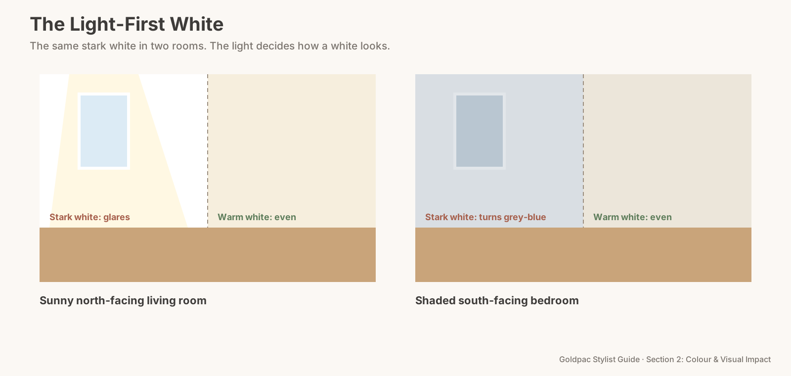
The painter has just finished. Every room in the house is the same bright, brilliant white, from the sunny front living room to the shaded back bedroom. In the living room it glares. In the back bedroom it has turned a flat, chilly grey. Same paint, same week, and neither room looks the way the swatch promised.
The rule in one minute. Stark white (a bright white with no warm undertone) isn't a safe default for every room. In strong sun it can glare and look clinical; in shaded, south-facing rooms it often turns grey or blue. Use it only where the light suits it: bright, evenly lit rooms and modern homes. Elsewhere, choose a soft or warm white. Test any white in a large patch, morning and afternoon, before painting a whole home.
The myth: white makes every room bigger and brighter
It's the most common painting advice before a sale. Paint everything white. White is clean, white is neutral, white makes rooms look bigger. Many sellers pick the brightest white on the card and use it everywhere, walls and ceilings alike.
Why it feels right
White does reflect the most light. A white wall bounces more light around a room than any colour. In a dim room, that matters.
And white looks fresh on the card. Under bright shop lights, a stark white chip looks crisp, clean and new. It's easy to imagine every room looking like that.
Why it backfires
White doesn't have its own colour; it borrows the light's. A wall in a white with no warm pigment shows exactly what the light is doing. In a north-facing room in the afternoon, full sun turns it blinding. In a south-facing room, where little direct sun reaches in the southern hemisphere, it picks up cool, blue-grey light from the sky and looks cold and dull.
Stark white can feel clinical. In a home with timber floors, linen and warm furniture, a cold, bright white makes everything else look yellow or tired by comparison. Rooms start to feel like a rental fit-out or a waiting room.
It shows every flaw. Bright white walls show patched holes, uneven plaster, scuff marks and shadows from poorly lit corners. In photos, a glare from the window across a flat white wall can also blow out detail.
And it photographs harder. A room full of stark white surfaces in mixed light can confuse a camera's colour balance, giving a blue cast in shaded rooms and harsh bright patches in sunny ones.
When does stark white work?
In bright, evenly lit rooms and in modern homes with cool finishes. A contemporary apartment with white joinery, grey stone and black fittings can carry a crisp white well. So can a gallery-style living room with big, filtered windows. In those rooms, a bright white looks deliberate.
Anywhere else, choose a softer white. Most Sydney homes, with timber floors, warm light and a mix of rooms facing different ways, look better in a soft white with a little warmth in it.
The Light-First White
- Note each room's orientation. North, east, west or south. North-facing rooms get the most sun across the day in Sydney; south-facing rooms get the least.
- Match the white to the light. Bright and sunny: a soft white or a crisp white can both work. Shaded or south-facing: a warm white, with a touch of yellow or red in it.
- Paint test patches large enough to judge, at least an A3 sheet in size, on two walls of each room: one that faces the window and one beside it.
- Look at them three times: morning, midday and late afternoon, with the lights off and then on.
- Choose one white for walls and one for ceilings and trims, and use them across the home where you can (Rule #50 covers trims).
- Keep stark white only for rooms that passed the test.
The Light-First White: test any white in an A3 patch on two walls, at three times of day, before using it, and keep stark white for bright rooms that pass.
The phone-camera test
Take a photo of each test patch with your phone, without flash, standing back from the wall. Look at it on the screen next to a photo of a plain white sheet of paper taken in the same spot. If the wall looks blue or grey in the photo, that white will look the same in the listing.
What to say to the painter
If someone else is painting, be clear about which white goes where. Something like:
"We're using one soft white on the walls throughout, except the front living room, which gets the brighter white we tested. Ceilings and trims are in the matching ceiling white. Could you paint large test patches in the main bedroom and living room first, so we can check them before you start?"
The blind spot: you chose it from a card
You picked the white in a shop. Under the shop's lights, on a tiny chip, against a white card. That's the one setting in which every white looks the same.
On your walls, the room's own light decides. And once it's painted, you get used to it in a few days. Buyers see it for the first time, in the light of the inspection hour.
What if…
You've already painted stark white everywhere. Warm the rooms with soft furnishings: linen curtains, oatmeal throws, timber pieces, warm globes. In shaded rooms, these do a lot of the work a warmer white would have done.
You're painting only one or two rooms before the sale. Match the white already in the rest of the home, even if it's not your favourite. One consistent white beats a better white in only two rooms.
FAQ
What is the best white paint for selling a house? A soft white with a little warmth suits most Sydney homes. Crisp, stark whites suit bright, modern spaces. Test either in a large patch before you commit.
Why does my white wall look grey? Usually because the room gets little direct sun. Shaded and south-facing rooms receive cooler light, which makes a white without warm pigment look grey or blue.
White is the colour that changes most with the light. A Photo Ready Consultation looks at each room in its own light and tells you which white to keep and where a warmer one would help, in a written room-by-room plan within 48 hours of the visit. We say what to do; you or your painter do it. For empty homes, send us the address and a fixed styling quote lands within two hours, through our home staging page. See current prices.
Keep reading: Rule #46: Beige, cream, grey and white are the universal base tones (the four base tones) · Rule #50: Paint trims and doors the same colour for a clean look (matching doors and trims)
◀ Previous: Rule #57: Match wall colours to flooring transitions where you can · Section 2 contents · Next: Rule #59: Don't mix warm whites and cool whites ▶
Part of the Goldpac Stylist Guide: 300+ home staging rules from Goldpac's Sydney styling team.