
Stylist Guide › Section 2: Colour & Visual Impact › Rule #36
Why does a room look slightly wrong when every piece in it is "beige"?
The rule in one minute. Every neutral has an undertone: warm (yellow, peach, red) or cool (blue, green, grey). A room looks calm when the big soft pieces share an undertone: rug, curtains, sofa and cushions all warm, or all cool. Mixing them is what makes "neutral" rooms look slightly off, especially in photos. Test each piece against a sheet of white paper to see its undertone, then swap the odd ones out.
Ask the Stylist: the undertone questions
These come up whenever we talk undertones with sellers. These are our answers.
"What exactly is an undertone?"
It's the colour hiding inside a neutral. Two beiges can look the same in the shop, but one leans yellow and the other leans pink. Two greys can look identical until you put them side by side, and one turns out to be blue-grey and the other green-grey. The main colour is what you see first; the undertone is what you feel.
"Why does it matter if they're all neutral?"
Because the eye notices when undertones fight, even if it can't say why. A cool, blue-grey rug under a warm, yellow-cream sofa makes both look slightly dirty. Put the same sofa on a warm oatmeal rug and suddenly it looks clean and expensive. Nothing changed except the undertone.
"Does this really show in listing photos?"
More than in person. Cameras pick up colour casts, and mismatched undertones show up as patches that look a little green, a little pink or a little grey next to each other.
"Do we have to replace everything?"
No. Usually it's one or two pieces: the rug, a throw, the curtains or a set of cushions. Match those to the undertone of the biggest piece you can't change, usually the sofa or the floor.
How do you match colours by undertone?
Find the undertone of the largest piece you're keeping, then make every other soft piece in the room lean the same way. The quickest test is to hold each item against a plain sheet of white printer paper in daylight: next to pure white, the hidden yellow, pink, blue or green shows up clearly.
The White Paper Test
- Pick the anchor. The biggest piece you can't change: usually the floor, the sofa or the kitchen bench.
- Hold a sheet of white paper against it in daylight. Does it lean yellow, peach or pink (warm), or blue, green or grey (cool)?
- Test every soft piece the same way: rug, curtains, cushions, throws, bed linen, lampshades.
- Sort into two piles: matches the anchor's undertone, or doesn't.
- Swap or store the ones that don't. Often a single rug or set of cushions is enough.
- Check the wall colour too. A warm sofa against a cool grey wall can look tired; a warm white wall brings it back to life.
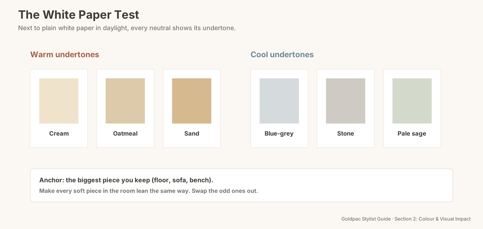
The White Paper Test: hold each neutral against plain white paper in daylight, find its undertone, and make every soft piece in the room lean the same way as the largest piece you're keeping.
Warm or cool: which should a room be?
Match the room's light and its fixed surfaces. In Australia, rooms that face north get warm sun and suit either; south-facing rooms often look better in warm undertones because the light is cooler. Orange-toned timber floors want warm neutrals. Grey tiles and chrome want cool ones. When in doubt, warm undertones are more forgiving in most Sydney homes.
The second-order effect: matched undertones make modest furniture look better
Undertone harmony reads as quality. Buyers can't tell a designer sofa from a budget one in a listing photo, but they can tell whether a room looks coherent. When everything soft in a room leans the same way, ordinary pieces look chosen, and the room looks more expensive than its furniture.
The blind spot: "it's all beige"
Most people group neutrals as one colour. Beige is beige, grey is grey. You bought the rug because it was "neutral", the cushions because they were "neutral", and the throw because it went with "neutral". Each one is fine on its own. Together, they're four different neutrals arguing quietly.
What if…
The floor and the sofa have opposite undertones. Use the rug as a bridge: pick one that contains both tones, such as a warm oatmeal with a soft grey thread.
You're not sure what you're seeing. Photograph the room in daylight and look at it on your phone. Mismatched undertones usually show up as one piece that looks oddly coloured.
FAQ
How can I tell if a colour is warm or cool? Hold it next to plain white paper in daylight. If it leans yellow, orange, peach or pink, it's warm; if it leans blue, green or grey, it's cool.
Can you mix warm and cool neutrals in one room? A little, through a bridging piece like a rug that contains both. But the large soft pieces (sofa, rug, curtains) should mostly share one undertone.
Should the rug match the sofa? It shouldn't be the same colour, but it should share the same undertone, with enough difference in lightness to stand apart.
Undertones are hard to see in a room you know well. A Photo Ready Consultation checks every soft piece against your floors, walls and light, and tells you which one or two to swap, in a written plan within 48 hours of the visit. For empty homes, Goldpac stages with our own furniture and textiles in matched undertones: send us the address and a fixed styling quote lands within two hours, through our home staging page. See current prices.
Keep reading: Rule #34: Neutrals plus one accent make timeless staging (Neutral-Plus-One) · Rule #33: Cool tones open a room up; warm tones draw it in (warm and cool colours) · Rule #46: Beige, cream, grey and white are the universal base tones (the four universal base tones) · Rule #51: Pair cool greys with blues and warm greys with beige (warm and cool greys) · Rule #128: Match curtains and blinds to the wall colour (matching curtains and blinds to the wall)
◀ Previous: Rule #35: Avoid bright or clashing wall colours · Section 2 contents · Next: Rule #37: Dark floors add stability but need contrast ▶
Part of the Goldpac Stylist Guide: 300+ home staging rules from Goldpac's Sydney styling team.