
Stylist Guide › Section 5: Textiles › Rule #138
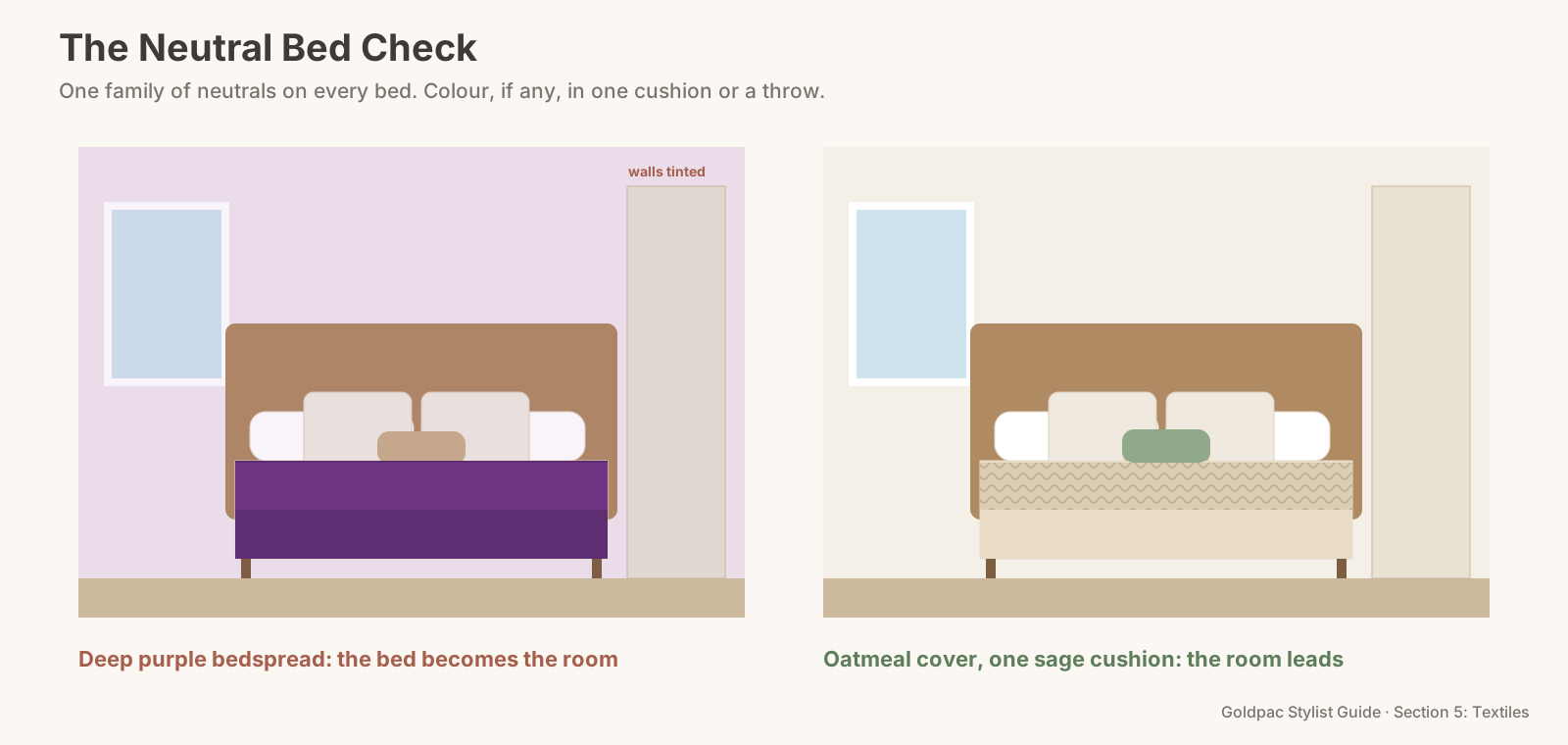
A buyer steps into the main bedroom: good size, built-in robe, a window onto the jacaranda. And a deep purple bedspread that turns the whole room faintly violet in every photo.
The rule in one minute. Choose neutral bed covers over coloured ones. A large coloured bedspread (red, purple, teal, mustard) dominates the bedroom, casts its colour onto pale walls in photos and dates quickly. White, ivory, oatmeal, stone or pale grey let the room's size and light lead. If you want colour, put it in one cushion or one throw, not across the whole bed.
Walking through the bedrooms, the way a buyer does
In the doorway, the bed is the biggest shape. It covers more of the floor than anything else in the room, so whatever colour it wears becomes the room's colour. A neutral cover reads as part of the room; a strong colour reads as the room itself.
Near the window, the light changes it. Saturated fabrics bounce their colour onto nearby walls and ceilings in daylight. In a photo, a white wall beside a red bedspread picks up a pink tint that wasn't there to the eye.
At the wardrobe, buyers start planning. They picture their own bed in the room. A neutral bed is easy to replace in their heads; a strong colour gets in the way.
In the kids' room, the same rule applies. Bright primary-coloured covers on a single bed fill the photo with colour and make the room look smaller and busier (Rule #129 covers patterned and branded bedding).
At the end of the walk, consistency counts. If every bedroom has a neutral cover, the house reads as calm and finished. If each one is a different strong colour, the listing gallery looks like a paint chart.
What colour bedspread is best for selling a house?
White, ivory, oatmeal, stone or pale grey: a neutral bed cover lets the bedroom's size and light lead, avoids colour casts on pale walls in photos, and suits every buyer; add colour, if at all, with one cushion or a throw across the foot. Keep the same neutral family across all bedrooms.
Two terms worth knowing
Two-term glossary Colour cast: a tint that a large, saturated surface reflects onto nearby walls and ceilings, which cameras pick up more strongly than the eye does. Bedspread: a single cover that sits over the whole bed, often to the floor. A quilt cover with a throw is usually a better look for photos.
The Neutral Bed Check
- Stand in each bedroom doorway in daylight. Note the colour of every bed cover.
- Anything saturated goes: red, purple, teal, mustard, bright blue, hot pink, dark navy.
- Swap in a neutral from the same family across the house: white for bright rooms, oatmeal or stone for warm rooms, pale grey for cool rooms.
- Keep colour to one accent per bed: a cushion or a throw in a soft tone that echoes the room (Rule #130 covers one statement throw).
- Take a phone photo and check the walls next to the bed. If they look tinted, the cover is still too strong.
- Repeat in every bedroom, including the spare room.
The Neutral Bed Check: every photographed bed in a white, ivory, oatmeal, stone or pale-grey cover from one neutral family, with any colour limited to one cushion or throw, and no tint on the walls in a daylight photo.
"But the room looks bland in neutrals"
Bland comes from flatness, not from neutrals. A neutral bed with three textures (a smooth quilt cover, a waffle coverlet and a chunky knit throw) looks rich and layered (Rule #125 covers layering the bed).
One accent is enough to warm it. A rust, sage or soft blue cushion, or a throw in the same tone, gives the room a point of colour without taking it over.
Buyers bring their own colour. A calm bedroom is the easiest one to imagine with their own things in it. That's what the photo is for.
Matching the neutral to the room
Bright, north-facing rooms suit white or ivory. They stay crisp in strong light.
Cooler, south-facing rooms look warmer with oatmeal, stone or a soft sand. Pure white can look grey in low light.
Rooms with timber floors and warm walls pair well with ivory, oatmeal and linen tones.
Rooms with grey carpet or cool walls pair well with pale grey and white.
Across the house, keep one family. Mixing bright white in one bedroom with yellowed cream in the next looks accidental in the listing gallery.
Where colour still works
On one cushion, echoing the art or the rug.
In a throw across the foot, in a muted tone: sage, terracotta, dusty blue, warm grey.
In a plant or a vase on the bedside table, where it's small and alive.
Never on the whole bed. The bed is too big a surface for a statement colour in a sale.
The blind spot: you chose the colour to make the room yours
A coloured bedspread is often a deliberate choice. It warms a cold room, matches a favourite artwork, or simply makes the bedroom feel like a retreat. For living there, it works.
For selling, it's the one thing in the room that belongs to you most. You see a cosy, personal space; buyers see a strong colour they'd change on day one. Swap it for a neutral for the campaign, and put it back on the bed in the new home.
Do-This-Sunday box Strip every coloured bed cover in the house. Put the most neutral cover you own on the main bed, then work down through the bedrooms. Make a shopping list for any bed still in colour: one white or oatmeal quilt cover per bed.
What if…
The only neutral covers you own are worn. A new white or oatmeal quilt cover per photographed bed is one of the few purchases worth making; it comes with you afterwards.
The bedroom walls are a strong colour. Even more reason for a neutral bed. Two strong colours in one room fight; one strong wall and a calm bed can work.
The bedroom faces a busy street or a neighbour's wall. A calm, neutral bed draws the eye into the room and away from the window.
The bed is in a kids' room with colourful furniture. Keep the bed neutral and let one or two colourful pieces stay. The neutral bed calms the room.
FAQ
Is a coloured bedspread bad for selling a house? It can be. A large coloured bedspread dominates the bedroom, can tint the walls in photos and narrows the appeal. Neutrals are safer.
What colour bedding photographs best? White, ivory, oatmeal, stone or pale grey, with texture from a throw or coverlet.
Can I keep some colour on the bed? Yes, in one cushion or a throw across the foot, in a soft tone that echoes the room.
Neutral beds let bedrooms show their size and light. Rather have someone dress every bedroom for the photos? With Photo Ready Styling, our stylist styles your home with your own furniture and bedding before the photos. For empty homes and agent listings, Goldpac stages bedrooms with our own beds and linen: send us the address and a fixed styling quote lands within two hours, through our home staging page. See current prices.
Keep reading: Rule #129: Choose plain bedding, never patterned or branded (plain bedding over patterned or branded) · Rule #125: Layer the bed: quilt, pillows and one throw (layering the bed)
◀ Previous: Rule #137: Add floor cushions only in casual living zones · Section 5 contents · Next: Rule #139: Contrast the rug's texture with the furniture ▶
Part of the Goldpac Stylist Guide: 300+ home staging rules from Goldpac's Sydney styling team.