
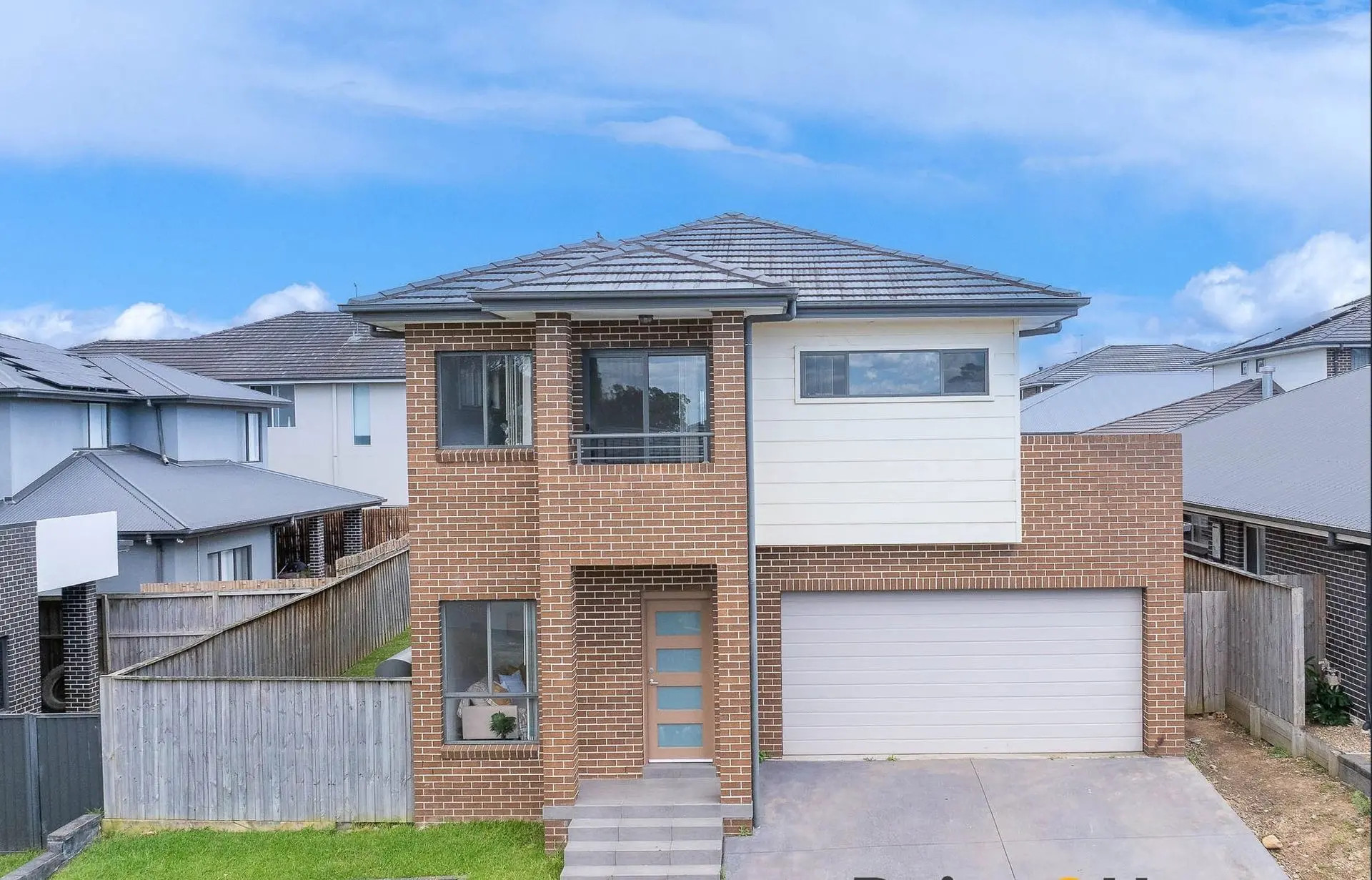
A sun-bright family home on Nangar Crescent — styled with our Standard Package to bring warmth, flow and easy “I can see us here” living, moments to North Kellyville Square and Rouse Hill Metro.
When the owners of Nangar Crescent, North Kellyville called us, the brief was simple: “Make it feel like a real family home — not just a brand-new shell.” The house already had the big wins: north-facing light, three living zones, a study at the entry, and an indoor-outdoor connection to covered alfresco and lawn. But un-styled, it felt echoey and oversized. The glossy white tiles downstairs bounced light everywhere, the rooms read larger than life, and buyers struggled to visualise where the everyday moments — breakfast at the island, homework at the dining table, Sunday naps — would actually happen.
Challenge, honestly:
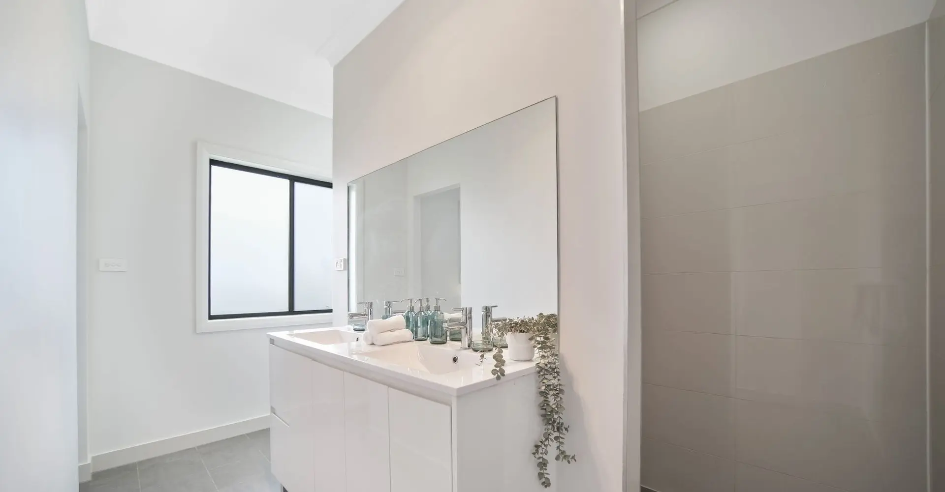
- Hard surfaces downstairs created glare and zero softness.
- Long open-plan areas needed clear zoning and scale cues.
- Neutral paint and grey carpet upstairs risked reading “cold” in photos.
- The study felt like a corridor pause, not a purposeful space.
Our strategy (Standard Package, full home): anchor, soften, and guide the eye.
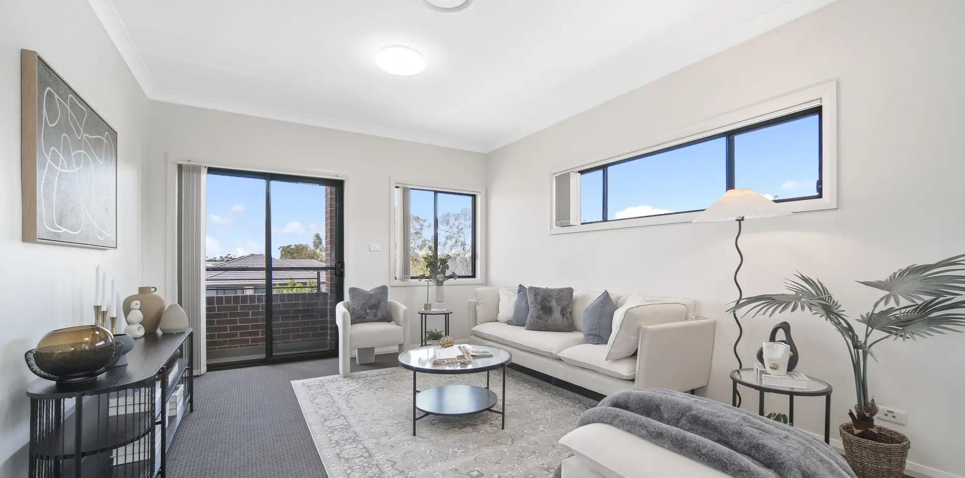
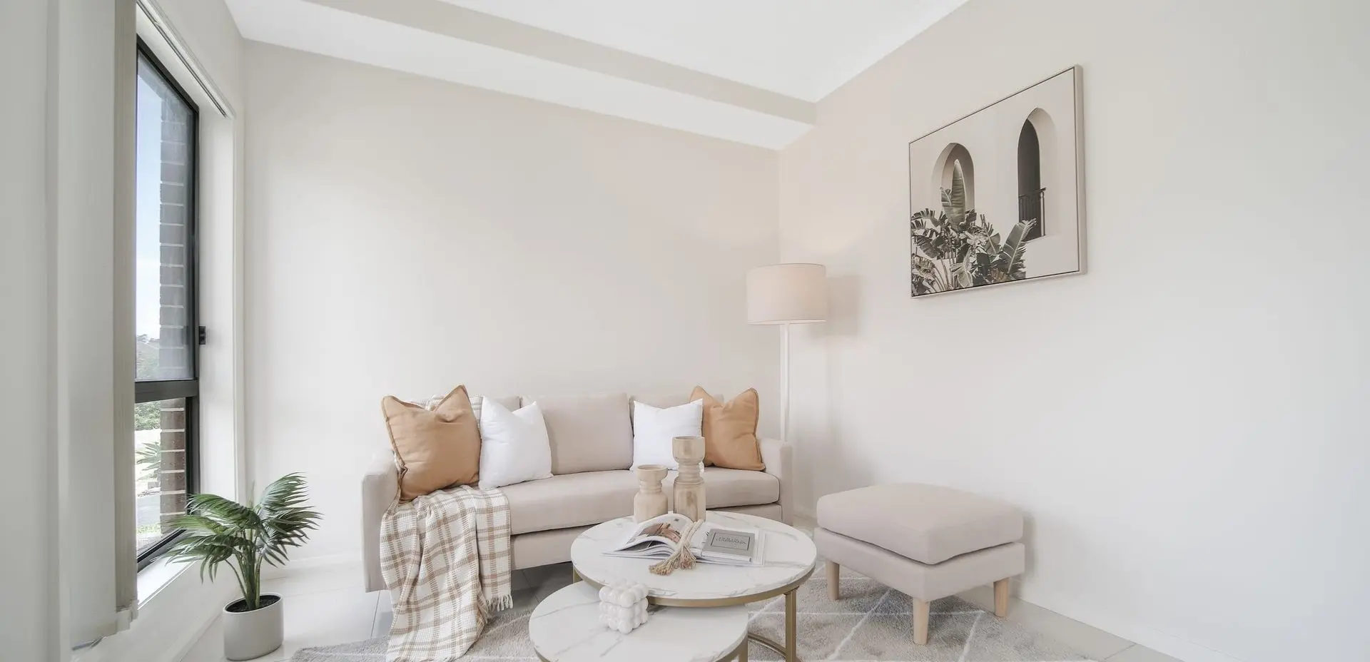
- Living 1 (front lounge / upstairs retreat): Cream sofas with linen-blend upholstery, layered with stone and slate cushions to echo the narrow highlight window. We used round glass coffee tables to float visually (no heaviness), and a slim black media credenza for a light footprint. Walls got abstract linework in soft oat and charcoal — sophistication without stealing attention from the sunshine and sky framed by the windows.
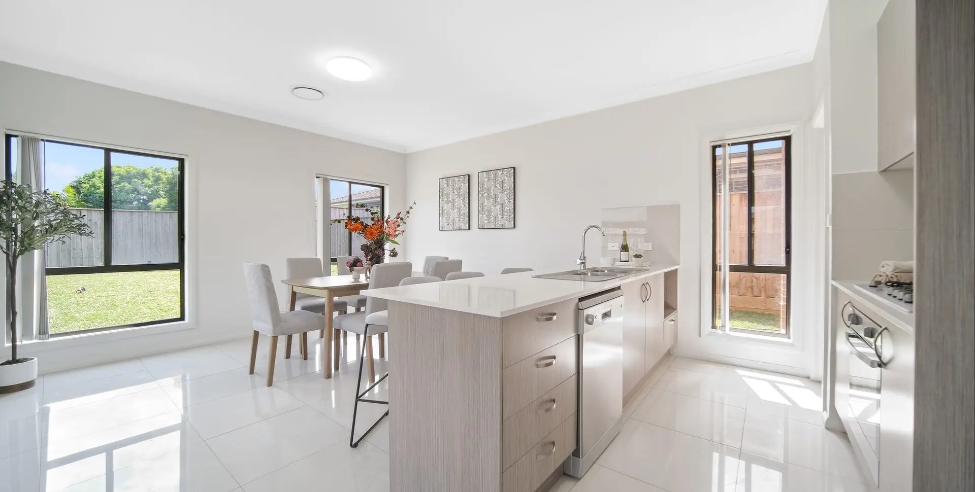
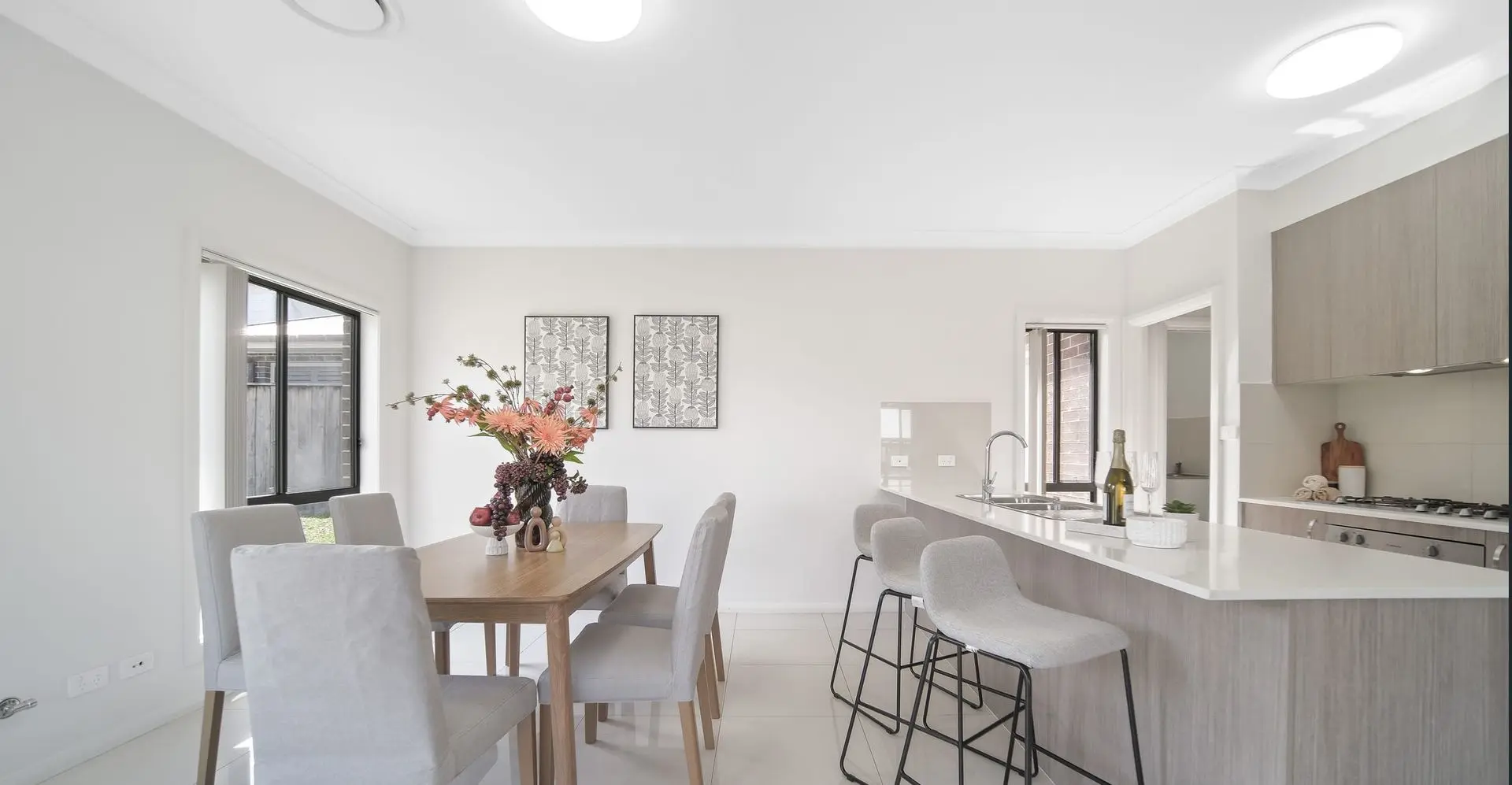
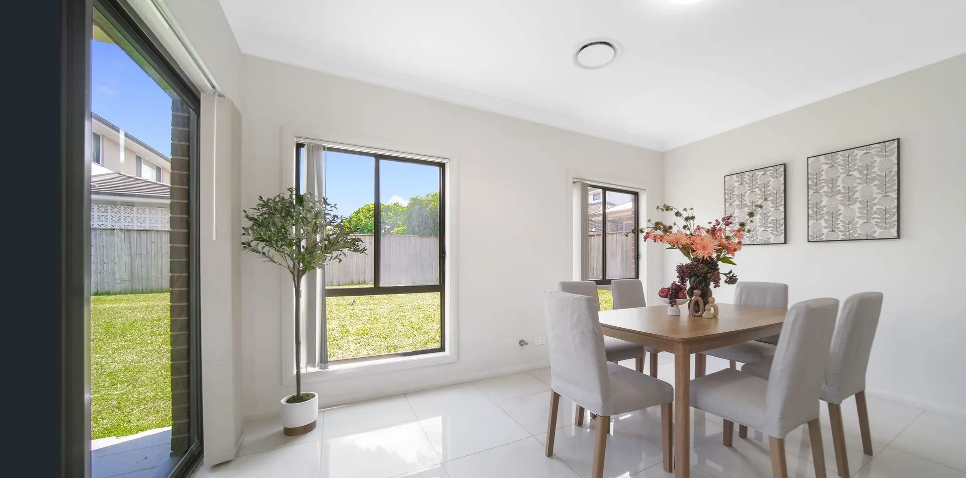
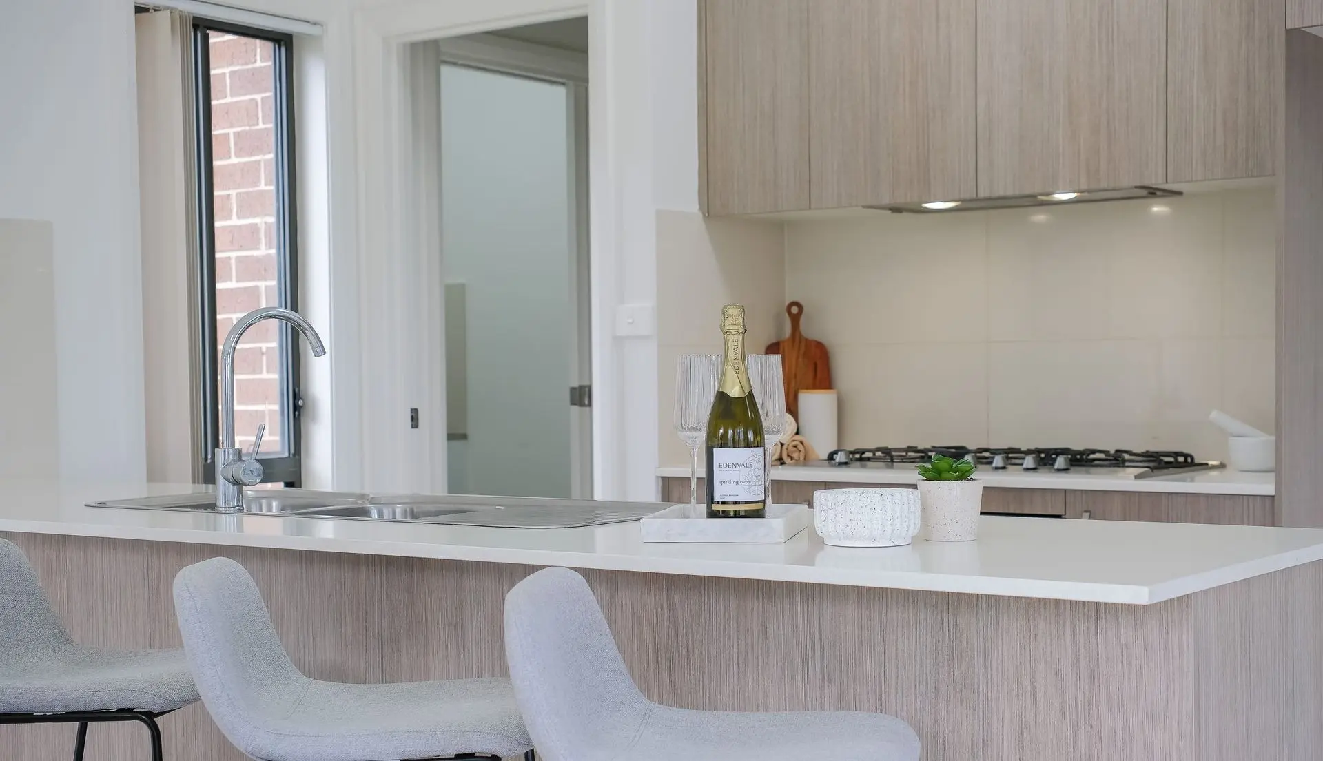
- Kitchen–Dining hub: We zoned with a warm oak dining table and six oatmeal-upholstered chairs, then repeated those oatmeal tones on curved bar stools at the island to knit kitchen and dining into a single lifestyle picture. Styling stayed practical and photographic: a marble tray with sparkling flutes at the breakfast bar, a cutting board + ceramic cluster by the 5-burner cooktop, and a seasonal floral moment at the dining centrepiece for scale and energy. The palette held to sand, oat, fog grey — all chosen to flatter the timber-grain cabinetry and stone benchtops.
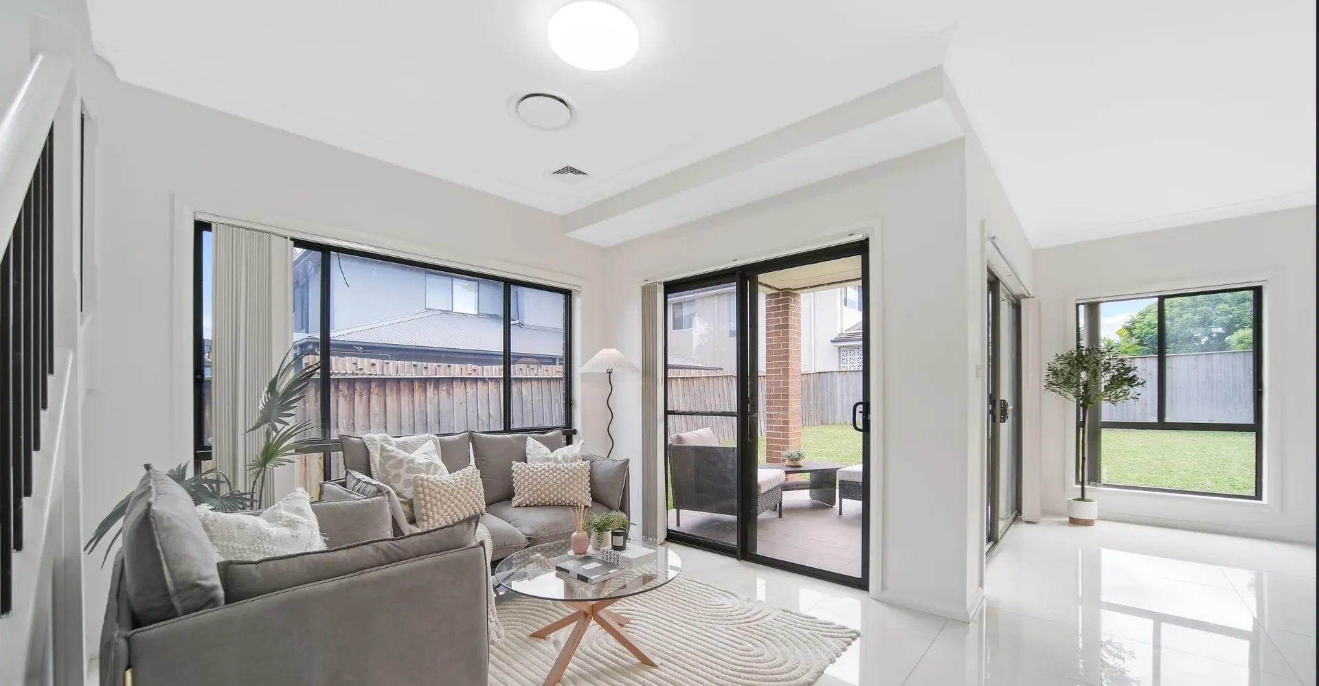
- Living 2 (garden-side family room): This space needed softness and an instant “sit.” We rolled out a thick ivory rug with sculpted circular pattern (texture that photographs beautifully on glossy tiles) and placed a deep grey sofa with bouclé and knot cushions. A glass-top coffee table kept sightlines clear to the lawn. Fluted floor lamp + potted greenery = cosy at twilight, fresh at open-home mornings.
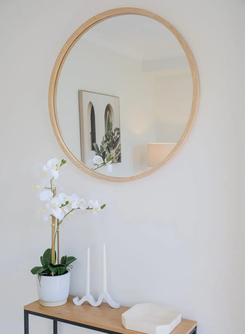
- Study at entry: We converted “transit” to “retreat” with a compact linen sofa, camel accent cushions, and nested marble-top tables — styled as a light reading nook. Above, a Mediterranean arch print created an aspirational vibe the moment buyers stepped through the door. The round timber mirror + orchid on the entry console delivered that vital first impression: calm, tidy, premium.
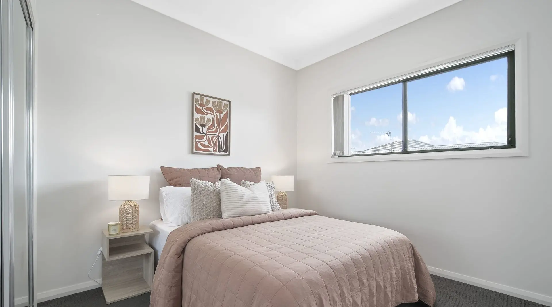
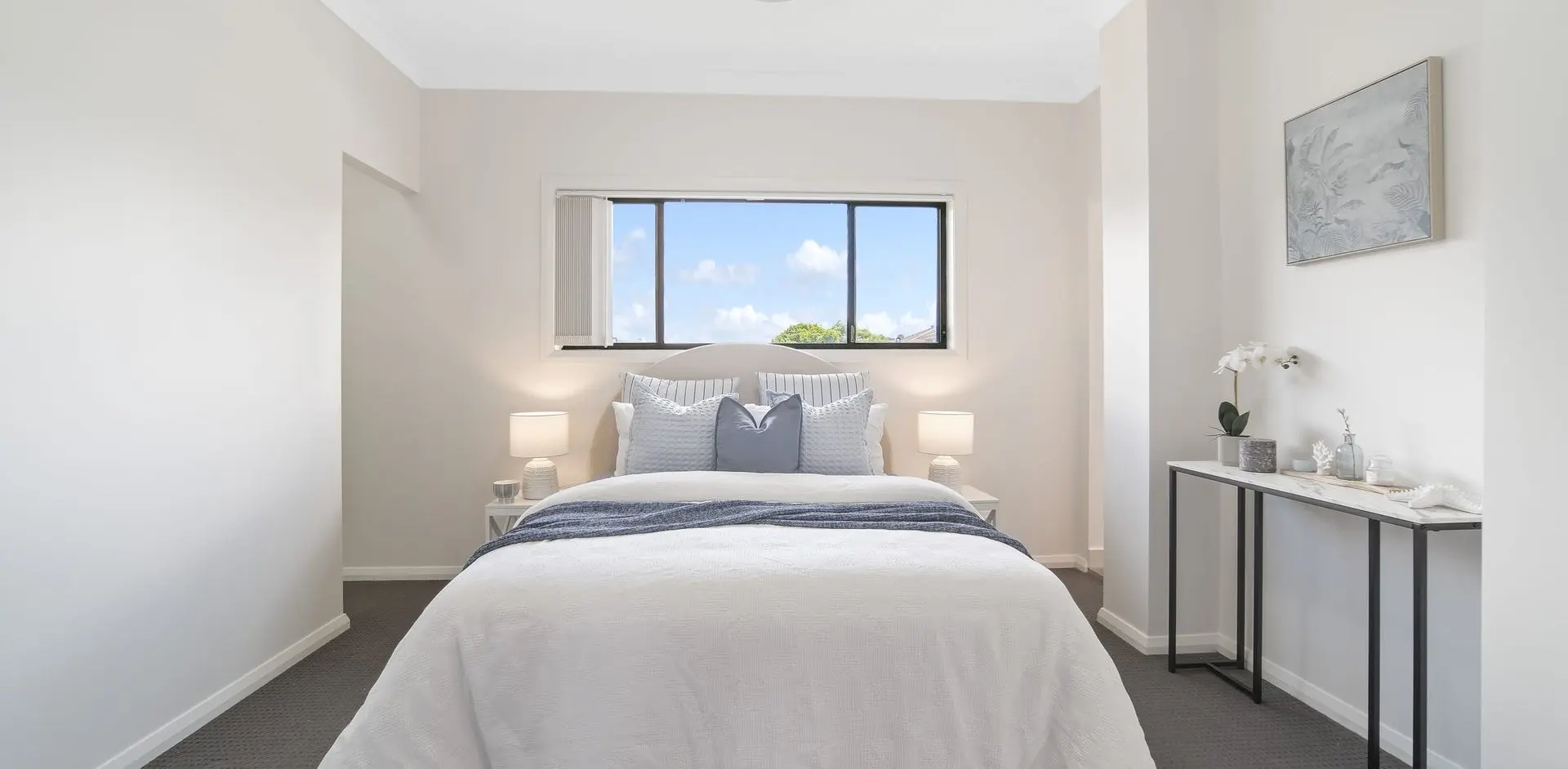
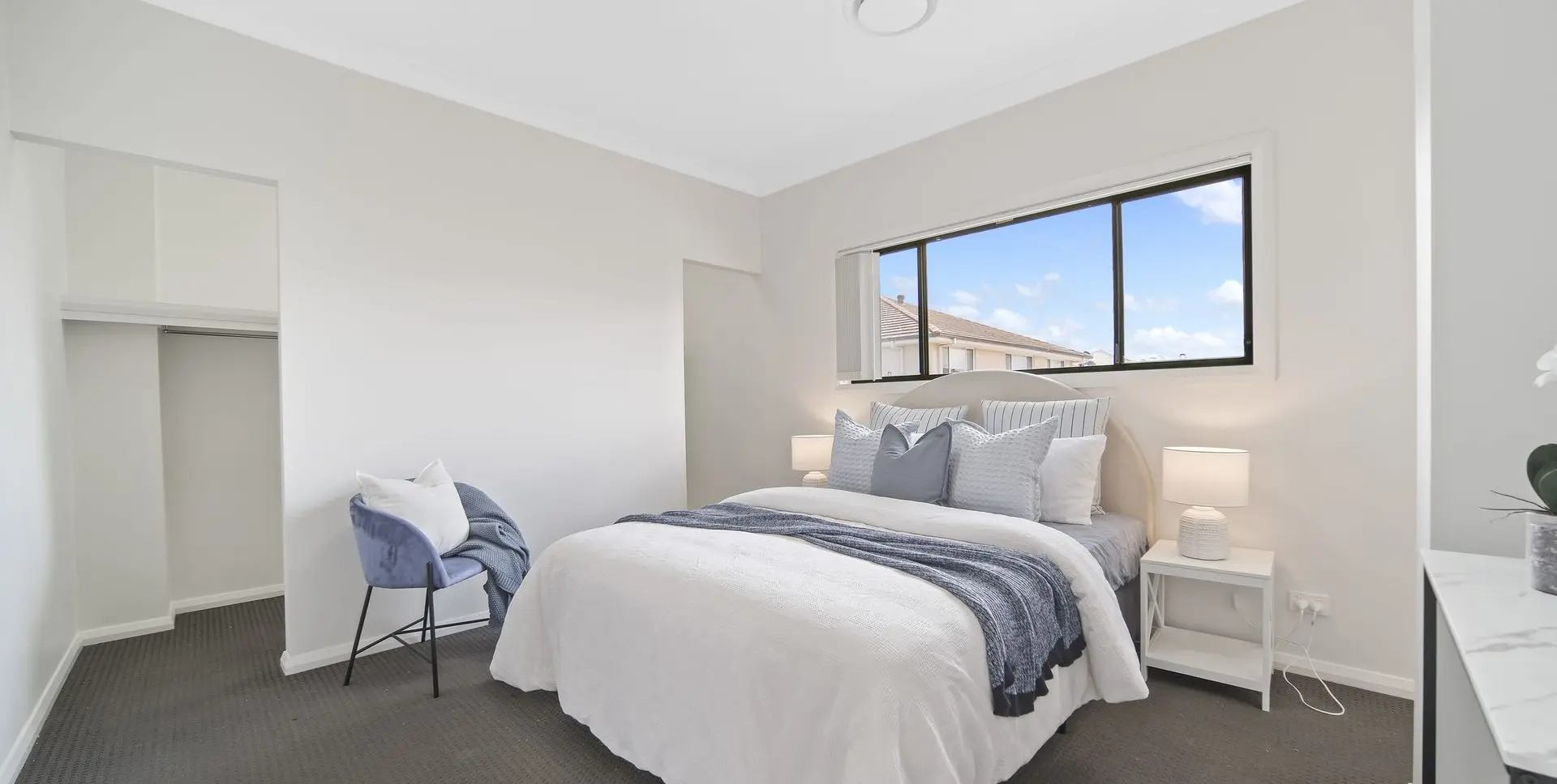
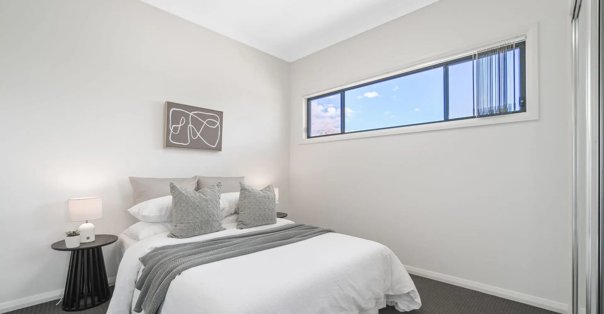
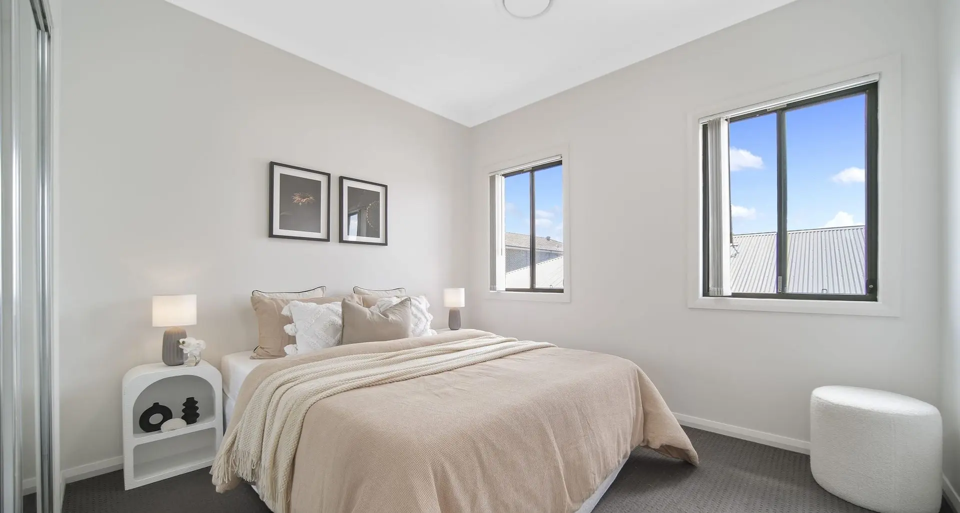
- Bedrooms: Crisp white bedding, piped euro pillows, and mid-blue throws to cue serenity and subtly widen the window lines. Side tables in chalk white with rounded lamps added softness against grey carpet. Nothing fussy, everything restful.
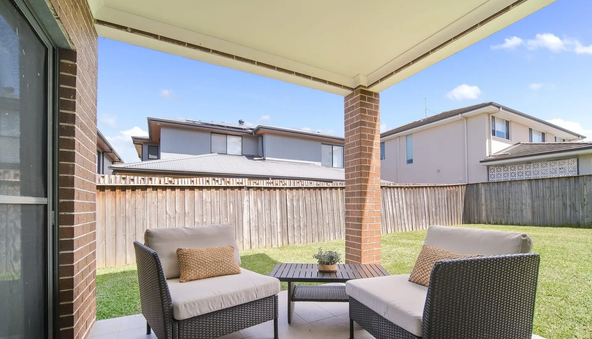
- Outdoor connection: We kept it simple and intentional — lines of sight from both sliders to covered alfresco and the level backyard were left open, so families immediately pictured weekend BBQs and backyard cricket.
Result: Professional photos jumped off the page — light, balanced, and scaled. The first open on Nangar Crescent (a quiet family street with easy runs to North Kellyville Square, Rouse Hill Town Centre and the Rouse Hill Metro) was busy, with multiple groups circling back to the island for another chat. Buyers commented on the “flow” and “calmness.” After the second open, a strong pre-auction offer landed and was accepted. Exactly what standard, strategic staging should do: remove doubt, add emotion, speed up decisions.
This is Goldpac Standard — not flashy, not over-styled. Just clear zones, human scale, layered textures, and a palette tuned to the architecture so buyers feel at home within seconds.
If you’re searching for Home Staging Sydney that focuses on results, this project is a textbook case. Our Home Staging Sydney approach uses neutral palettes, scaled furniture, and purposeful zoning to turn light and layout into emotion. Agents love it because Home Staging Sydney done right shortens campaigns and attracts confident offers.
“Every group said the same thing — it just feels easy to live here. That’s what sold it.” — Agent
🏡 4-bedroom North Kellyville family home — sun-bright, three living zones.
🎨 Styling theme: soft neutrals, oak accents, glass + black metal details.
🌿 Feel: calm, layered, and clearly zoned — from study nook to alfresco.
⚡ Outcome: pre-auction offer accepted after the second open.
💬 Feedback: “Buyers loved the flow — it finally felt like home.”