
111 Wigram Street, Harris Park — 400m to Parramatta Station, styled into a calm, coastal-leaning lifestyle base with a balcony that actually pulls its weight
One-bedroom apartments don’t get the luxury of “pretty enough”. They either feel effortless… or they feel like someone’s spare room with a balcony attached. And in Harris Park — where buyers are comparing walkability, convenience and value within minutes of Parramatta CBD — the smallest hesitation becomes a reason to keep scrolling.
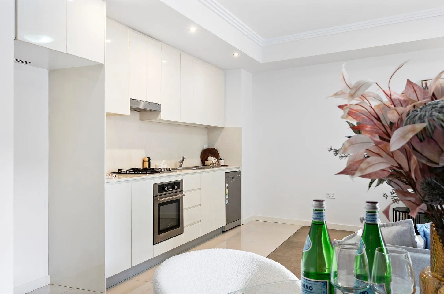
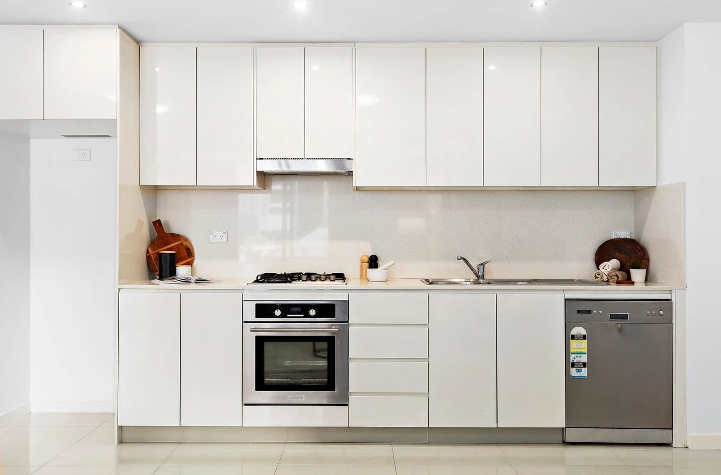
The challenge at 111 Wigram Street wasn’t the condition. The bones were clean: contemporary kitchen, open-plan living, modern bathroom, built-ins, air-conditioning, and a balcony that should have been a major selling point. The real issue was emotional: it needed a story. Right now, it read as “a practical one-bed near the station.” Practical is fine. Practical doesn’t create urgency. And urgency is what fills opens and triggers offers.
So we staged it with one mission: make it feel bigger than it is — without pretending it’s a two-bed (buyers can smell that from the lift).
Step one: protect the light and the exit line
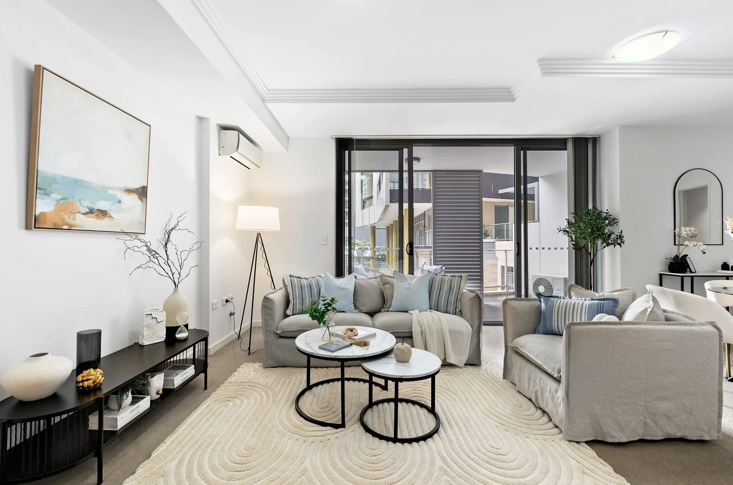
That big sliding door is the apartment’s breathing point. If you crowd it, the whole home tightens up. We kept the furniture footprint light and the sightlines long — a relaxed grey sofa with soft blue cushions, a slipcovered armchair that feels airy (not bulky), and nested round coffee tables that allow movement without “furniture traffic jams”. The curved, textured rug was the quiet genius: it softens the geometry of the room, makes the living zone feel wider, and creates a sense of flow instead of “box”.
Step two: give the space a calm centre
One-bedders need one anchor moment — one thing your brain lands on that says: “This makes sense.” We built that around the dining zone. Instead of a heavy dining setting (instant cramped vibe), we used a round glass table (light, transparent, visually forgiving) with boucle chairs (soft, warm, modern) and a bold floral centrepiece. It’s not decoration — it’s orientation. Buyers walk in, see that table, and instantly understand: dinner here, couch there, balcony there. Clarity = comfort.
Step three: make the balcony feel like an extra room
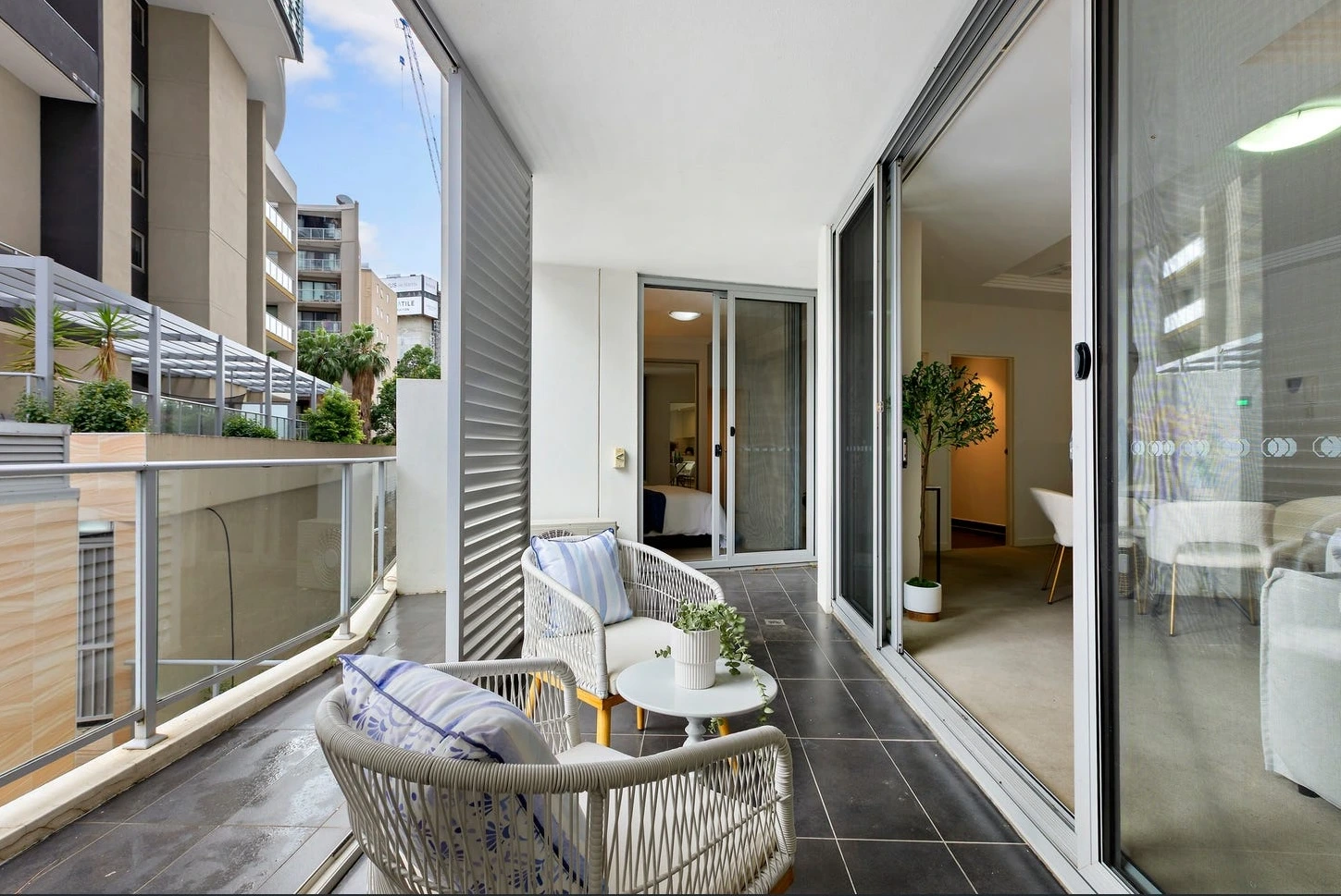
A balcony that looks unused is basically wasted marketing. Here, we styled it like a morning routine: woven lounge chairs, a small round table, a relaxed cushion moment, and greenery to soften the urban outlook and privacy louvre. It says: “You’ll actually sit here.” And when buyers believe they’ll use the balcony, the apartment feels like it has an extension — not just outdoor tiles.
Step four: finish like a boutique hotel
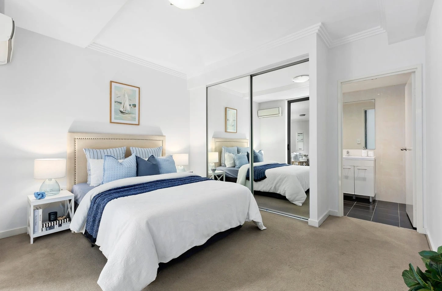
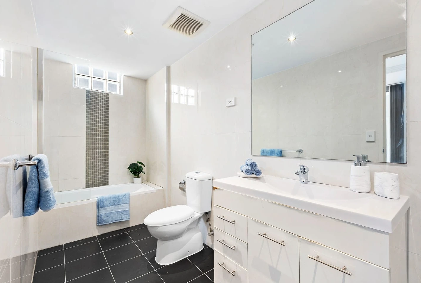
The bedroom was styled for calm — upholstered headboard, crisp white bedding, layered blues, and artwork that leans coastal without turning into “themed”. Mirrored robes amplify space. Bedside lamps add warmth (not the sad overhead-light energy). Even the bathroom got the hotel treatment: clean surfaces, folded towels, fresh blue accents, a touch of greenery. These are tiny signals that say: this home is cared for. Buyers don’t argue with that.
Outcome: the campaign shifted from “good value” to “wanted”. The opens felt sharper. People lingered. Conversations changed from measurements to lifestyle. The apartment went under offer within 10 days and sold shortly after — because it finally looked like a place you’d be proud to come home to, not just a place you’d tolerate for the postcode.
Goldpac delivers Home Staging Sydney that’s designed for one thing: buyer certainty. In compact apartments like 102/111 Wigram Street, Home Staging Sydney isn’t about filling rooms — it’s about creating flow, protecting natural light, and staging clear zones that photograph beautifully and feel even better in person. If you’re an agent looking for Home Staging Sydney that makes a one-bedroom feel larger, calmer, and more premium — with smart focal points and strong lifestyle cues — this is exactly how we stage to sell.
💬 “The moment we staged it, buyers stopped asking ‘will it fit?’ and started saying ‘when can we move in?’” — Agent
🏢 1-bed Harris Park apartment — open-plan + balcony, 400m to Parramatta Station.
🎨 Theme: calm coastal neutrals + soft blues + light, curved shapes.
✨ Hook: the apartment feels bigger than it is (without trying too hard).
⚡ Result: stronger opens, faster decision-making — under offer in 10 days.
💬 Reaction: “It finally felt like a real home, not a one-bed compromise.”
If you want the honest truth: staging a one-bedroom is like packing a suitcase for a two-week holiday into carry-on luggage. You can do it — but only if you stop trying to bring “everything” and instead choose the right essentials. That’s what we did at 111 Wigram Street. We didn’t “add furniture”. We edited the story.
This apartment already had the ingredients buyers like: clean white walls, modern kitchen, air-con, built-in robes, and a balcony that connects directly to the living zone. But ingredients don’t sell. A buyer doesn’t walk in and think, “Nice cabinetry.” They think, “Will this feel easy, or will I be constantly adjusting my life around the space?” In a one-bed, the fear is always the same: it’ll feel tight. Tight when you host. Tight when you work from home. Tight when you just want to breathe.
So we staged for the opposite emotion: lightness.
Not “minimal”. Not “empty”. Lightness — a feeling that the space is calm, organised, and ready.
1) The living room: light footprint, strong comfort
We chose a sofa with a relaxed profile and styled it with soft blue cushions that lift the palette without shouting. Blue is doing a quiet psychological job here: it reads clean, coastal, and fresh — and it cools down the “white box” feeling that some modern apartments can have. The slipcovered armchair is another deliberate move: it looks soft and airy, so it doesn’t visually “occupy” the room the way a structured armchair does.
Then we used round nesting tables. That’s not just aesthetic — it’s circulation. In small spaces, corners feel aggressive. Circles feel forgiving. You can walk around them easily, and your eyes flow around them too. Add the textured rug with curved linework, and suddenly the living room reads wider, softer, more premium. It’s like you ironed the wrinkles out of the space.
The console and wall art play a supporting role: a low black unit grounds the room (so it doesn’t feel washed out), while the ocean-toned artwork gives the apartment a subtle identity. Not “beach theme”. Just a hint of lifestyle.
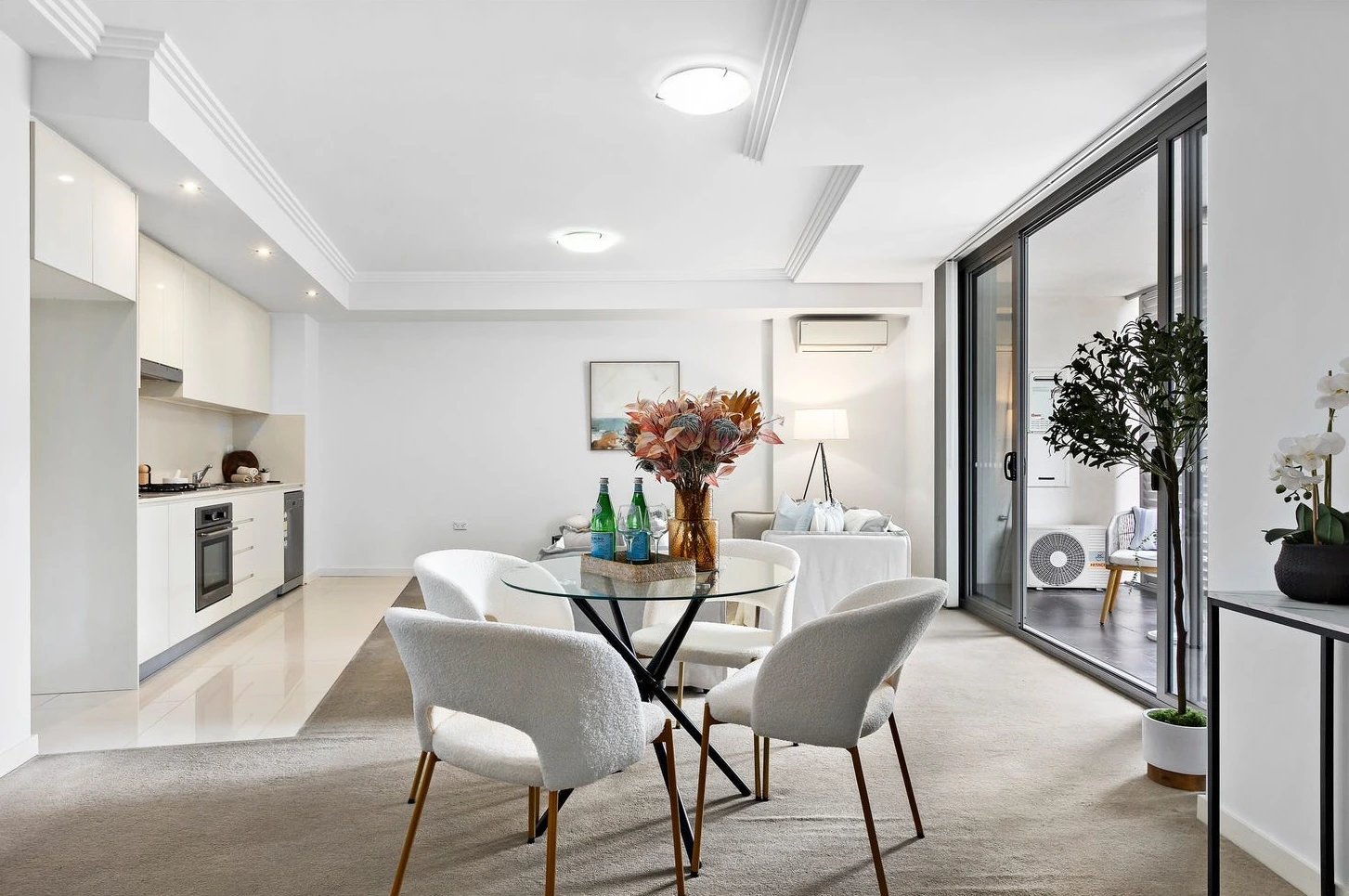
2) The dining area: the apartment’s control panel
This is the core: the dining space is where open-plan apartments either feel “designed” or “random”. A heavy dining setting makes it feel like you’re forcing the space. A tiny café table makes it feel like a rental. The answer here was: round glass.
A round glass table is basically a staging cheat code for one-bedders (the legal kind). It defines a zone without blocking visual space. You can see through it, so the room feels larger. The boucle chairs add warmth and texture, so it still feels expensive and tactile. And then we place the hero: the vase with florals. That becomes the scene-stealer — the anchor moment your brain remembers after the inspection. Buyers might not remember the dishwasher brand. They’ll remember how the dining area felt.
3) The balcony: turning “outdoor area” into “lifestyle area”
A balcony is only valuable if buyers can picture themselves using it. So we gave it a purpose: two woven chairs (conversation), a small table (coffee, book, phone), cushions (comfort), greenery (softness). The privacy louvre screen becomes a benefit: it suggests shelter and privacy, not just “apartment living”.
And here’s the sneaky part: when the balcony looks usable, buyers perceive the entire apartment as larger. Because their mind counts it as real living space, even if it’s not on the floorplan in the same way.
4) Bedroom + bathroom: calm, not clinical
The bedroom is styled like a boutique hotel: upholstered headboard, layered blues, crisp whites, balanced symmetry. Mirrored wardrobes double the sense of space. The ensuite entrance is framed by that calm styling, so it feels like a proper master suite — not a bedroom with a door to a bathroom.
The bathroom finishes the story: fresh towels, clean surfaces, and just enough styling to suggest “move-in ready.” Buyers don’t want to imagine scrubbing. They want to imagine living.
This is what Goldpac does best: we don’t stage rooms — we stage decisions
And in a one-bedroom, that decision needs to feel surprisingly easy.
What Matters Most in a One-Bedroom
Yes: one clear hero moment — and everything else supports it.
For this apartment, the hero is the round glass dining table with the floral centrepiece.
Why that, specifically?
It sits in the visual centre of the open-plan, so it “organises” the apartment instantly.
Glass removes visual weight — buyers perceive more floor space.
Round shape improves flow (no harsh corners, easier circulation).
The flowers act like a magnet: eyes land there first, then map the room effortlessly.
In a one-bed, the rule is: one anchor + clean edges + light footprint + strong balcony story.
That’s the whole recipe.
Stylist’s Personal Note
“I honestly love one-bedroom apartments — and I also think they’re the hardest. Bigger homes give you multiple chances to impress. A one-bed gives you one shot. Every piece has to earn its place, because one wrong item can make the room feel smaller instantly.
What I’m aiming for in a one-bed is always the same: I want buyers to walk in and feel surprised — like, ‘Wait… this is actually spacious.’ That’s why I use light-footprint furniture, curved shapes, and clear hero moments. Here, the dining table is the anchor, and the balcony styling is the extra ‘yes’.
When a one-bedroom finally clicks, it’s the most satisfying transformation — because you didn’t add space… you revealed it.” — Goldpac Stylist