
101 High Street, Mascot — a quiet rear-positioned, north-facing unit near Botany Road cafés and Mascot Station, staged to feel instantly “obvious” to buyers.
Agents use it to mean “blank canvas.” Buyers hear it and translate it instantly into: work, uncertainty, and decision fatigue. They start mentally renovating before they’ve even sat down. And in a compact apartment — where every corner is visible, and every layout choice matters — that’s how inspections turn into polite nods instead of offers.
That was the brief for 101 High Street, Mascot.
The bones were absolutely there: north-facing light, cross-ventilation, parquet timber floors, a balcony, air con, and the best kind of positioning — privately set at the rear of the complex. But visually, it needed help telling the story. At 52m², you don’t get to be vague. You either feel like a lifestyle… or you feel like a “project”.
And this one had a few classic hurdles:
The living zone had strong light, but without clear zoning it could read as “just a room”.
The teal beam and frosted window framing gave character — but they could easily overpower the space if we fought them.
The kitchen was neat, functional and honest (hello, real life), but not the kind of glossy “new build dopamine” that carries a listing by itself.
The bathroom doubled as a laundry — practical, yes, but emotionally it can feel like a compromise unless it’s styled with care.
So we didn’t stage it like an Instagram set. We staged it like a buyer who wants their week to feel easier.
The strategy: make the apartment feel instantly readable
Goldpac’s approach here was simple and slightly ruthless:
remove mental noise, create flow, make the lifestyle obvious in the first five seconds.
We leaned into what the apartment already offered — light, privacy, and that airy north aspect — and built the design around soft coastal clarity. Not “beach house props.” More like: calm palette, curved forms, tactile textures, and zero clutter.
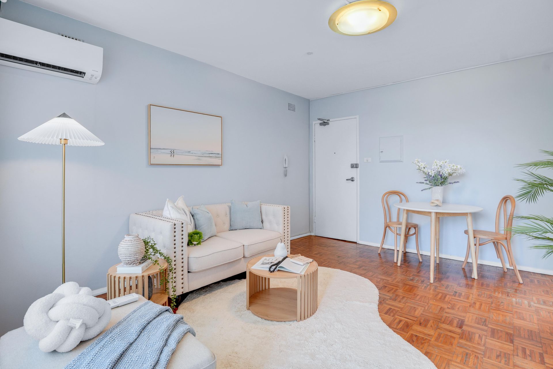
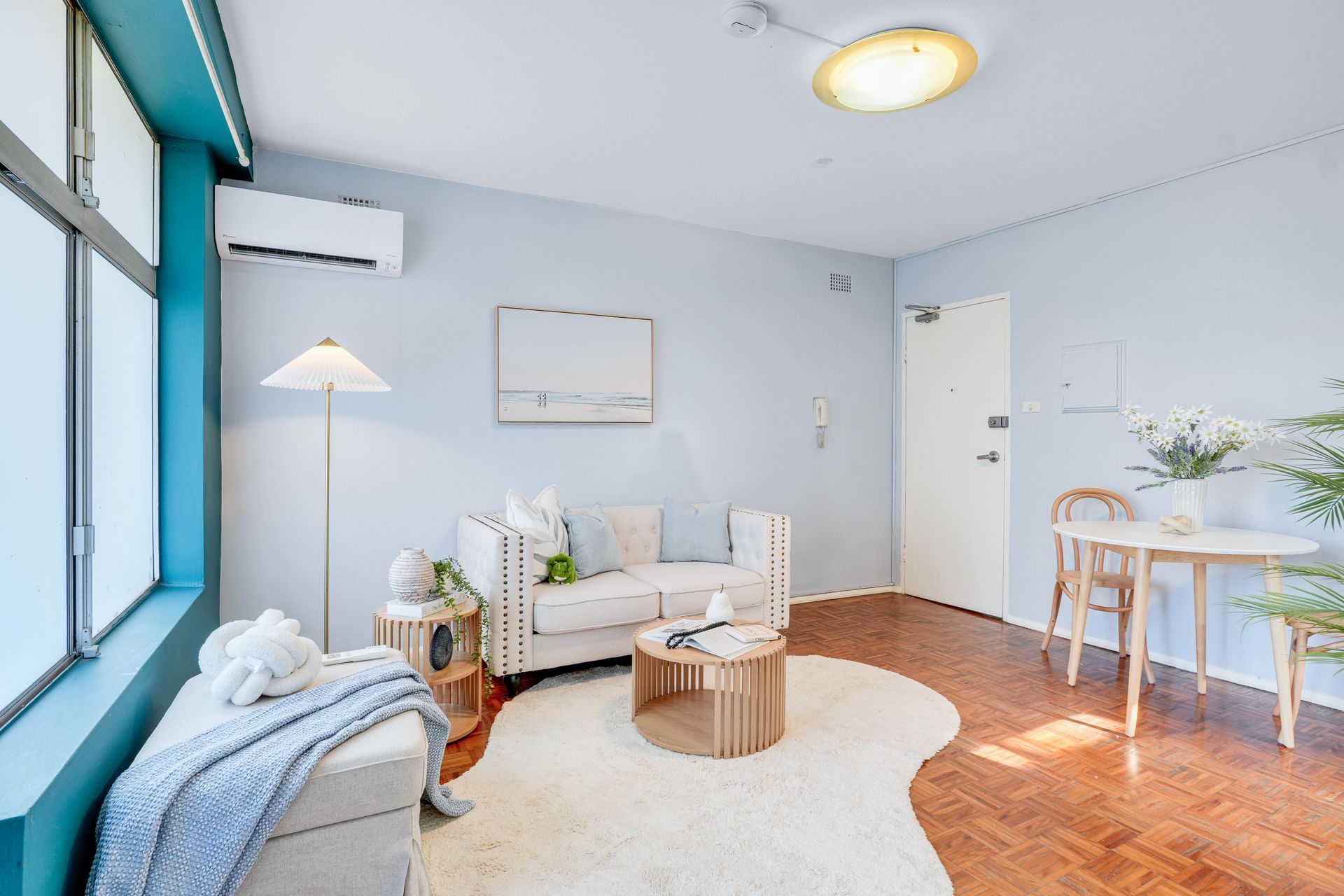
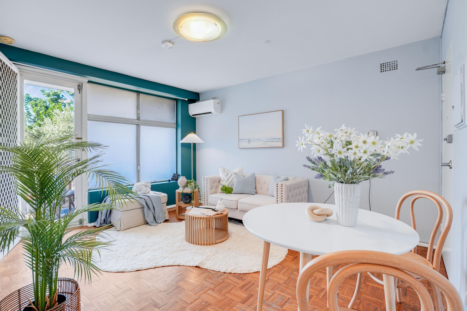
Living: lightness without emptiness
The living room became a small-space masterclass in restraint.
A compact neutral sofa anchored the space without swallowing it. We paired it with a round timber coffee table (curves = better circulation, and buyers subconsciously read it as “more room”). Underfoot, a cloud-soft ivory rug softened the parquet and visually widened the footprint.
Then we did the detail work that changes the way buyers feel:
A pleated floor lamp for that warm “evening mood” glow.
Soft blue cushions that echo the sky tone and reinforce the north-light story.
A simple coastal artwork — quiet, bright, and not trying too hard.
Greenery placed deliberately to pull the eye upward and make the room feel fresh, not staged.
It’s funny: buyers rarely say “nice rug.” They say, “This feels bigger than I expected.” That’s the point.
Dining: the moment the layout starts making sense
Small apartments often suffer from “random dining.” You know the type: a square table jammed into a corner like it’s been grounded.
We went the opposite direction: a round white dining table with bentwood chairs — clean, light, and easy to walk around. Round shapes are a cheat code in 52m²: they create flow, soften the room, and photograph well from multiple angles (which matters because most buyers meet the property online first).
The dining setting also sent a clear message:
This is a home where you can actually host someone. Even if it’s just your friend from work and a pizza on a Thursday. That’s still lifestyle.
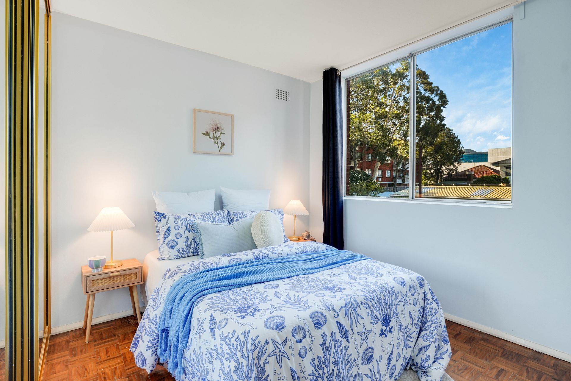
Bedroom: hotel-fresh, not “staged to death”
The bedroom styling was about emotional safety — the feeling of walking in and immediately relaxing.
We kept the base crisp and bright, then layered in soft blue textiles (subtle coastal energy, not theme-park beach). Matching lamps created symmetry, and the mirrored wardrobe doors helped bounce light around, so we didn’t overfill the space. The result: calm, clean, believable.
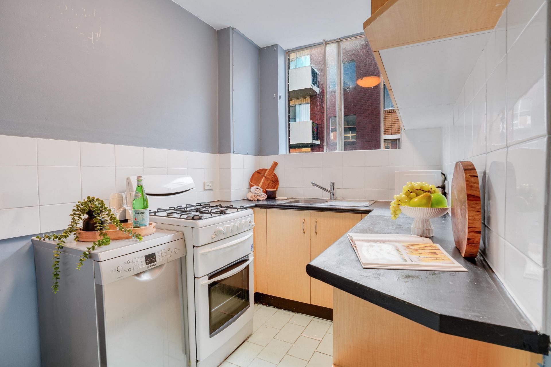
Kitchen + bathroom: make “practical” feel cared for
The kitchen is compact but functional — gas cooktop, clean benches, great natural light through the window. Instead of trying to disguise it, we styled it like a buyer who lives well: a fresh bowl of fruit, warm timber boards, and minimal, tidy surfaces. It didn’t scream “renovate me.” It quietly said: move in, live, upgrade later if you want.
The bathroom/laundry combo got the same respect. Fresh towels, simple neutral styling, and greenery to soften the hard surfaces — because when a space is small, “clean and cared for” is more powerful than “new.”
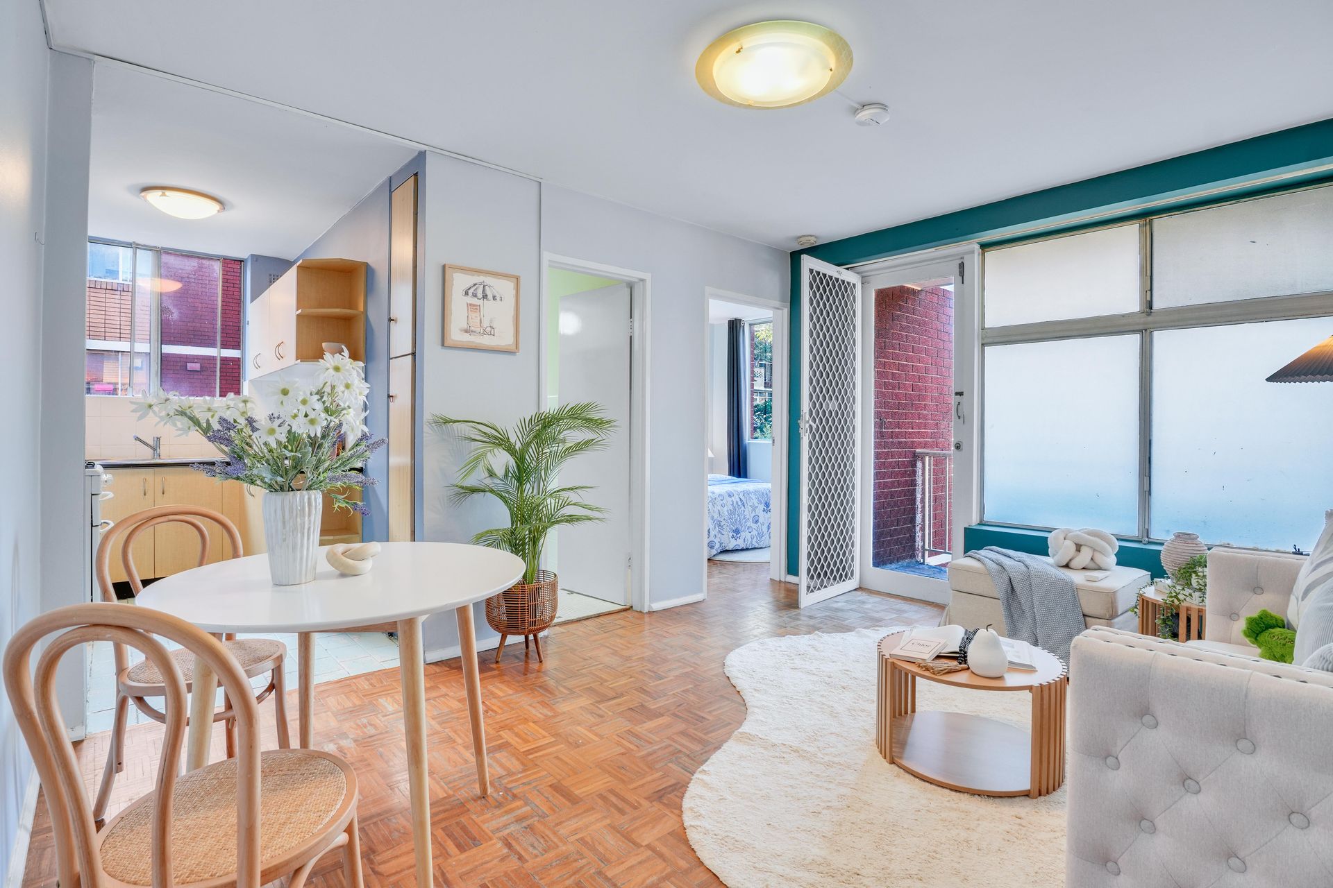
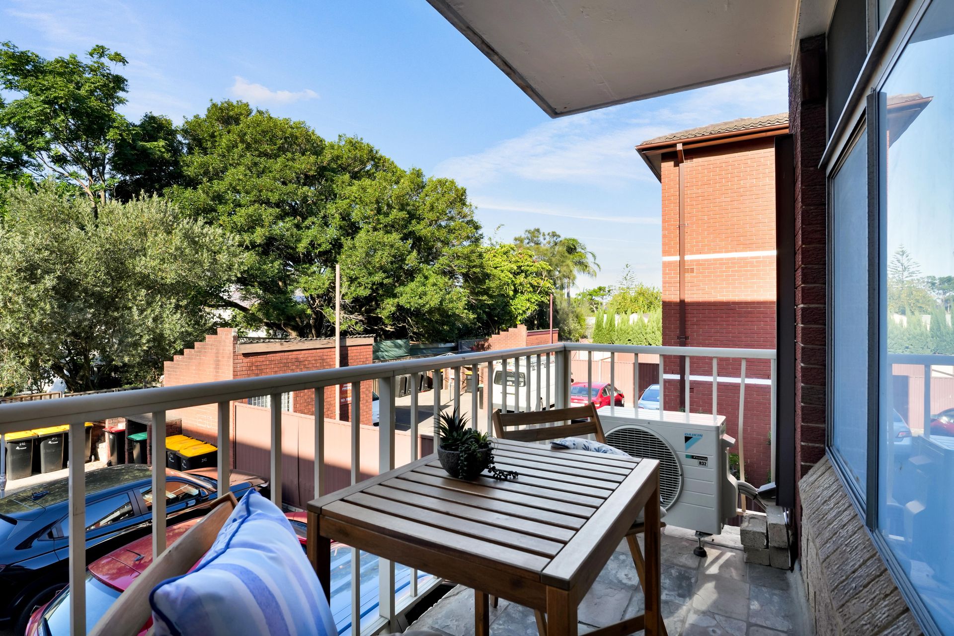
Balcony: a real lifestyle moment
We didn’t pretend the balcony was a rooftop terrace. We made it real.
A compact timber setting, a little greenery, and that leafy outlook — the kind of setup that makes buyers think, morning coffee, fresh air, close the door, the world can wait ten minutes.
Outcome: buyers stopped measuring and started imagining
Once staged, the apartment stopped feeling like a “personal touch” conversation and started feeling like a lifestyle decision — bright, private, and easy.
And because the copy already leaned into convenience — Botany Road dining, IGA Mascot, Mascot Station, quick access to the domestic airport and the CBD train line — the styling completed the story: not just a unit, but a calm base in a high-motion part of Sydney.
That’s what agents actually want staging to do.
Not “make it pretty.”
Make it decisive.
If you’re marketing an apartment like this, Home Staging Sydney is the difference between “buyers can see potential” and “buyers feel ready to act.” With Home Staging Sydney, especially in compact units, the goal is to create instant clarity: clear zones, clear flow, and a lifestyle that photographs beautifully. Home Staging Sydney works best when it’s strategic — using light, scale-appropriate furniture, and emotional cues so buyers stop analysing and start imagining. For agents in Sydney suburbs like Mascot, that’s exactly how Home Staging Sydney helps generate stronger first impressions, better opens, and faster momentum.
💬 “The photos finally matched what we knew the property could be — buyers walked in and got it instantly.” — Agent
🏢 101 High Street, Mascot — 52m² north-facing unit with parquet floors + quiet rear position.
🎨 Styling theme: calm coastal clarity — light timber curves, soft blues, zero clutter.
🌞 Hook: the layout became “obvious” in 5 seconds — bigger feel, better flow, stronger photos.
⚡ Result: stronger early traction and faster decision-making (no more “personal touch” hesitation).
💬 Reaction: “Buyers walked in and got it instantly.”