
A light-filled Sydney apartment with warm timber floors, a balcony breeze, and a styling plan built to sell — not just to look pretty
This one had the classic problem: the apartment was objectively good… but emotionally quiet. The bones were there — warm timber floors, generous living zone, big sliders to the balcony, and that leafy outlook that makes the whole place feel calmer the second you step in. But “good” doesn’t win auctions or spark offers. “Good” gets you polite compliments and people saying, “We’ll think about it.”
The brief was simple (and very real): turn an honest, older-style apartment into a lifestyle listing buyers could feel from the first photo. Not by over-styling it. Not by fighting the building’s age. But by creating a clean, modern story that made the space read brighter, larger, and more current — while still feeling like a home someone could move into on Saturday and host friends on Sunday.
The first challenge was the open-plan flow. The living room, balcony, and dining area all connect, which is a huge asset — unless the styling doesn’t “direct traffic.” Without a clear layout, buyers don’t relax. They start measuring with their eyes. They start mentally rearranging furniture. That’s when you lose them.
So we staged this apartment like a confident tour guide.
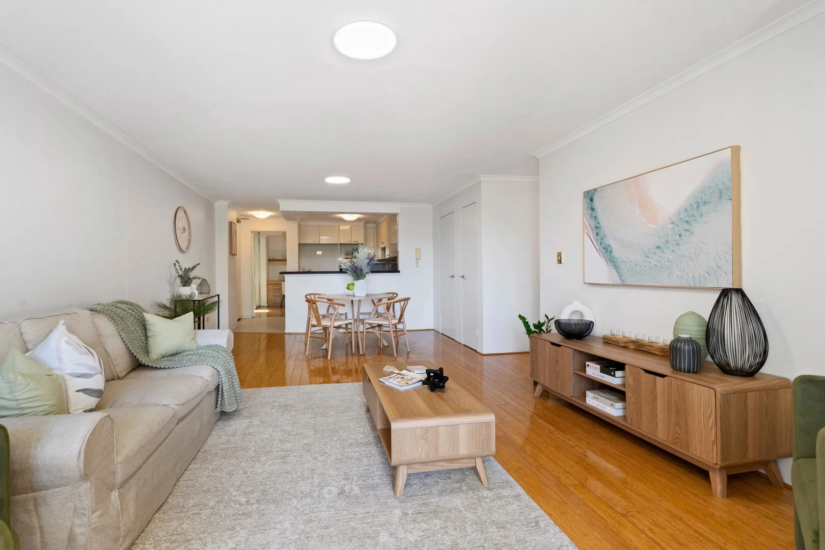
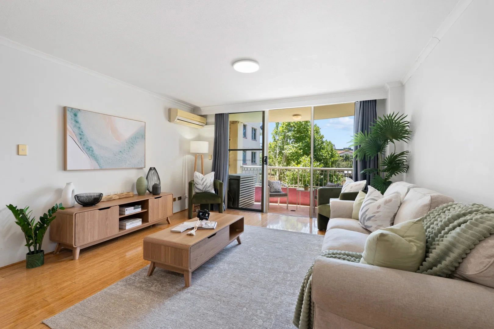
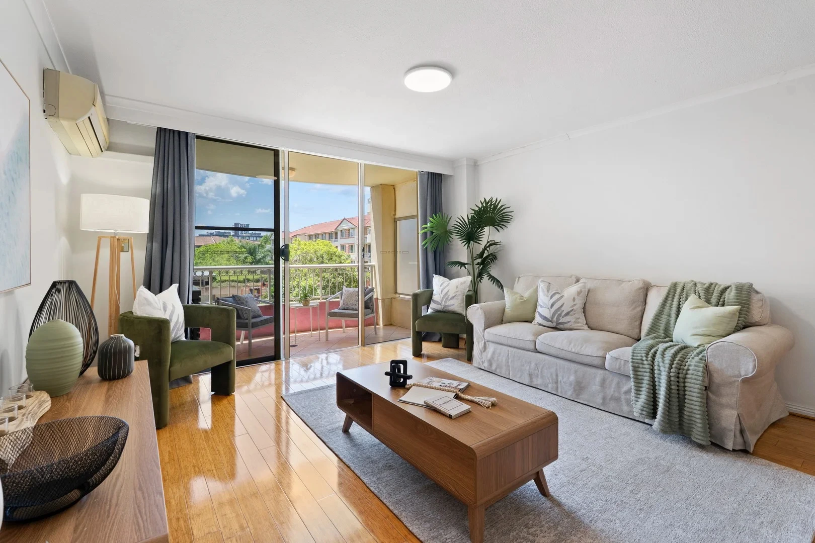
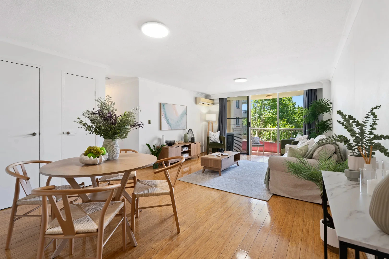
In the living zone, we anchored the room with a soft neutral sofa (inviting, not precious), then added deep eucalyptus-green accents in the armchairs and cushions — a subtle move that did two things at once: it tied the interior to the leafy outlook, and it added contrast against the white walls without making the space feel heavy. The coffee table and entertainment unit in warm timber echoed the floorboards, creating a continuous “golden line” that visually stretches the room. Buyers don’t consciously notice that trick — they just feel like the space is bigger than expected.
Then we worked the balcony like it mattered. Because it does. Outdoor areas sell a version of someone’s week. Two chairs, a small table, and that simple promise: morning coffee, evening wine, fresh air on demand. Suddenly, the balcony wasn’t “nice to have.” It was part of the lifestyle.
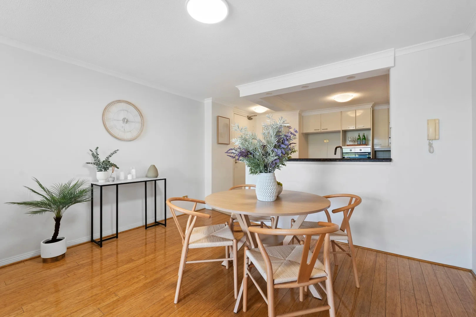
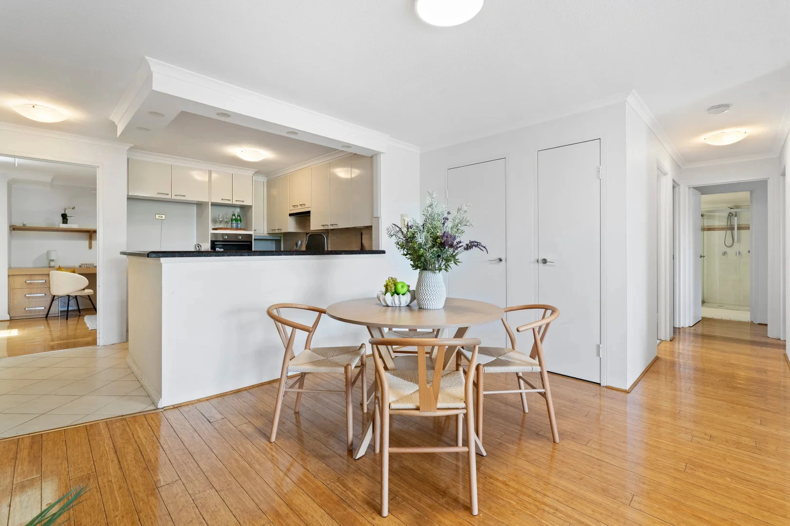
In the dining space, we went round — literally. A round table softens the whole open-plan area and makes movement feel easy, especially in apartments where every walkway counts. Light timber chairs kept it airy. We used a simple centrepiece that reads fresh and premium without screaming “I staged this 15 minutes ago.”
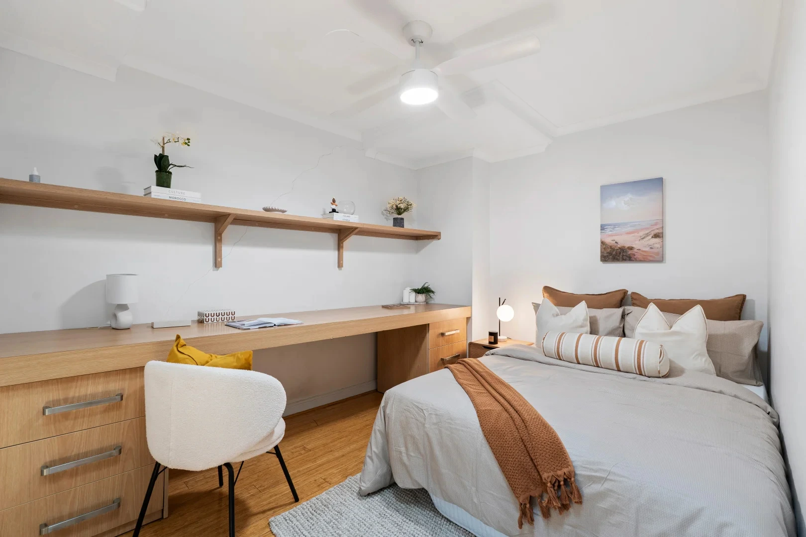
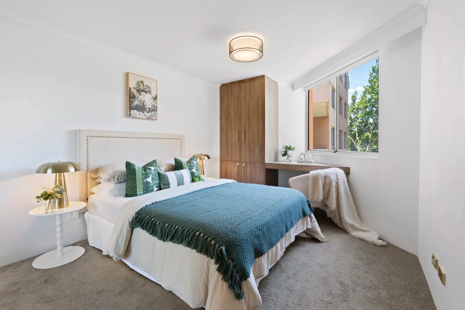
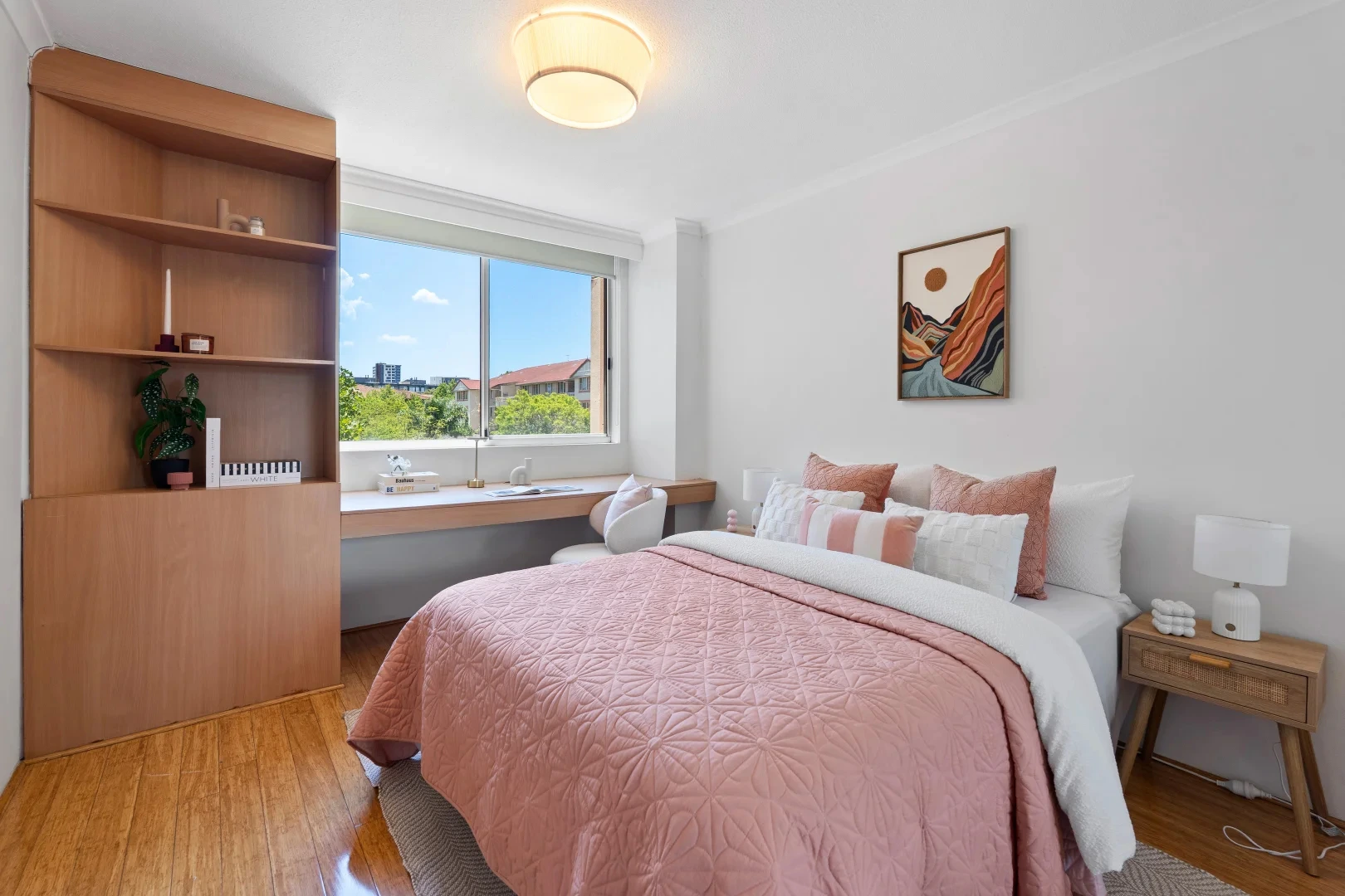
The bedrooms were treated like a decision-maker’s shortcut: calm, tidy, emotionally obvious. One room leaned into crisp whites and layered greens — a clean, boutique-hotel vibe with warmth. Another introduced soft blush tones paired with timber and simple artwork — creating a gentle, contemporary feel that photographs beautifully and widens buyer appeal (it’s not “girly,” it’s soft luxury). And the study/desk zones were styled with restraint: enough to show function, not enough to feel like someone else’s life. Buyers want to imagine their laptop there — not yours.
The result? The property stopped feeling like “an apartment in a complex” and started reading like a home with an easy rhythm. Photos looked brighter, rooms felt more intentional, and inspections shifted from cautious to confident. That’s the point of staging when you do it properly: you’re not decorating — you’re removing doubt.
If you’re competing for attention in Sydney listings, presentation is not optional — it’s strategy. Home Staging Sydney is about shaping the buyer’s first impression so the property feels easy to choose, easy to love, and easy to act on. With Home Staging Sydney, we focus on flow, light, and emotional clarity — so the photos pull people in, and inspections convert. Goldpac approaches Home Staging Sydney like a sales tool: defining zones, balancing colour, and creating a lifestyle story that matches the suburb vibe and the buyer profile. When Home Staging Sydney is done with intent, buyers don’t just “like it” — they start planning their future in it.
💬 “It didn’t feel staged. It felt like the kind of place you’d move into and instantly relax.” — Buyer at inspection
This project is a perfect example of how a tight palette + a few smart visual tricks can modernise an apartment without pretending it’s something it’s not. The building reads “solid, established, classic Sydney.” So we didn’t try to turn it into a glossy new-build fantasy. We staged it like a premium, liveable upgrade — which is exactly what buyers are craving: updated feel, low effort, no drama.
1) The palette: warm timber + soft neutrals + eucalyptus green
The hero feature here is the timber flooring. It carries warmth, and it can easily dominate if the styling fights it. So instead of introducing cool whites and stark blacks everywhere, we chose a palette that harmonises with the floor:
Base neutrals: warm whites, sandy beige, soft grey in the rug and curtains.
Accent greens: eucalyptus/sage tones in chairs, cushions, and throws.
Natural timber: repeated in the coffee table, entertainment unit, and dining table.
That repetition is not accidental. Buyers read repeated tones as “cohesive” and “well maintained,” even if they can’t explain why. The apartment feels resolved. That matters because unresolved spaces create buyer hesitation.
2) Contrast without weight: charcoal curtains as a framing device
Those darker curtains do a quiet but powerful job. They frame the sliding doors like a picture, pulling attention outward to the balcony and the leafy outlook. This is a camera trick and a buyer-perception trick: the eye goes to the brightest area (the glass), and the darker frame makes that brightness feel even stronger. The apartment reads lighter and more premium — without adding a single downlight.
3) “Air under furniture”: why the room feels bigger
Notice how key pieces sit visually light: the coffee table has clearance, the entertainment unit has legs, and the dining chairs don’t visually block sightlines. This is the “air under furniture” rule — it makes apartments feel more spacious because the floor remains visible. More visible floor = more perceived space.
Even the decor choices follow this: vases and objects are sculptural but not cluttered. You get styling detail without visual noise.
4) Zoning: the living room layout tells buyers where to be
Open-plan spaces can feel like a big rectangle unless you give them a story. Here, we created a clear “conversation zone” by placing seating in a way that subtly points toward the balcony. The green chairs aren’t just pretty — they’re directional. They encourage the body to turn toward the view, which makes the balcony feel like part of the living area.
The rug is also doing heavy lifting: it anchors the lounge and tells buyers, “This is the main zone. This works.” When buyers feel a layout works instantly, they stop problem-solving and start feeling.
5) Bedroom psychology: hotel calm, but with personality
The bedrooms are staged with two different moods to widen appeal:
A green/white room that feels crisp, fresh, and tailored — like a boutique stay.
A blush/timber room that feels soft, warm, and modern — calm, not clinical.
This is deliberate: buyers often disagree as couples. One wants “clean and minimal,” the other wants “warm and comforting.” We gave both, without creating conflict, because the palette stays disciplined.
6) Study corners that don’t kill the vibe
Desks can ruin a room if they look like a chaotic home office. Here, the styling is restrained: clean surfaces, a chair that looks intentional, and shelves that feel curated rather than crammed. That shows function while keeping emotion intact.
In 2026, buyers don’t just ask “Where do I sleep?” They ask “Where do I work without hating my life?” This apartment answers that quietly — and that sells.
7) The “balcony promise”: lifestyle staging that converts
Two chairs and a small table is not “filler furniture.” It’s a lifestyle cue. It tells buyers the apartment has a daily rhythm: sunlight, air, pause. That’s what converts interest into action. Because buyers don’t buy square metres — they buy a future week that feels better than their current one.
That’s the Goldpac approach in a nutshell: strategic styling that reduces doubt, increases emotional clarity, and makes the decision easier.
🏡 Apartment staging — warm timber floors + balcony flow that finally makes sense.
🎨 Theme — soft neutrals + eucalyptus green + natural timber layering.
🌿 Feel — bright, calm, “move-in ready” with a quiet premium edge.
⚡ Result — stronger photos, stronger opens, faster buyer commitment.
💬 Reaction — “It didn’t feel staged. It felt like home.”