
Burwood | Where a two-level apartment learned to breathe again
The challenge
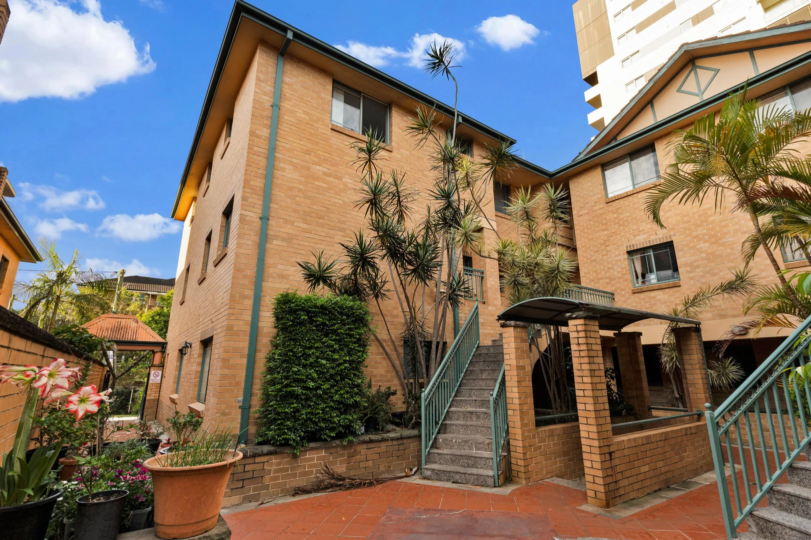
Before Goldpac arrived, this split-level apartment in the heart of Burwood had everything on paper—102 square metres, a quiet leafy street, walkable access to Burwood Park, Westfield, cafés, and the train line.
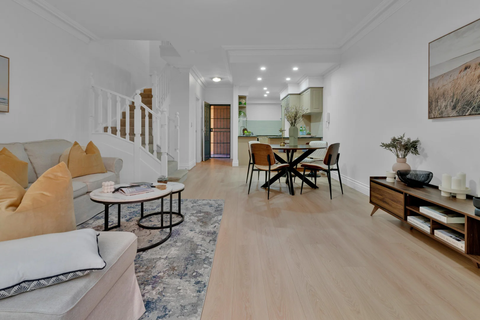
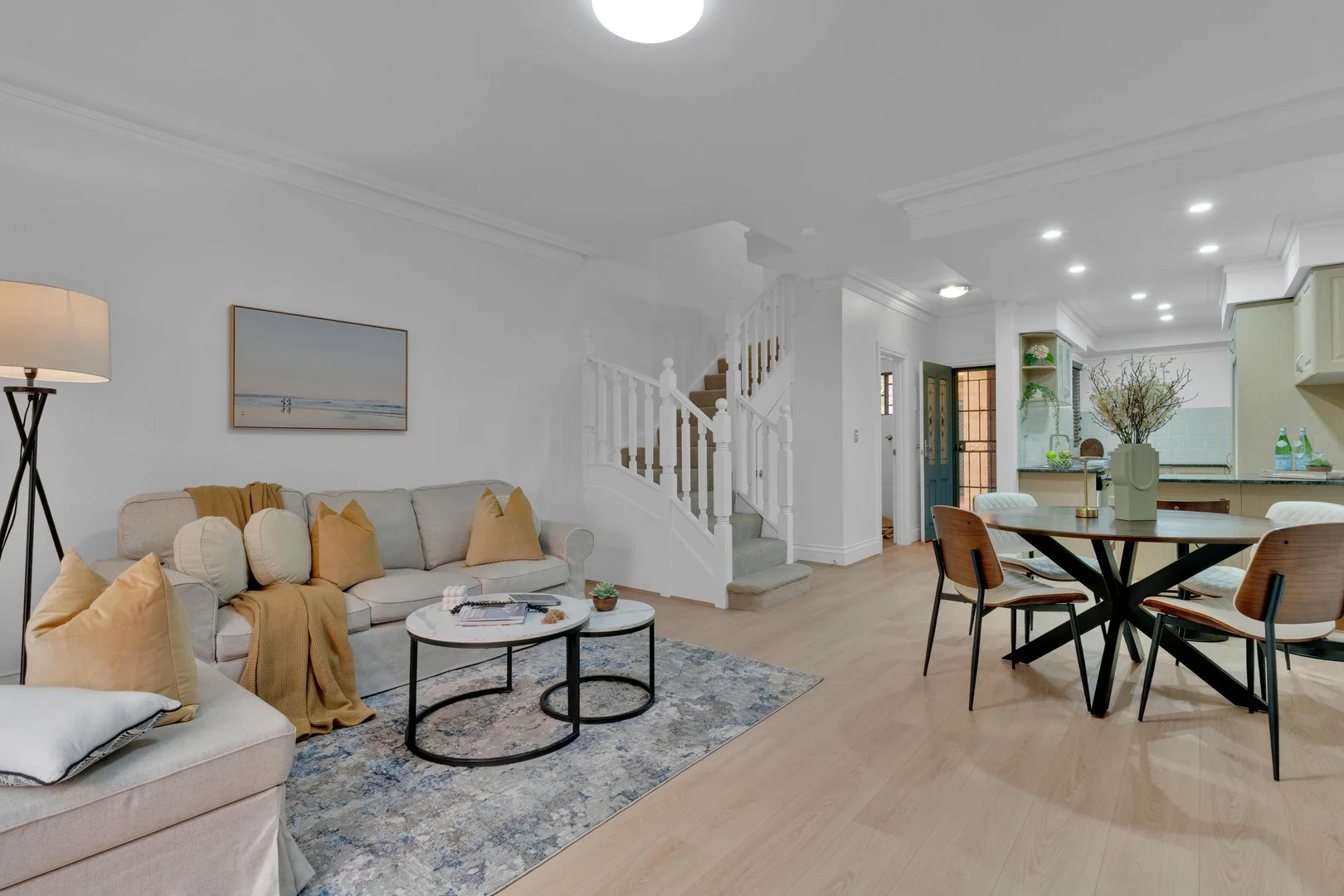
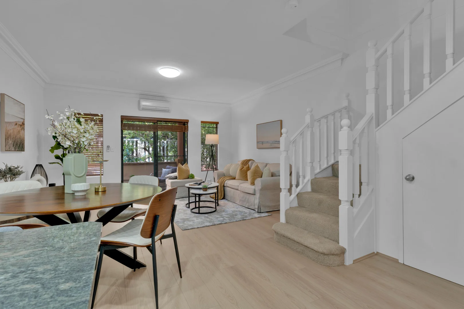
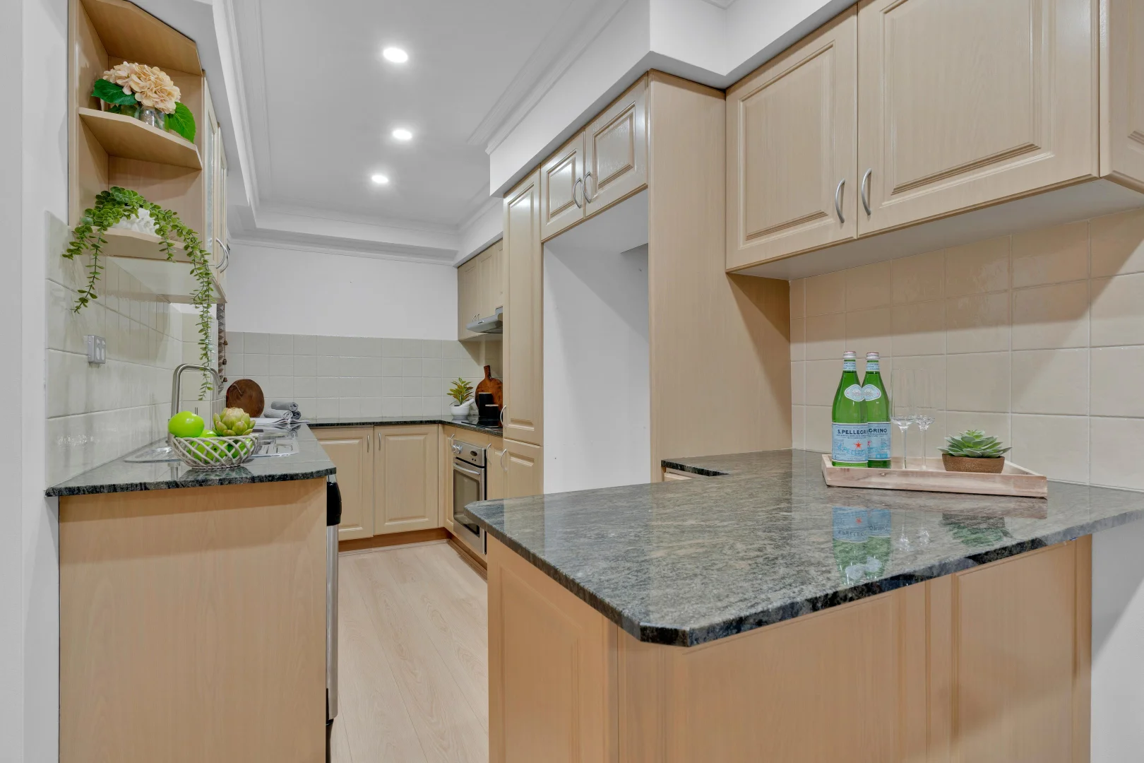
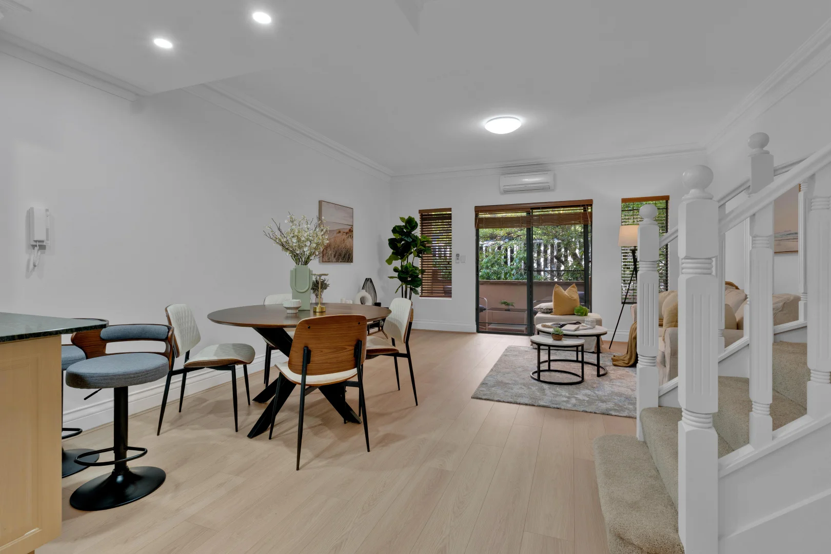
But when the agent first walked us through it, the mood was flat. The layout felt long, thin, and awkwardly divided. A staircase sat in the middle of the open-plan living area like a white barricade. Beige carpet met cream walls and a granite kitchen that looked tired from the early 2000s. Every element was technically fine—just visually disconnected.
The previous owners had moved out quickly, leaving the space echoing and emotionally cold. “We need to make this one feel like home—fast,” said the agent. “It has to sell on first impression.”
That’s where we came in.
We didn’t want to disguise the property. We wanted to reveal its potential.
Our stylist team wrote one guiding sentence on the mood board:
“Turn a functional space into a lifestyle buyers feel before they notice the finishes.”
That meant working with the existing kitchen tones, not against them; using warm timber, texture, and movement to create flow; and giving the entire apartment a soft, sophisticated, move-in-ready personality.
Our mission: make a Burwood first-home buyer—someone coming from a small rental—walk in and think, “This feels like mine already.”
Behind the scenes — the transformation day
7:45 AM. Our truck backed up to Gloucester Avenue. Inside: two sofas, six boxes of accessories, a dining set, art, and one tall fiddle-leaf fig that had already done six other Goldpac projects and earned a nickname: “Fergie.”
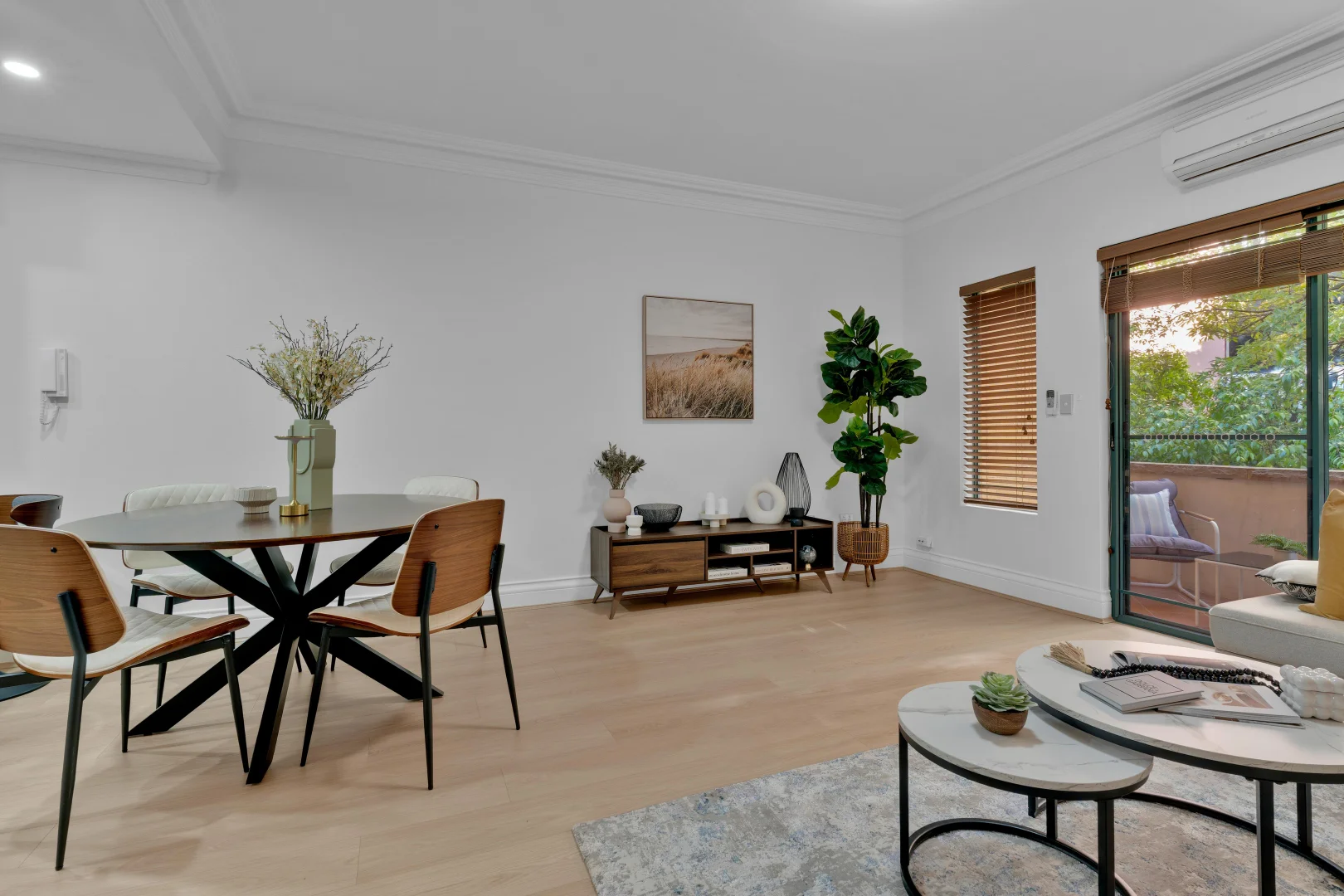
8:10 AM. The stylist, Maria, called out: “We need to control the sightlines—too much wall!” So she mapped the layout on the floor using painter’s tape, marking where the rug would define the lounge zone and how far the dining area should reach without blocking the kitchen.
9:20 AM. A pair of nesting marble-top coffee tables went in—our visual anchor. The circular shape broke the corridor-like feel of the room. Suddenly, the space had rhythm.
10:00 AM. We placed a round dining table under the downlights—another deliberate curve to fight the geometry of the long rectangular plan. The team paired it with mid-century chairs in walnut and soft cream fabric, a tactile counterpoint to the crisp white walls.
10:45 AM. Cushions in warm ochre and honey tones landed on the beige sofa. “Add a throw in caramel—same tone as the kitchen cabinets,” Maria said. “Let’s make the cabinetry look intentional.”
11:30 AM. Final touches: a beachscape print (horizontal to visually widen the wall), a stack of design books, and a ceramic bowl with white coral—a quiet nod to Sydney’s coastal spirit.
12:00 PM. Lighting check. “Turn that tripod lamp on,” Maria called out. “Warm white, not cool!” The glow hit the art perfectly. The living room instantly shifted from neutral to emotional.
By lunchtime, the once-flat interior felt alive. Every photo angle had a focal point. The textures layered subtly: boucle cushions, natural linen, ceramic matte finishes, woven timber blinds—all harmonising without clutter.
Upstairs — tone, texture, and emotional calm
Bedrooms are where we slow down buyers’ minds.
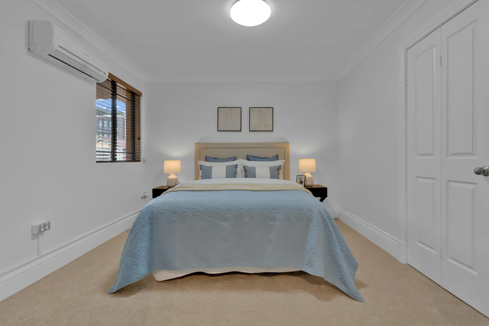
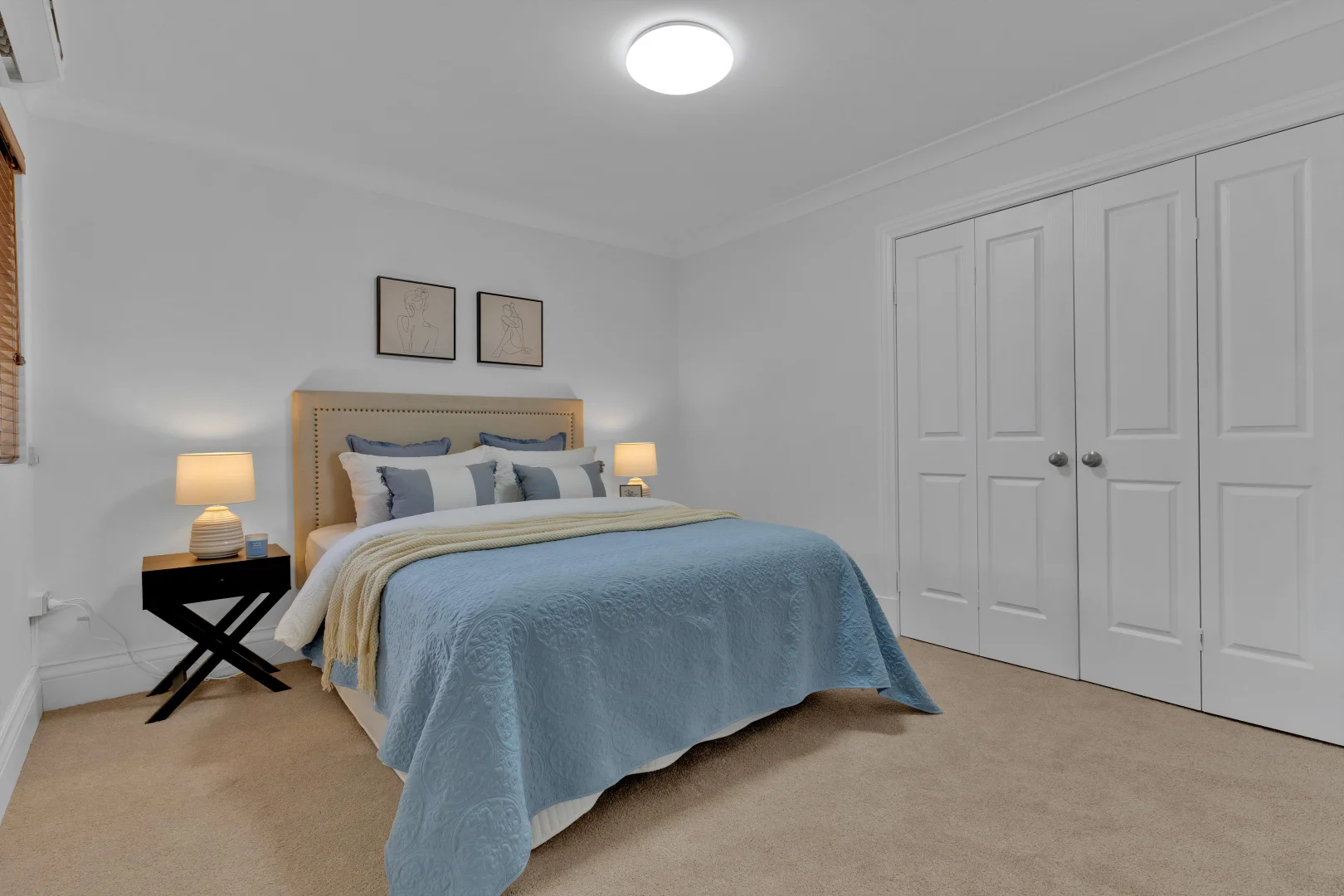
The main bedroom took on sky-blue linen and layered neutrals, echoing the daylight that filtered through the wooden blinds. Minimalist line-art above the bed added structure without visual noise.
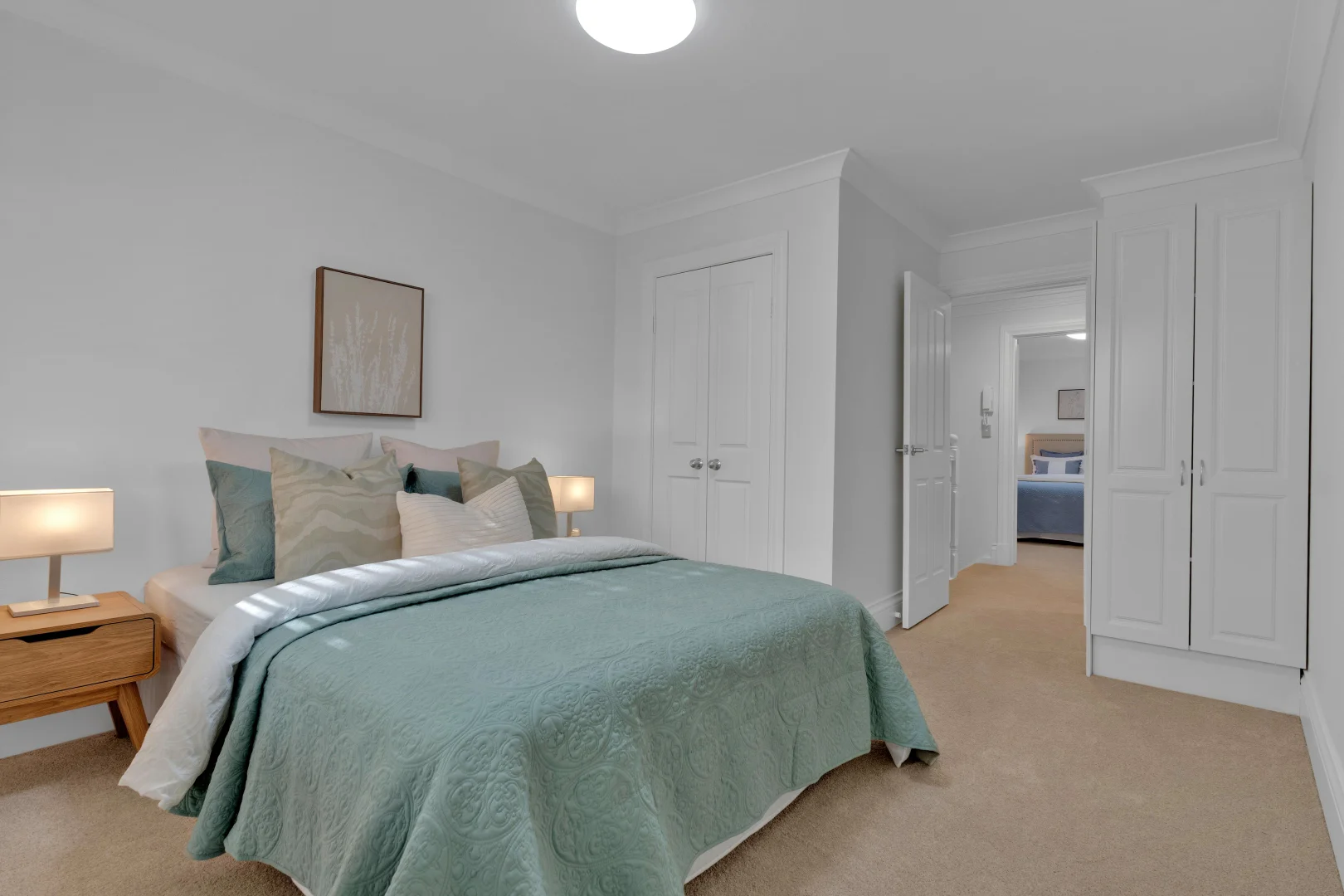
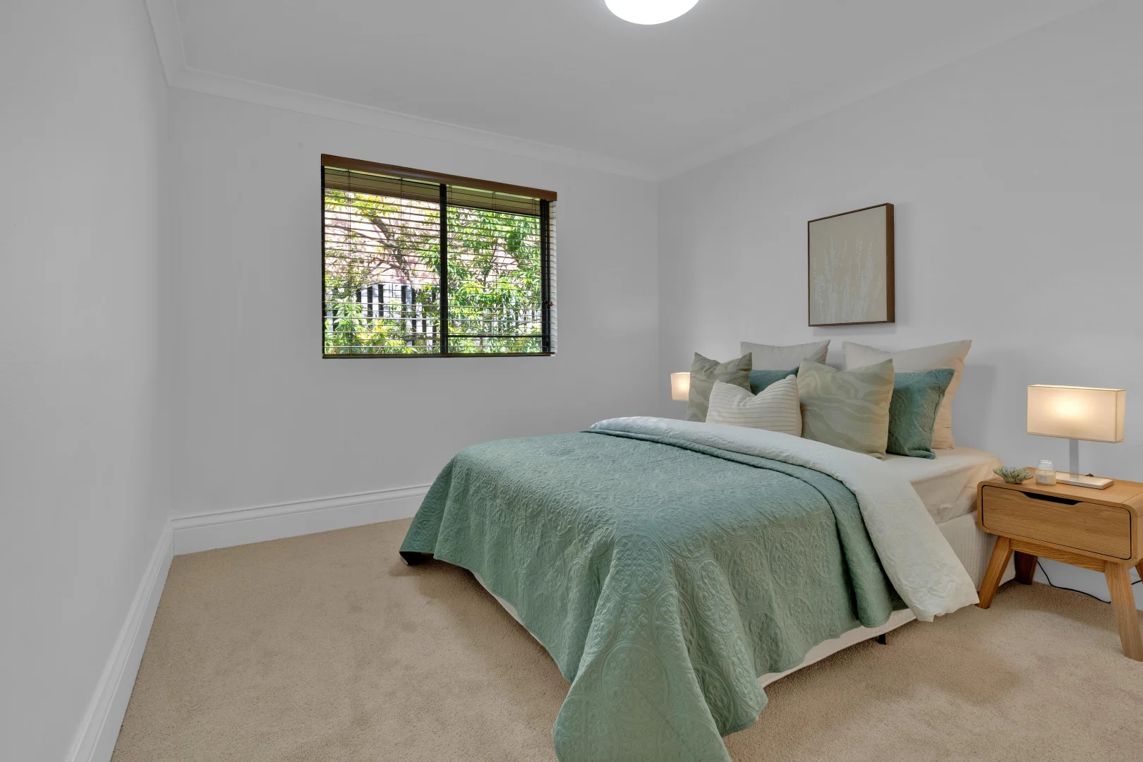
The second bedroom followed a soft eucalyptus palette with light oak side tables—fresh, calm, and photogenic. The beds looked hotel-perfect, but not staged-perfect. A buyer could imagine real mornings there.
Our insider rule: “Every room should make you want to take your shoes off.”
The design logic — why it worked
- Curves over corners: Every circular element (tables, vases, art proportions) gently softened the hard geometry of the floor plan.
- Warmth over white: Mustard and toffee accents bridged the gap between old cabinetry and new flooring—creating colour cohesion without repainting or replacing.
- Texture over quantity: We deliberately reduced the number of items in each vignette. A single sculptural branch in a tall vase did more for the room than five small objects ever could.
- Zoning for flow: Rugs and lighting created invisible walls. Buyers subconsciously felt “living area” and “dining area” without needing physical dividers.
- Photogenic strategy: Every camera angle had depth—foreground object, mid-plane feature, background contrast. That’s how you design for photos that convert clicks to inspections.
The result
When the first inspection opened, the agent called us:
“Every open feels slower—in the best way. People aren’t rushing through. They sit down.”
That’s the goal. Not just traffic—connection.
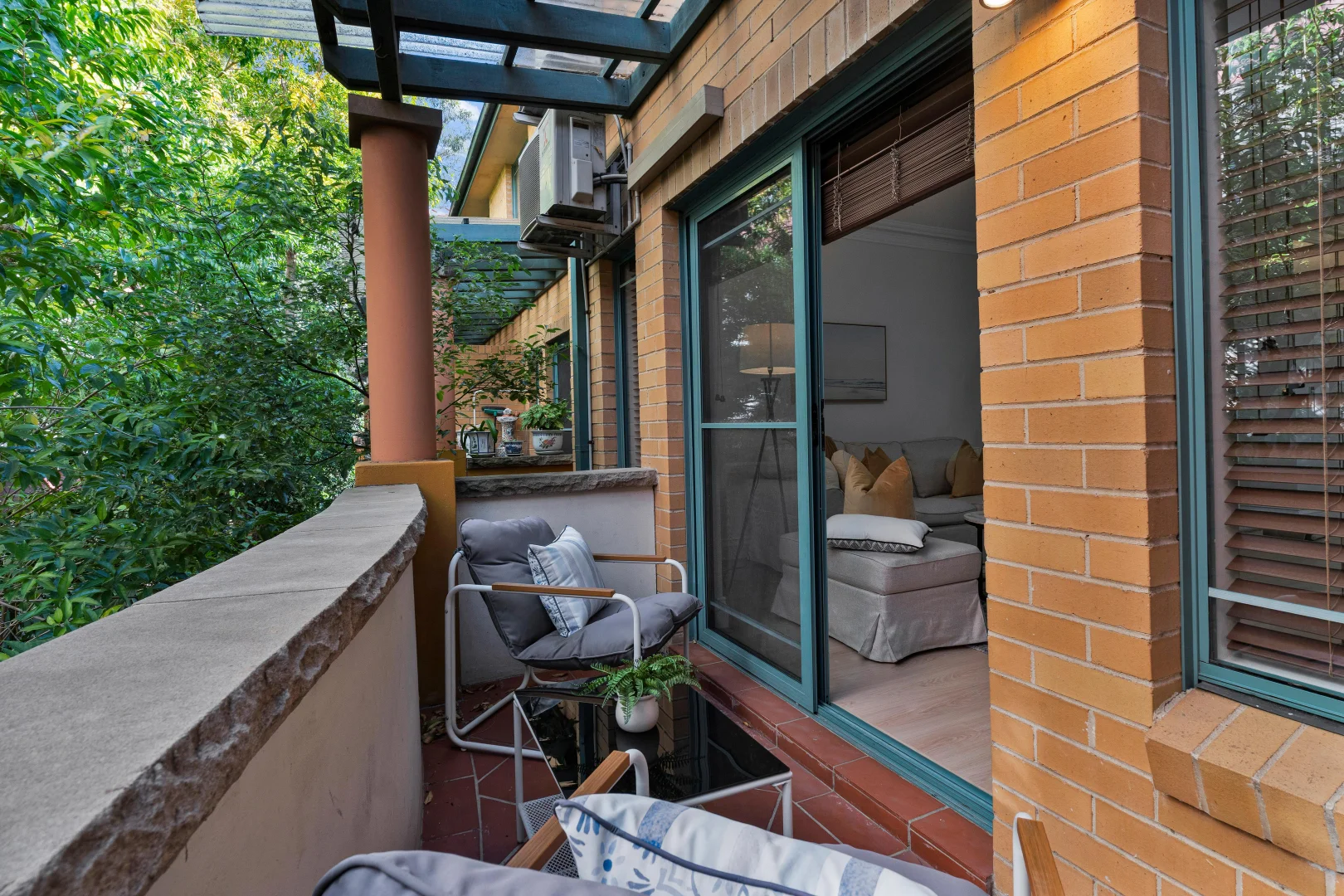
The unit felt like a private retreat in a central postcode. Even the once-dated granite kitchen was now being praised as “durable and timeless.” The balcony read as an extension of the living room.
Within days, enquiries doubled.
This was no luxury penthouse. It was an ordinary apartment turned extraordinary through psychology, palette, and proportion.
That’s the Goldpac difference: we don’t just fill rooms—we engineer emotion.
Any staging company can deliver furniture. But when your listing has tricky proportions or dated finishes, you need a strategic eye.
At Goldpac, every layout is treated like a mini marketing campaign:
- Who’s the target buyer?
- What emotional story do we need to tell?
- What colour pathway will guide the eye through photos?
That’s how Home Staging Sydney becomes more than décor—it becomes sales architecture.
For agents and vendors searching for Home Staging Sydney that actually drives results, this project says it all. Goldpac’s team understands the rhythm of Sydney buyers—from first-home hopefuls in Burwood to upsizers in Epping or Lane Cove.
Our Home Staging Sydney process isn’t about hiding flaws. It’s about revealing potential. By zoning long floor plans, balancing older kitchens with fresh tones, and injecting just enough emotional warmth, we help properties feel bigger, lighter, and worth more.
If you’re an agent ready to elevate your next campaign, trust Home Staging Sydney by Goldpac—fast installs, market-savvy styling, and results that photograph beautifully and sell confidently.
“I couldn’t believe it was the same space. It finally felt like home the second I walked in.” – Buyer
🏡 2-bedroom Burwood apartment, split-level with leafy balcony.
🎨 Styling theme: warm contemporary + coastal calm.
🌿 Feel: light, relaxed, photo-ready—kitchen integrated seamlessly.
⚡ Impact: more dwell-time, stronger connection, faster interest.
💬 “Every open was packed—and peaceful.” — Agent