
Winston Hills — A bold reimagining of space for a modern family retreat.
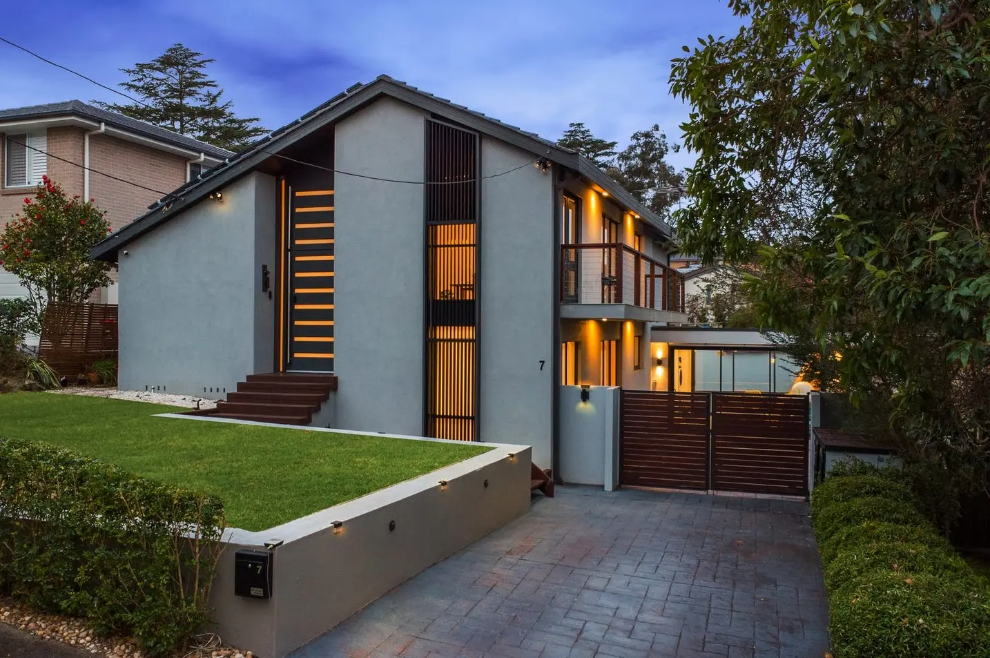
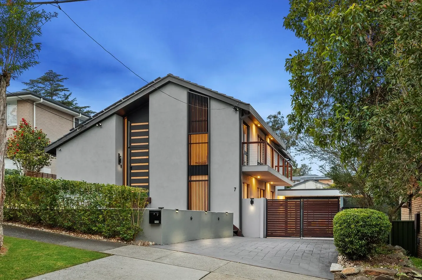
There are homes you walk into and instantly know they’re going to be a challenge — and then there are homes like 7 Lister Street, Winston Hills. Two levels of complex geometry, cathedral ceilings that soar dramatically above you, skylights pouring in natural light, and sharp angles that make you stop and take stock of every single wall. In short: this was no cookie‑cutter family home. It had potential written all over it — but unlocking that potential meant rethinking our usual playbook.
The brief from the agent was straightforward but ambitious: “Make it feel like a high‑end family retreat — but keep it on a standard styling budget.” A tall order, but exactly the kind of challenge that excites us at Goldpac.
Finding the story inside the space
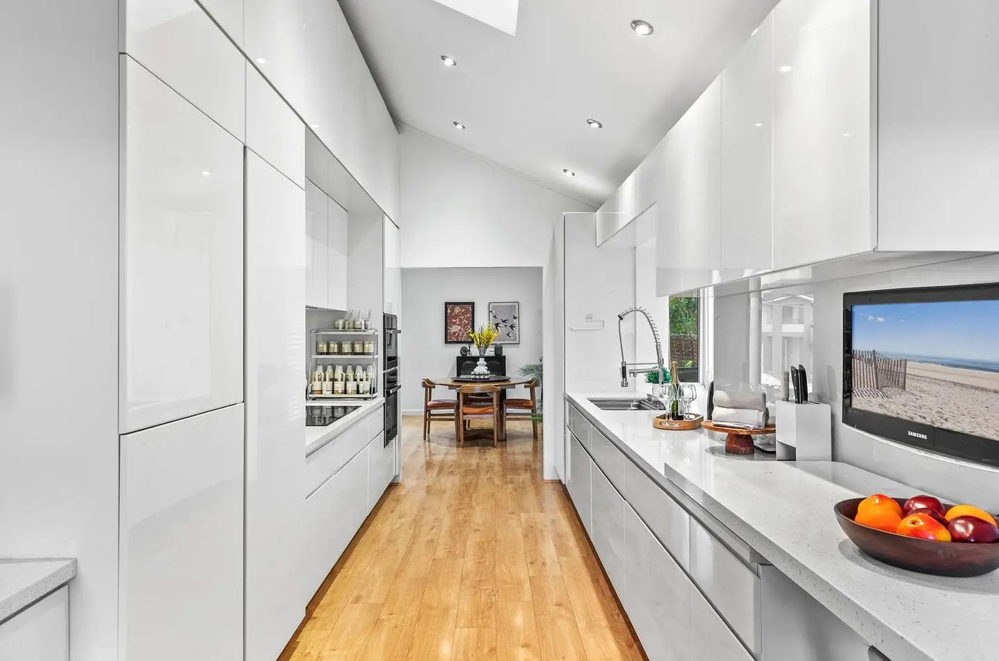
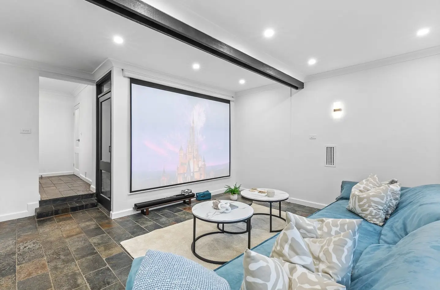
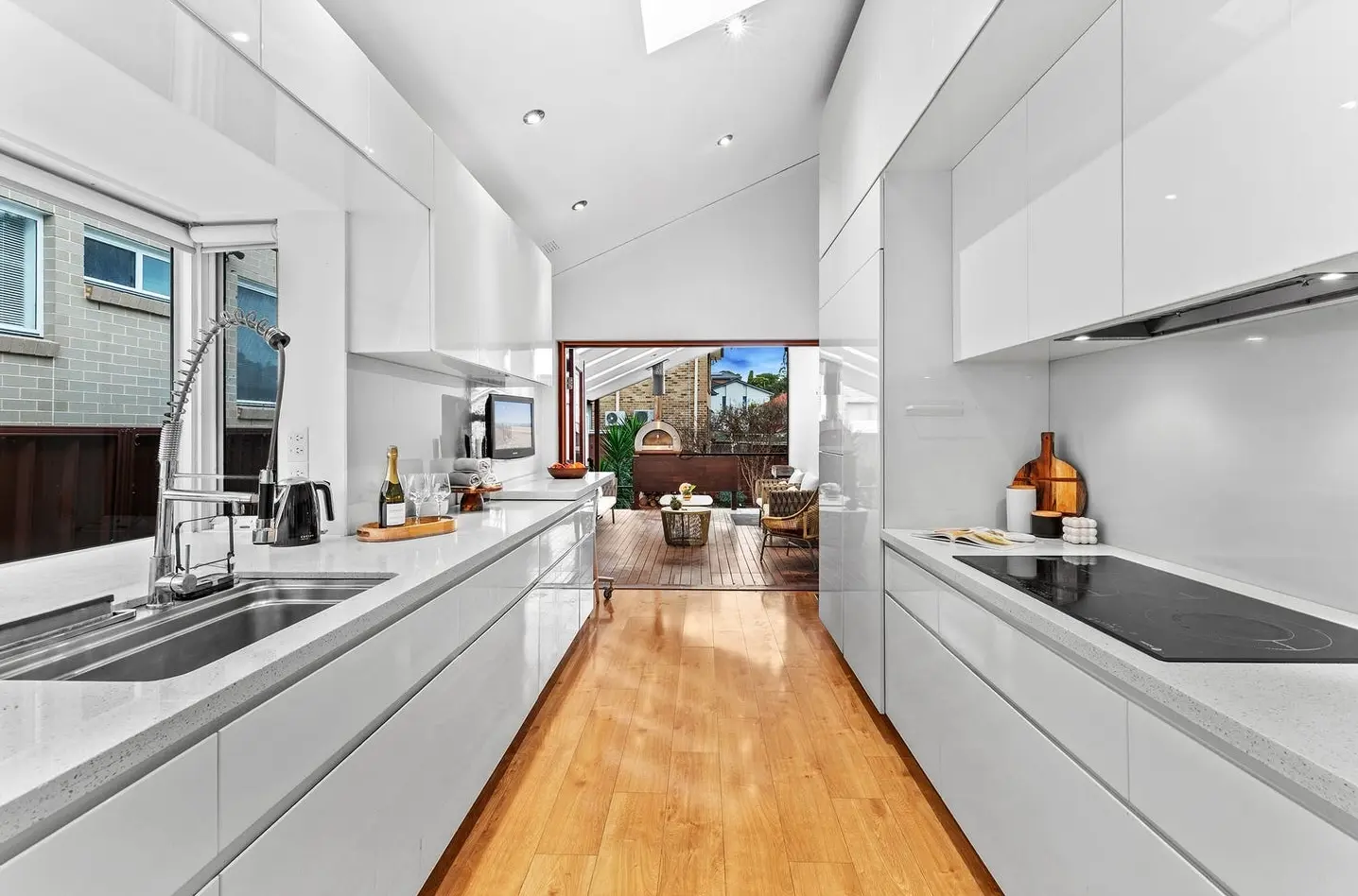
The first thing that struck us was the personality of the house. It wasn’t trying to blend in. The design wanted to be noticed — the black‑on‑white entry doors, the clean modern kitchen stretching toward an alfresco deck, and the vaulted ceilings in the living room that were just begging for a grand statement. But personality isn’t always market‑ready. For a prospective buyer, unique architecture can feel confusing or even overwhelming without careful styling to ground it.
That’s where our job came in: to take this bold, multifaceted structure and turn it into a warm, cohesive home that would speak to the emotions of a young, confident family — one that wanted contemporary style without sacrificing comfort.
The challenge of space (and how we bent the rules)
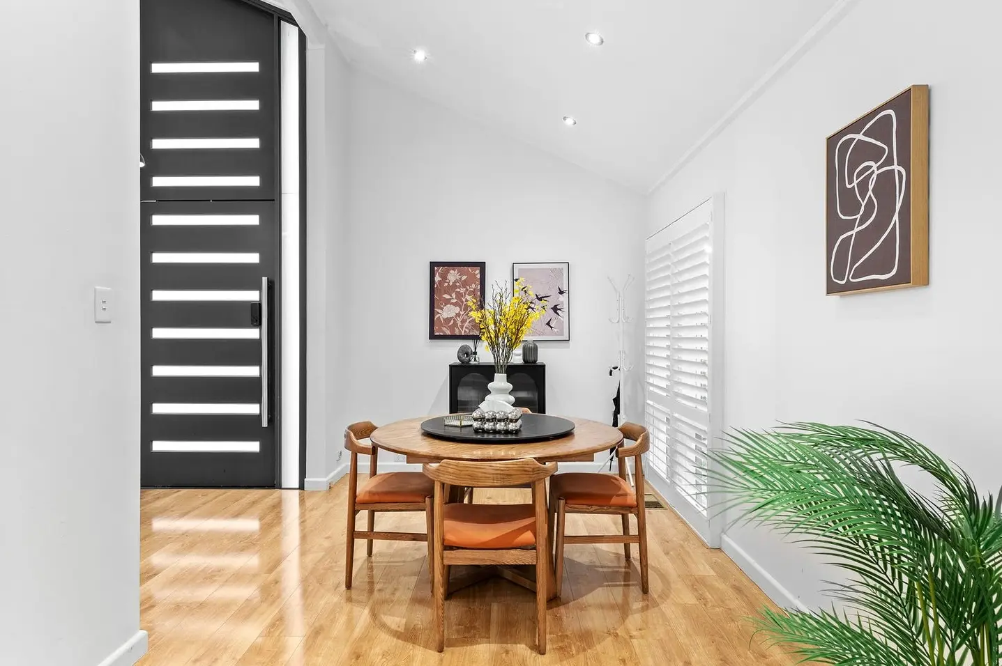
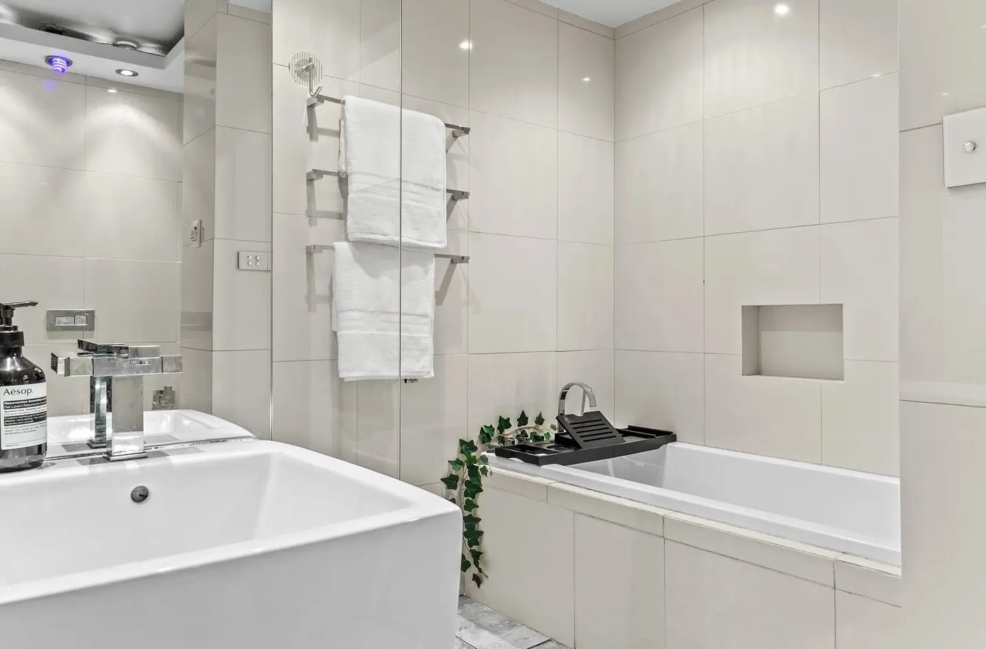
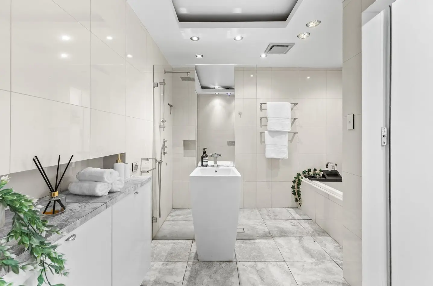
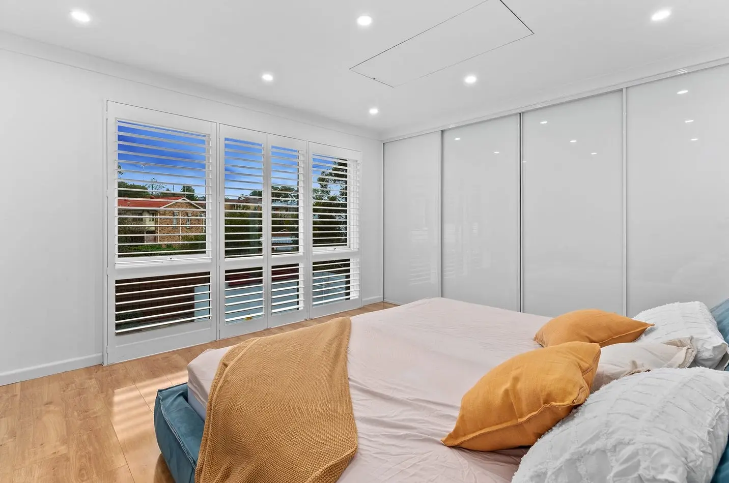
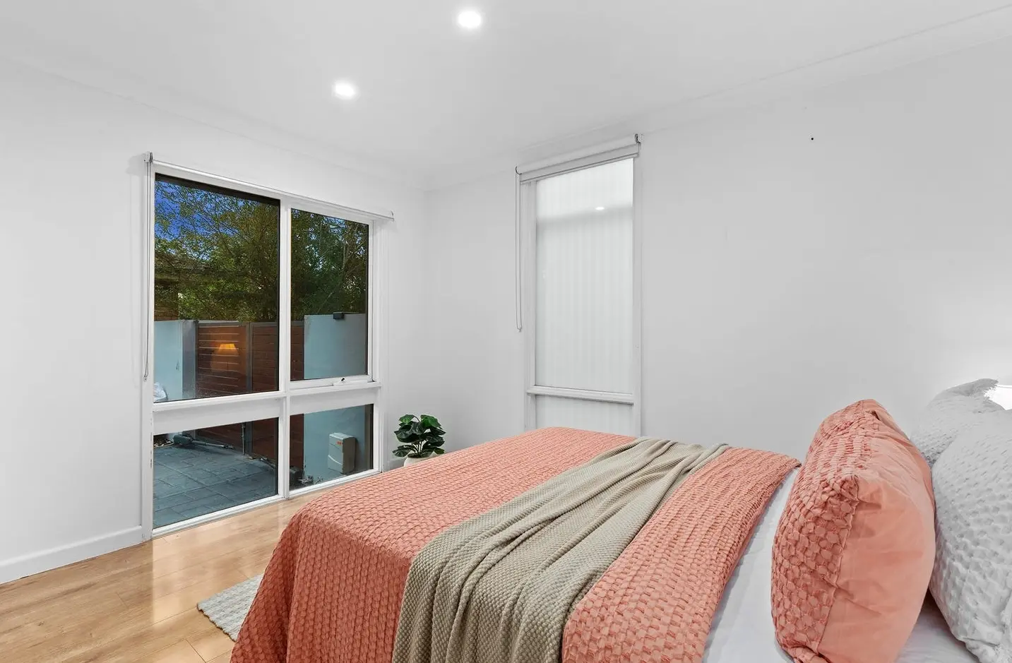
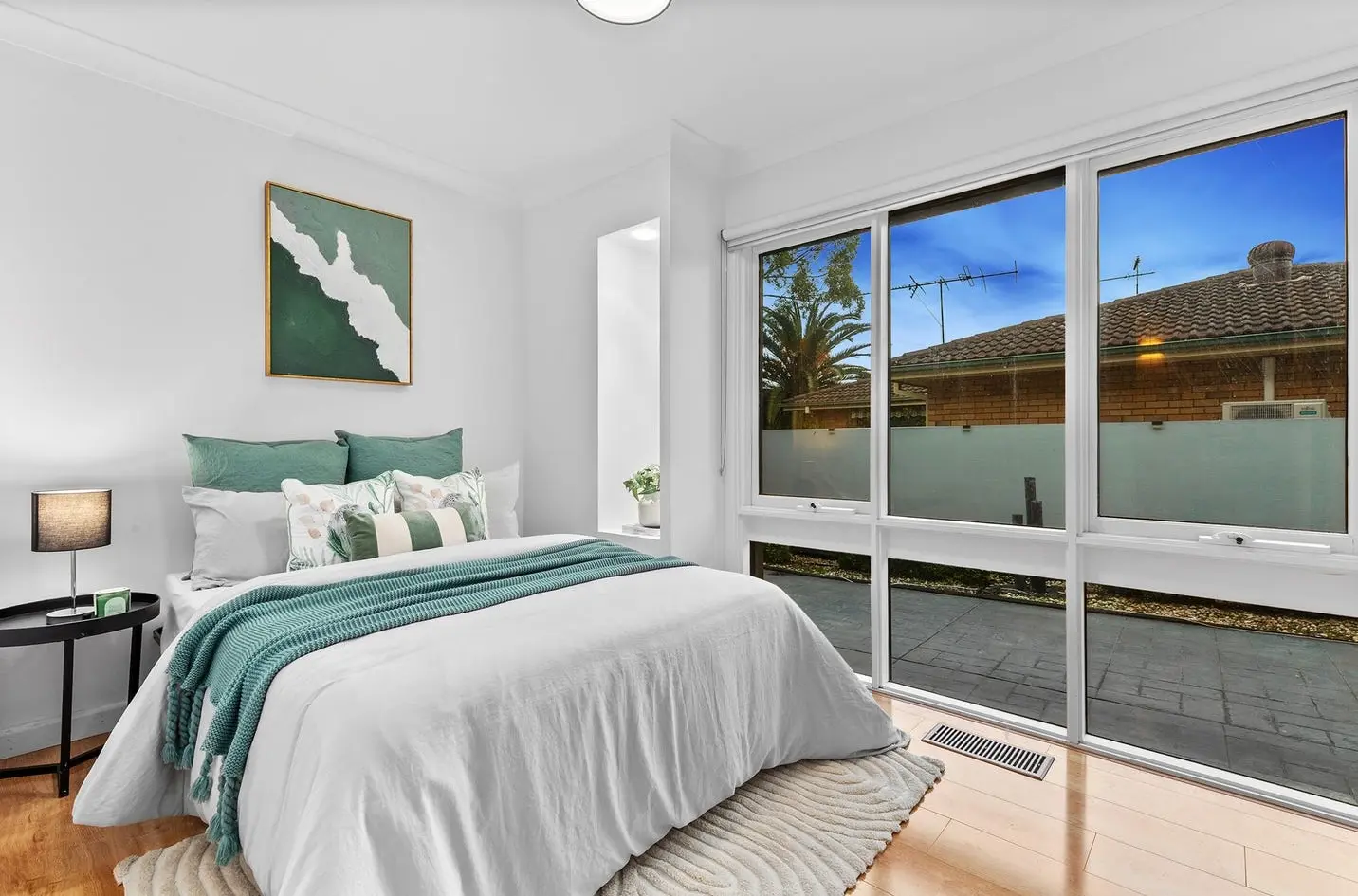
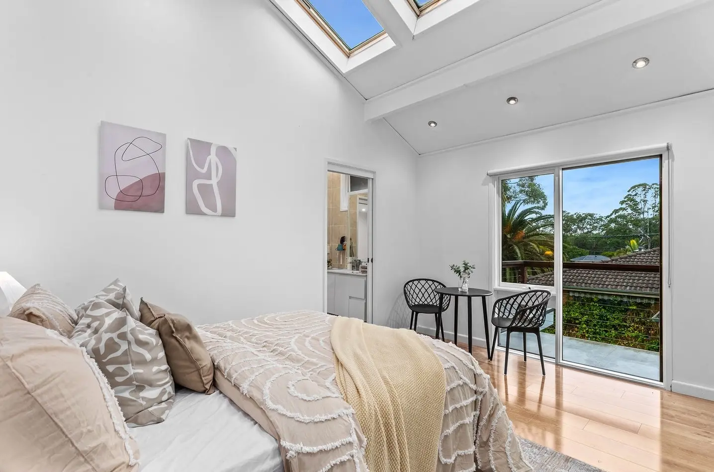
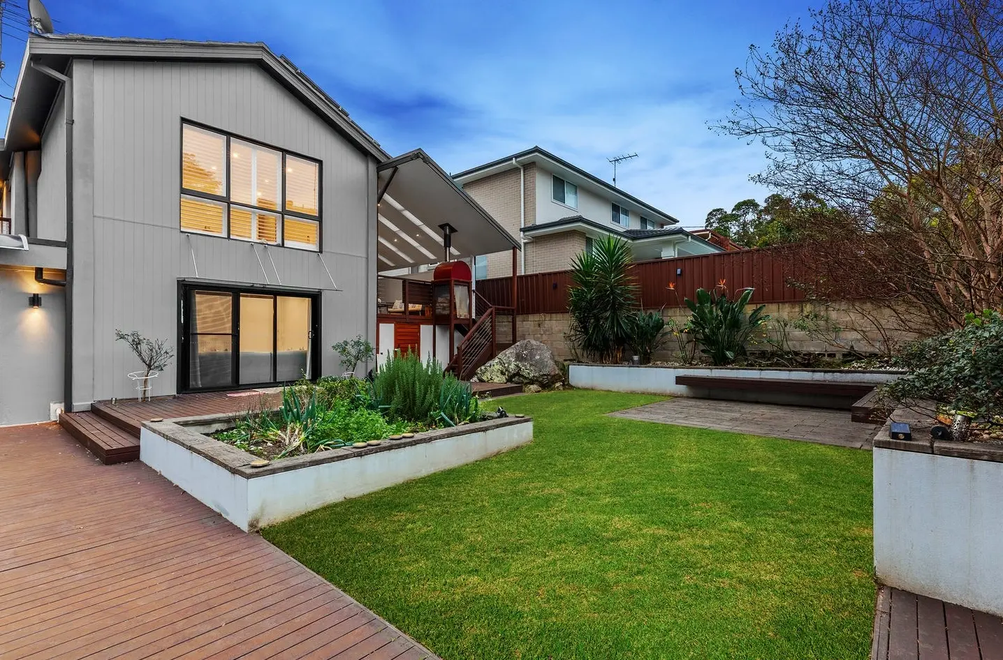
This home didn’t just need furniture; it needed solutions. Bedrooms were compact, making it tricky to showcase them as functional and appealing. High ceilings threatened to make the main living area feel cold if left under‑furnished. And the dining area? Tucked into an awkwardly shaped nook that needed to look intentional, not like an afterthought.
We decided early on that the usual amount of furniture wouldn’t cut it. This house demanded more — more volume, more texture, more layering. So, we doubled our standard furniture volume. Yes, double.
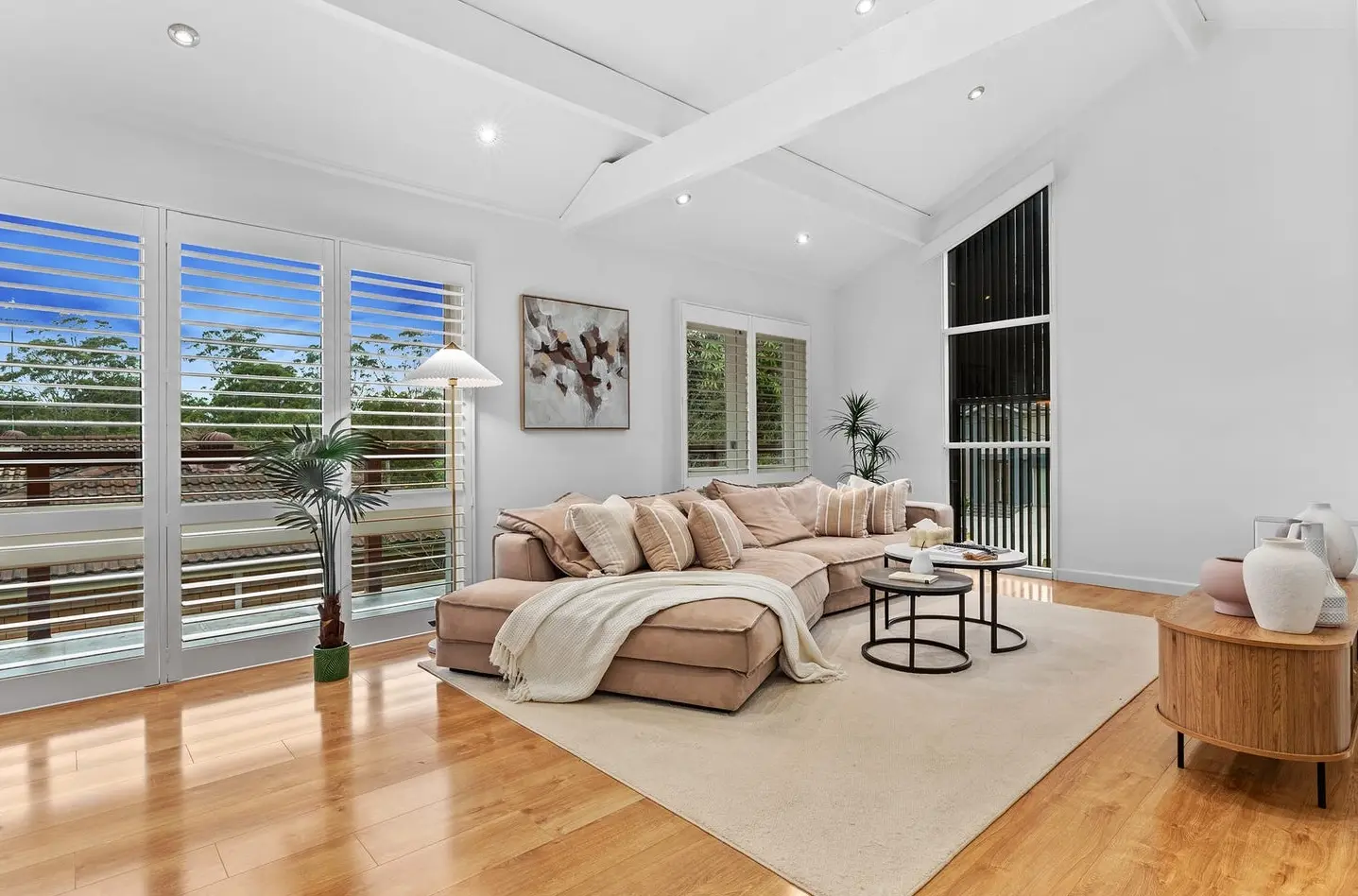
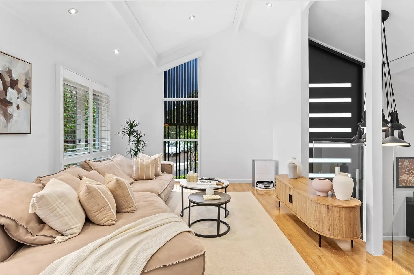
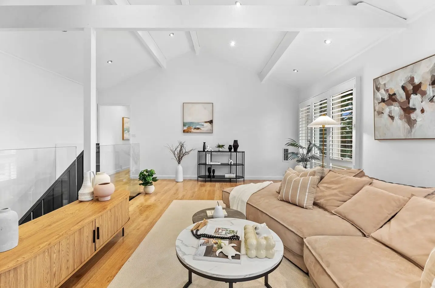
In the living room, we layered generous, soft‑toned modular sofas with a mix of textured cushions, grounding the vertical space with a plush rug and oversized artwork. In the entryway, where most people would leave the space bare, we introduced a slimline console, arched mirror, and subtle accessories to create a welcoming vignette — small touches that instantly shifted first impressions.
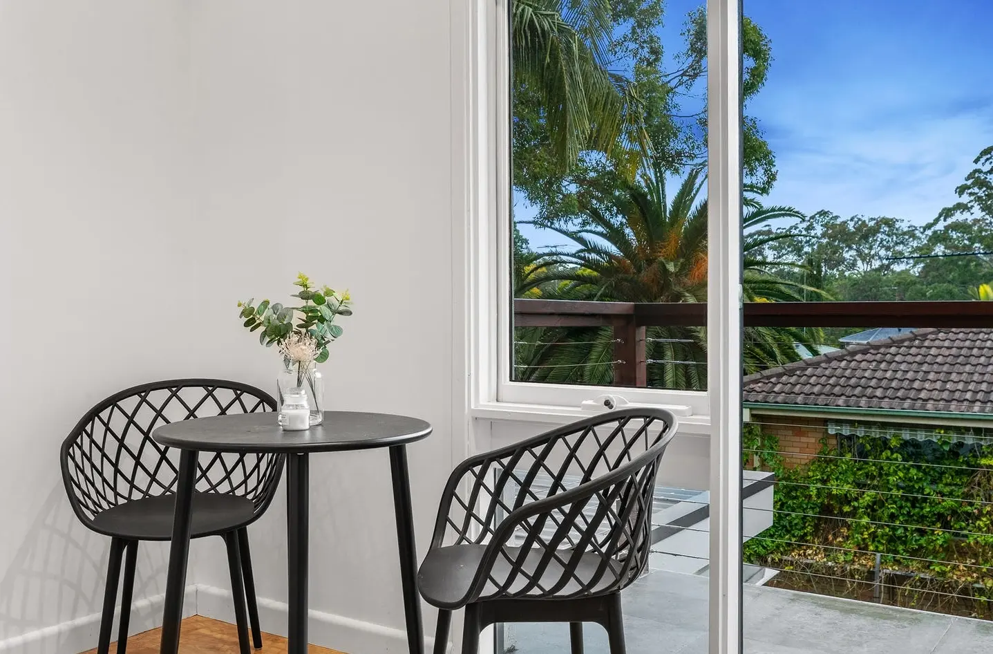
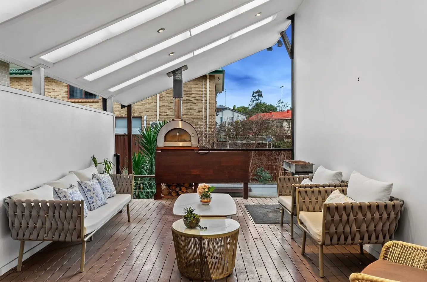
The bedrooms, though compact, were transformed with low‑profile beds and smart layering. We leaned on soft linen tones, occasional bursts of colour in the accessories, and mirrors to create an illusion of space without overwhelming the rooms. And for the alfresco deck, we didn’t settle for a couple of token chairs; we turned it into an outdoor lounge — complete with plush seating and a table setting — because buyers in Winston Hills aren’t just buying a house. They’re buying the idea of entertaining on a Sunday afternoon with friends and family.
Luxury feel. Standard budget.
One of the most satisfying parts of this project? Achieving a look that agents described as “expensive” while staying firmly within a standard package budget. We did it through clever curation rather than high‑end splurges — layering affordable yet stylish pieces, playing with textures (think linen, boucle, and matte ceramics), and introducing curated greenery to add life to every corner.
This wasn’t about throwing money at the problem; it was about making smart styling choices that elevated every space. It’s proof that you don’t need a luxury budget to create a luxury impression.
The result: From interesting to irresistible
By the time we finished, the house felt transformed. What once seemed like a maze of quirky angles and varying room sizes became a cohesive, welcoming family home. Buyers weren’t just walking through rooms — they were imagining their lives here: watching movies in the media room, cooking in that gleaming white kitchen, hosting dinners in the alfresco space, and retreating to cosy bedrooms at the end of the day.
The agent summed it up best:
“It felt like a completely different home. Buyers kept saying it looked ‘expensive’ — that’s the best compliment you can get.”
Why it worked
This project succeeded because it wasn’t just about filling rooms. It was about creating zones with purpose, using furniture and accessories to guide the eye and evoke emotion. It’s a reminder that home staging isn’t decoration — it’s strategy.
Final thoughts
7 Lister Street wasn’t easy. But that’s exactly why we loved it. It gave us a chance to push beyond the standard, to experiment with proportion and layering, and to prove that “luxury” isn’t always about cost — it’s about how a space makes people feel.
And judging by the feedback, this one felt exactly right.
🏡 5-bedroom Winston Hills house — multi-level with cathedral ceilings
🎨 Styling: Warm luxe layers with double the furniture volume.
✨ Feel: Expensive, cohesive, and family-ready.
⚡ Impact: Turned an architectural challenge into a luxury-feel retreat.
💬 “It felt like a completely different home.” — Agent.