
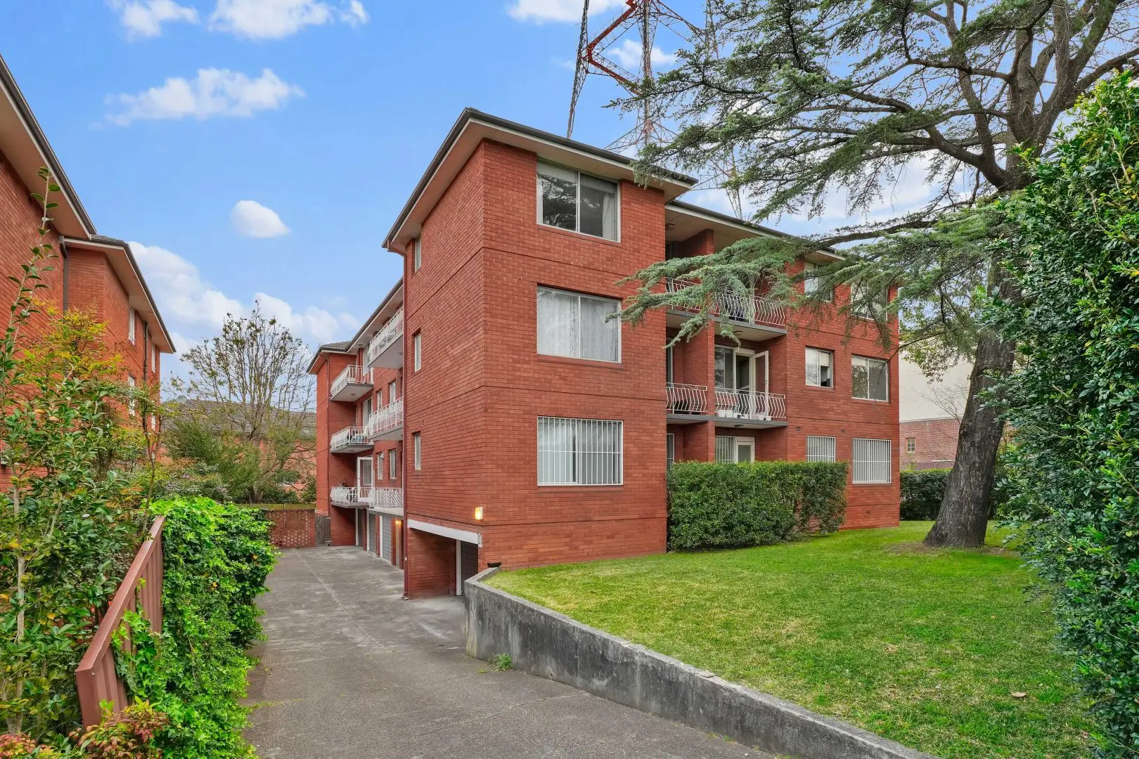
Artarmon — sun-washed, two balconies, and a quiet view to Chatswood
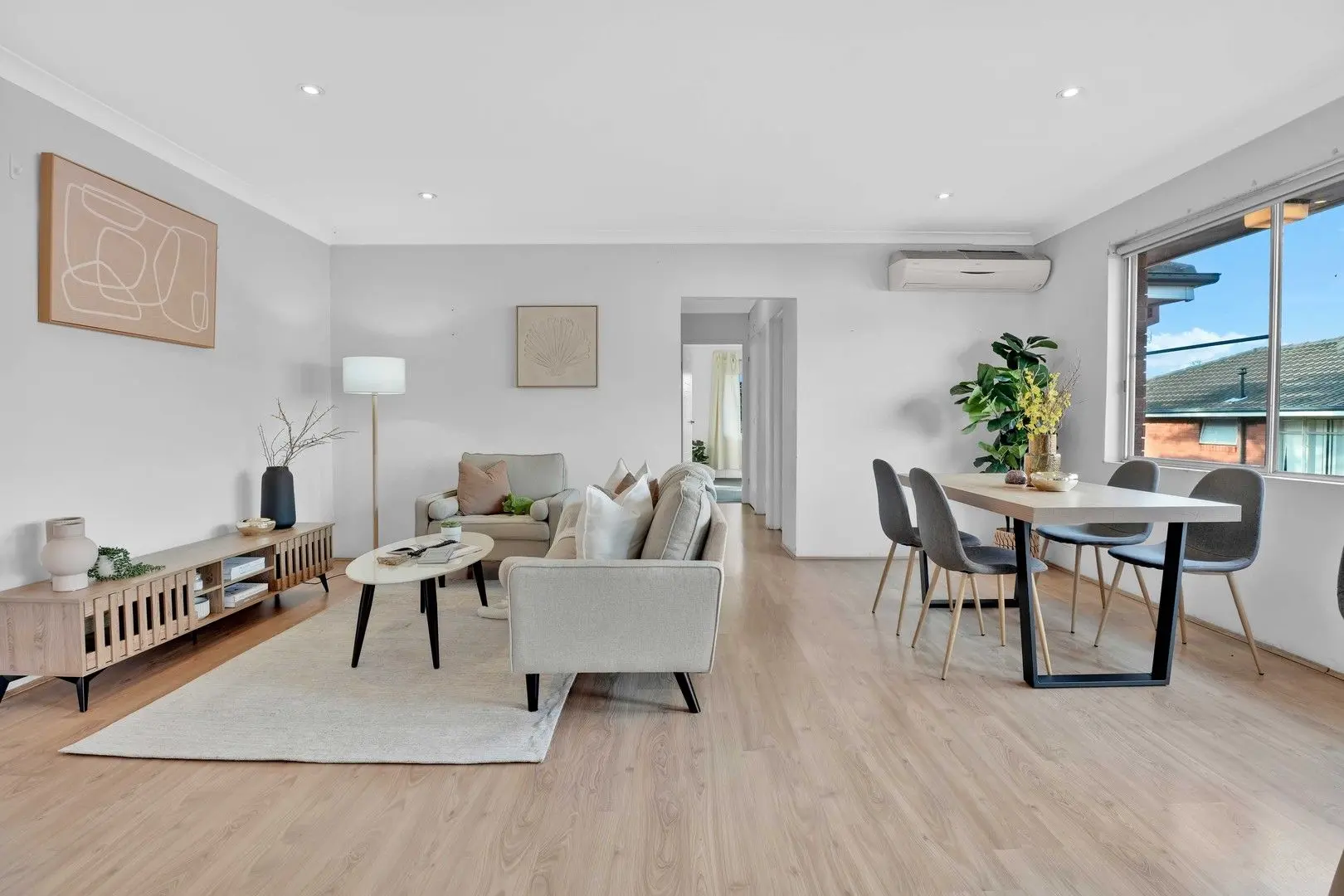
When I first walked into 10/344 Mowbray Road, I didn’t think “unit.” I thought of the person who’ll drop keys on the slatted oak console, throw a bag on the sofa, and open the balcony door to that little slice of sky. The bones were honest: light timber floors, pale grey walls, bedrooms with charcoal carpet, and those classic red-brick frames outside. But the space was reading like a corridor—long, clean, and a bit anonymous. In a suburb where red-brick blocks are a category standard, “clean” isn’t enough. We needed emotion, flow and a reason to stop scrolling.
The brief we wrote for ourselves: reduce the corridor effect, warm the palette, and stage the two balconies so they signal “morning coffee here.” That’s how you move a listing from commodity to choice.
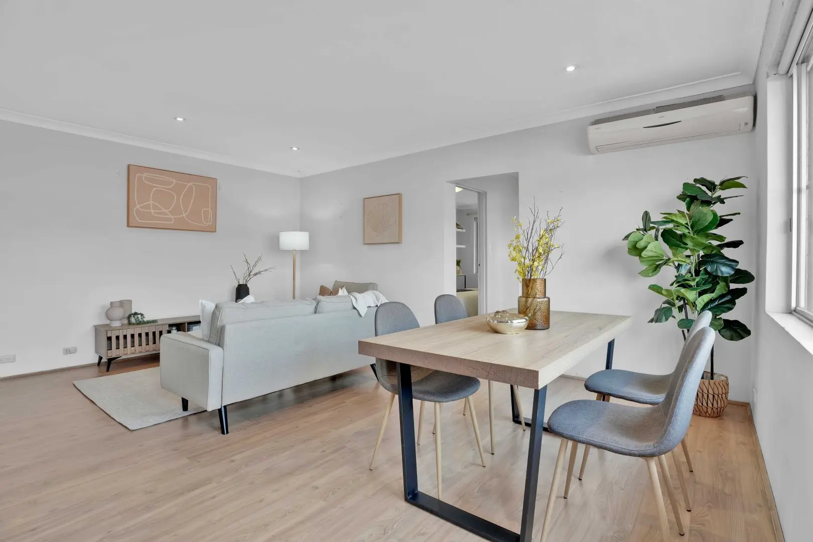
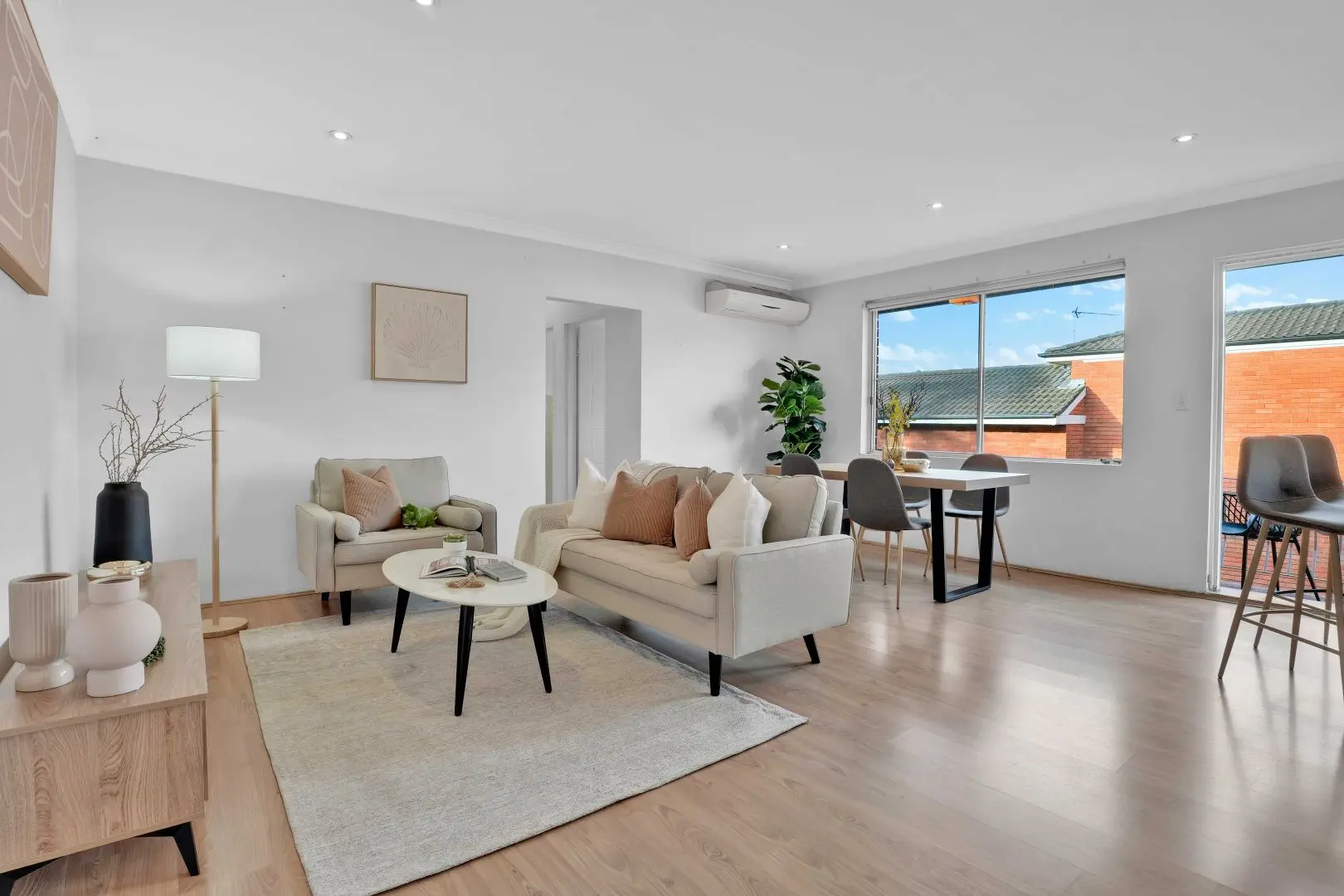
We started by zoning the living/dining. The living end got a light, compact sofa with creamy, textured cushions and a soft throw that falls gently onto a pale rug—simple, human, lived-in. We paired it with two pebble-shaped coffee tables (those soft curves break the hard lines) and anchored the TV wall with a slim timber console with slatted doors—the kind people actually want to own. A tall white floor lamp lifted the corner, while a matte black vase and a single branch brought a quiet, editorial moment.
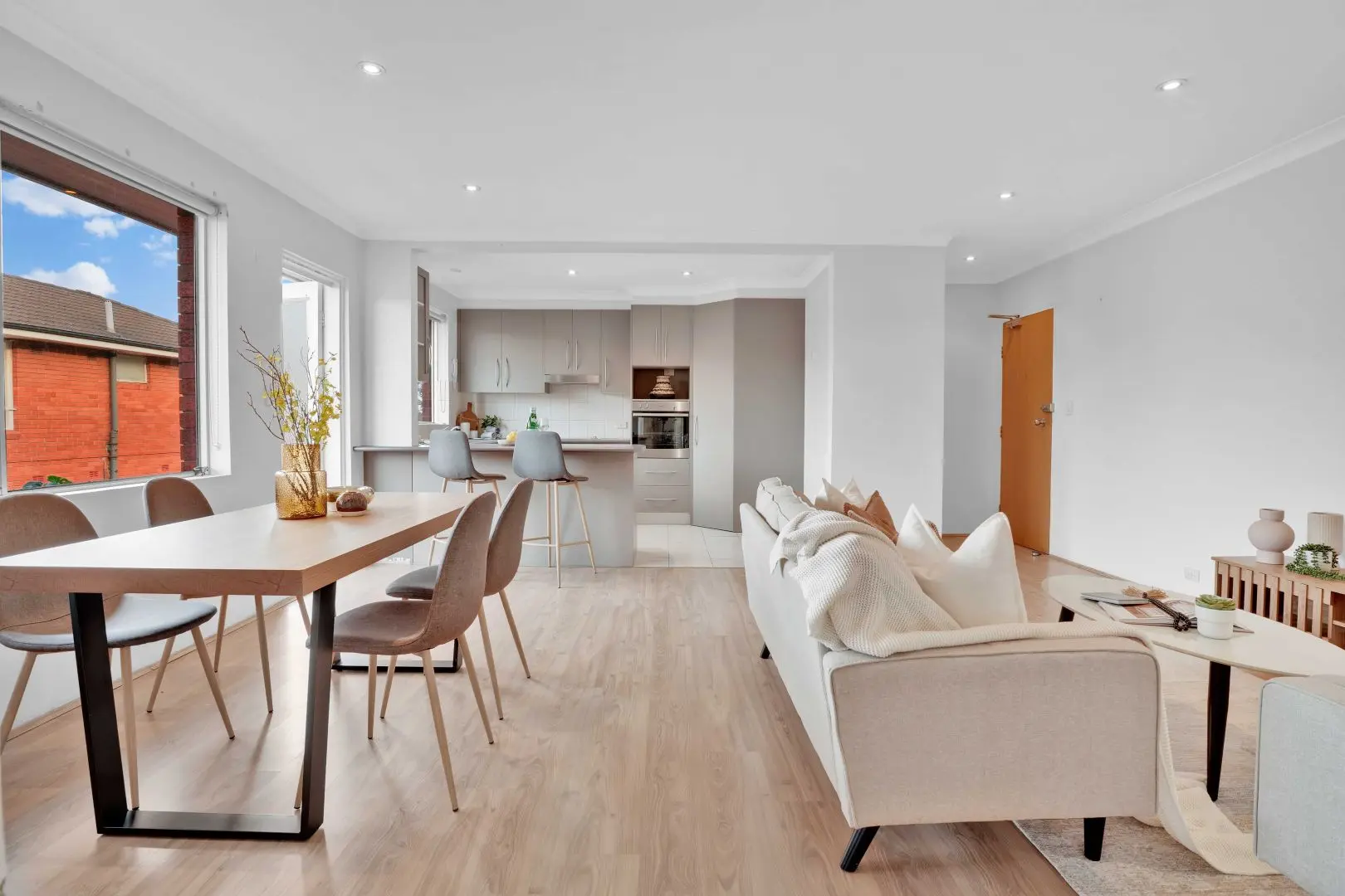
At the dining end, right by the big window, we set a natural oak table on black steel legs with four grey upholstered chairs—comfortable, narrow footprints, perfect for open-plan sightlines. A fiddle-leaf fig and a bud-vase arrangement gave life to the wall under the split-system A/C (visible, yes; softened, absolutely). Now the long room read like three scenes—lounge → meals → balcony—instead of one echoing tunnel.
The kitchen was already neat, all in soft greys, so we added two light barstools and styled the bench with functional–pretty: chopping board, glass bottle, citrus. Less catalogue, more Saturday.
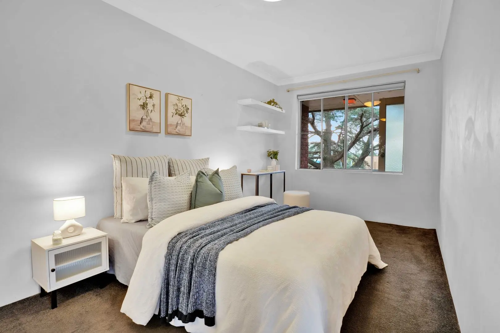
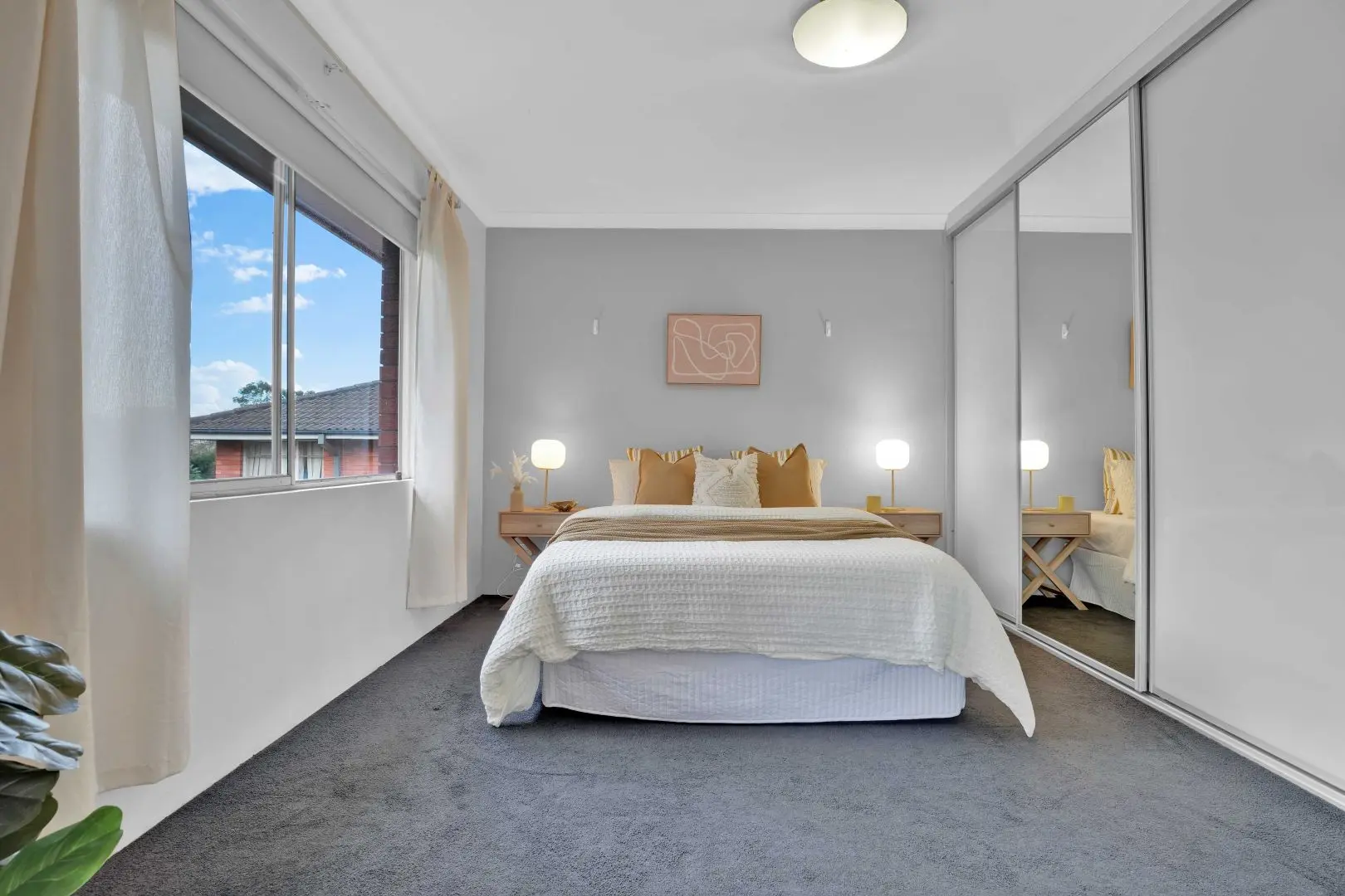
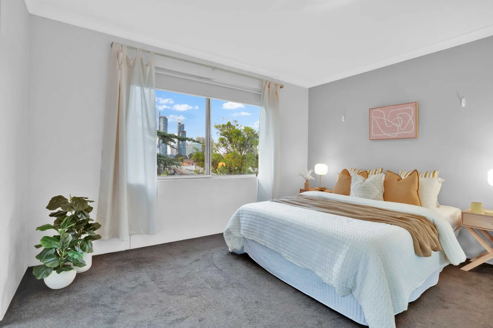
Bedrooms = trust. In the main bedroom, we leaned into calm: a gentle grey feature wall, warm mustard and cream cushions, and timber X-base bedsides with round white lamps. The mirrored robe doors did what mirrored robe doors should—double the light—so we kept everything tonal and layered, not shiny. The second bedroom was the “surprise and delight” zone: layered bedding, a soft navy throw, botanical prints and wall shelves with small curated pieces. From one window you catch a glimpse of the Chatswood skyline; we made that a feature, not a footnote, by keeping the curtains light and the sightline clear.
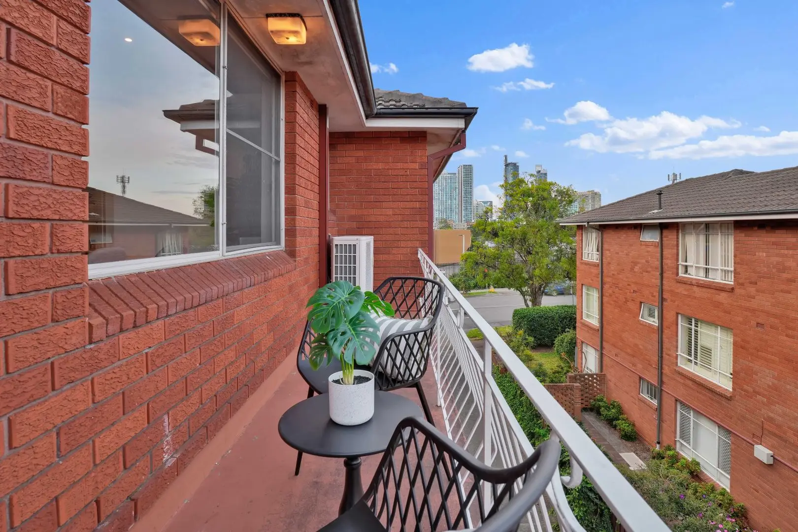
And because lifestyle sells faster than floorplans, we took both balconies seriously. Each got black café chairs and a small round table, with a potted monstera to echo the greenery below. On inspection day, people always step out to “feel the air.” We designed that moment.
- Positioning: in a market crowded with similar stock, we differentiated through emotional utility—comfort, routine, a place to exhale.
- Conversion design: clear spatial zoning reduces cognitive load; buyers instantly understand use and scale.
- Price defence: warm timber, textured textiles and restrained art raise perceived value without raising cost base.
- Campaign velocity: balcony activation + bedroom trust shots = more saves, more opens, faster offers.
Open-home traffic lifted immediately. The agent reported longer dwell times in the living zone and constant comments about the “fresh, calm vibe.” The vendor accepted a strong offer 12 days in—prior to auction. Not a fairy tale—just good strategy, good styling, and a home that finally felt like one.
Local note: Set on Mowbray Road with an easy walk to Artarmon Station and cafés on Hampden Road, the block sits near Artarmon Public School catchment and green pockets like Thomson Park and Artarmon Reserve. We referenced that everyday convenience in the styling—simple, walkable, real life.
If you’re searching for Home Staging Sydney, this is the playbook. Take a neat red-brick apartment in Artarmon, use zoning, texture and balcony storytelling, and you transform scroll-past into shortlist. Goldpac treats staging as strategy—market positioning, buyer psychology, campaign speed. That’s the difference Home Staging Sydney should make: not just prettier photos, but faster decisions and stronger outcomes.
“It didn’t feel like a unit anymore—just… home.” — Buyer at first open
🏢 2-bed Artarmon unit — two balconies, Chatswood glimpses.
🎨 Theme: Warm neutrals, oak textures, soft curves.
🌿 Feels like: Calm, liveable, “I can move in now.”
⚡ Result: Offer accepted in 12 days, pre-auction.
💬 Agent: “Every open ran long—people stayed to talk.”