

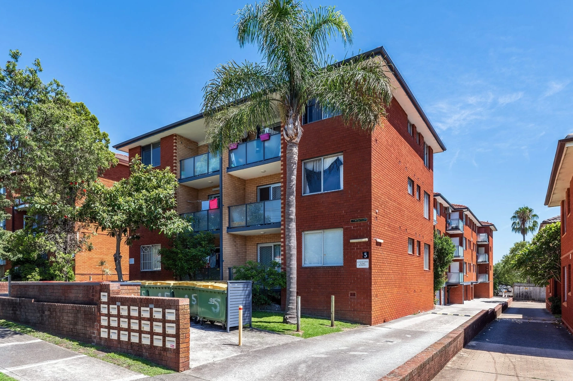
5 Phillip Street, Roselands NSW 2196 — a fast-moving campaign for a fast-moving agent
This one wasn’t about “making it pretty”. It was about making it sell — fast.
The agent on 5 Phillip Street, Roselands is the kind of operator who doesn’t have time for slow listings and polite maybes. Their style is simple: launch clean, create urgency, get offers early. And that meant our brief was sharper than usual:
Take a bright but plain top-floor unit and turn it into a “this is easy” decision — immediately.
Because without staging, apartments like this can photograph as generic. White walls, timber-look floors, practical kitchen, decent balcony… buyers scroll past it as “fine”. And “fine” is where listings go to quietly die for three weeks while everyone pretends it’s still “early days”.
So we treated it like a campaign build.
The challenge: it had space — but it didn’t feel premium
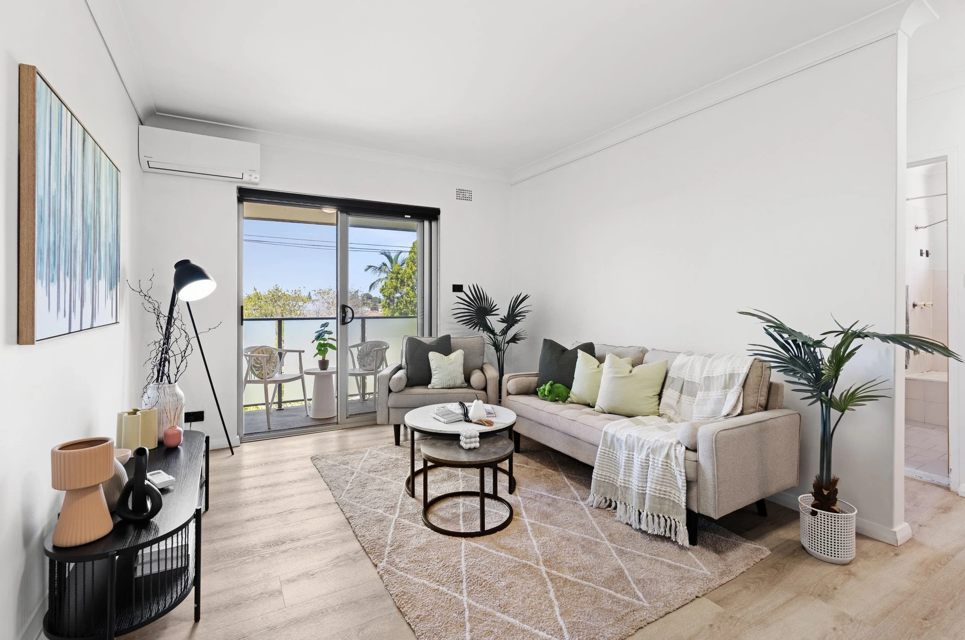
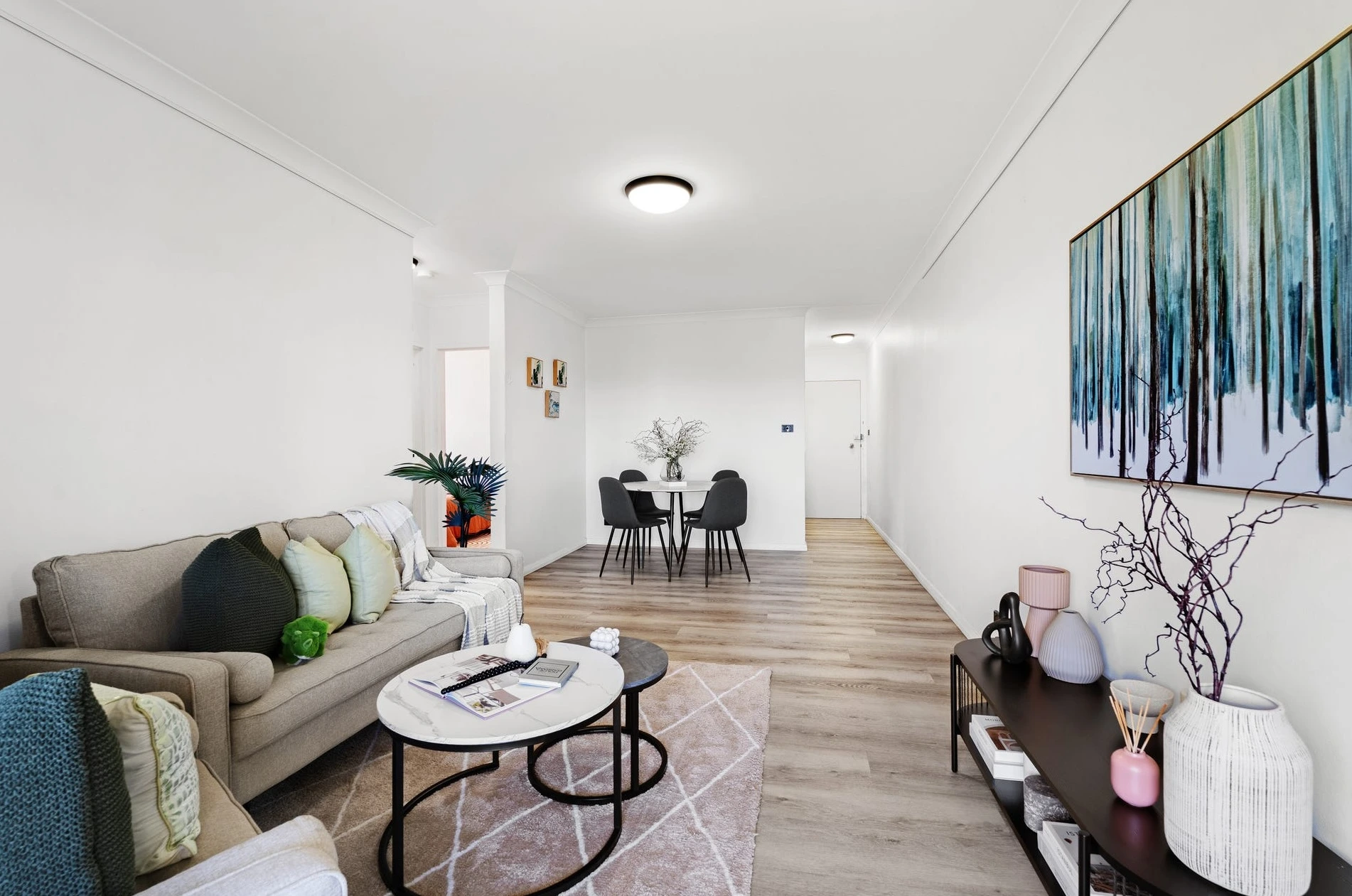
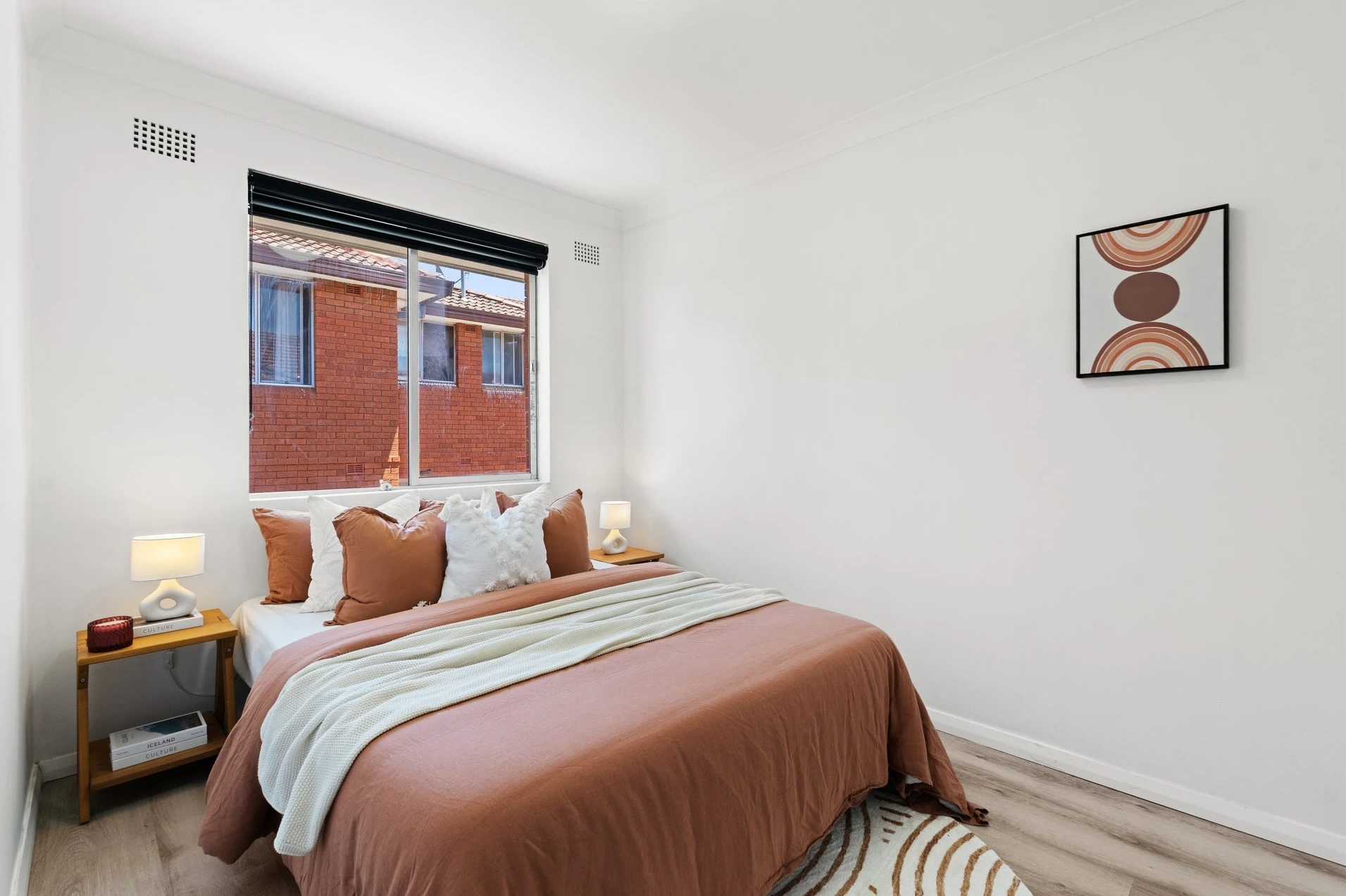
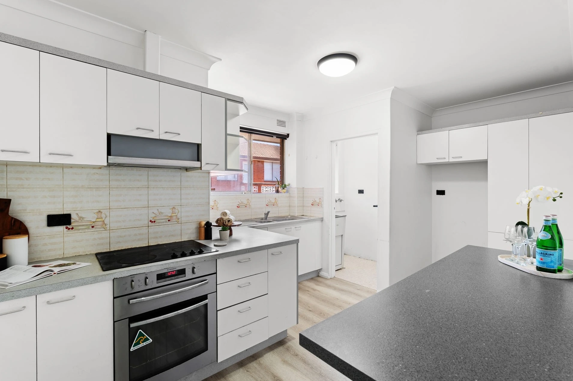
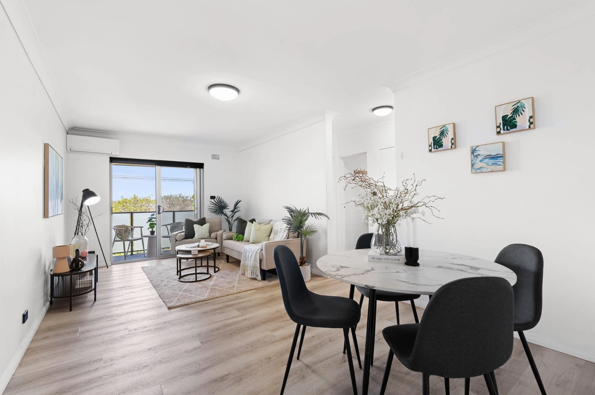
This unit is generously proportioned (especially for the area), with two large bedrooms, separate laundry, separate W.C., a covered balcony and a leafy outlook. The problem was emotional: empty space reads as cold space online, and long living/dining rooms can look like an awkward corridor if you don’t break them correctly.
The agent didn’t need more furniture. They needed a faster “yes”.
The solution: stage for speed, not decoration
We made one strategic decision and let it drive everything:
Keep the apartment open, but make the layout obvious in a single glance.
That’s why we leaned into air + flow as the hero — not because we “like minimalist”, but because in a two-bedroom unit, buyers equate breathing room with value.
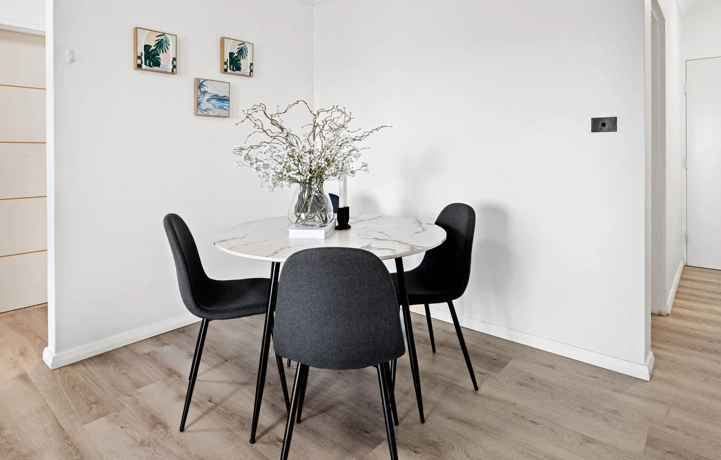
In the living zone, we used a soft neutral sofa and armchair that sit light on the floor, with rounded nesting coffee tables that don’t visually block the centre. The rug anchors the space (so it reads as a living room, not a hallway), while plants pull the balcony greenery into the photos.
In the dining area, we avoided the heavy rectangular table that screams “tight”. The round dining setting keeps the room moving and makes the space feel effortless — exactly what first-home buyers and investors want: low friction.
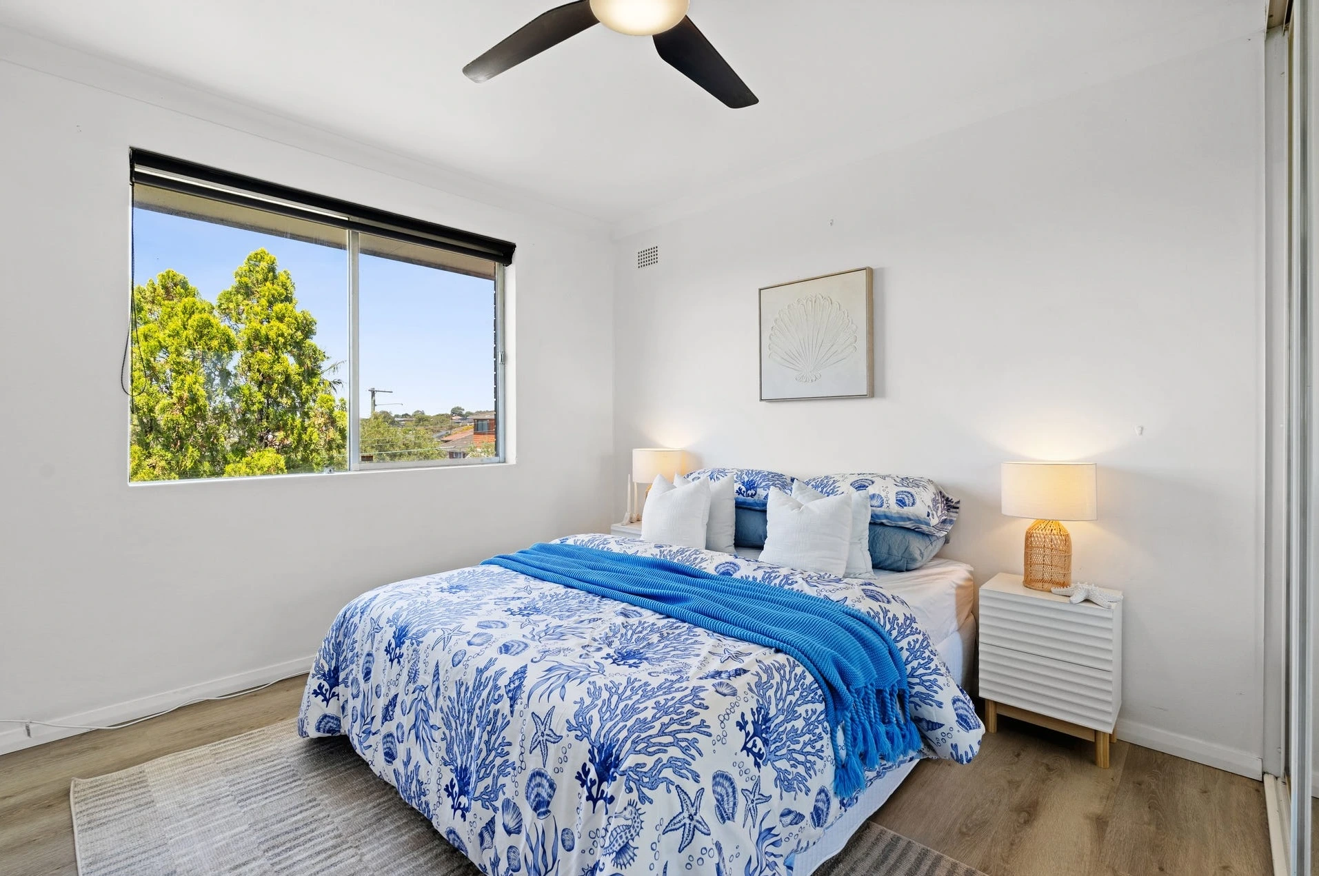
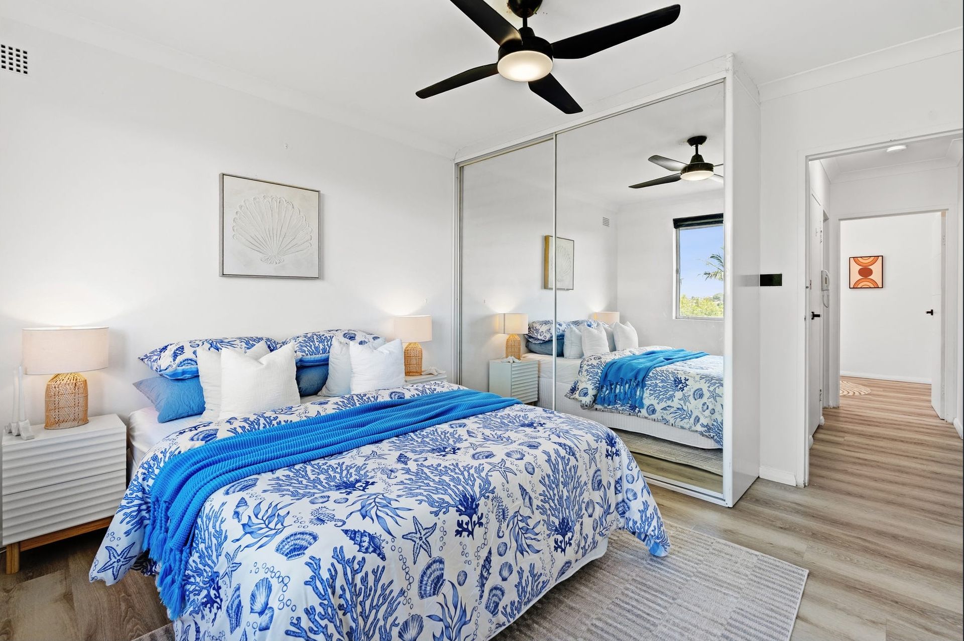
Bedrooms were styled with two moods: one crisp and coastal (fresh, bright, move-in ready), the other warm and grounded (comfortable, easy to imagine as a guest room or home office). It quietly broadens buyer appeal without saying it out loud.
The key: we didn’t fill the unit. We edited it.
And in apartments, editing sells.
The result: the market responded immediately
The campaign went live with images that felt calm, clean, and confident — not empty, not busy, not “trying too hard”. That combination is what creates speed: buyers feel like the property is easy to live in, easy to maintain, and easy to buy.
We staged it — and it went under offer almost straight away.
That’s the whole point of staging as a strategy partner: you don’t wait for the market to “warm up”. You manufacture certainty from day one.
Fast sales don’t happen by accident — they happen when the presentation is engineered. Home Staging Sydney is not just for luxury homes; it’s how apartments like this turn into fast, confident decisions. With Home Staging Sydney, we build visual clarity: layout that reads instantly, furniture that protects space, styling that feels low-friction and “move-in ready”. If your agent cares about speed, Home Staging Sydney becomes a sales tool — not a décor choice.
💬 “That’s exactly what I needed — clean photos, clear layout, and buyers moving fast.” — Agent
🏢 2-bed top-floor Roselands unit — balcony + leafy district outlook.
🎯 Strategy: stage for speed (clarity first, emotion second, clutter never).
🛋️ Hero move: kept air + flow, defined zones in one glance.
⚡ Result: styled → launched → under offer almost immediately.
💬 Agent vibe: “Buyers moved fast.”