
18 Sorrell Street, Parramatta NSW 2150 — a north-facing courtyard apartment styled to feel calm, social, and effortlessly “move-in ready” in the heart of Parramatta CBD.
Parramatta isn’t a “maybe later” suburb. It’s a right-now suburb. People buy here because life is on their doorstep — a quick coffee run, Westfield within minutes, Parramatta Station close enough to keep your mornings sane, and Parramatta Park ready for a walk when your brain says “enough screens.” So when we were brought in to stage 1/18 Sorrell Street, the brief wasn’t about turning it into a luxury fantasy.
It was about something harder.
Make a very normal apartment feel like a lifestyle upgrade.
And make it feel that way in the first five seconds.
Yes — this is Parramatta. And no — this isn’t a “prestige showpiece”.
But that’s exactly why it belongs in our portfolio.
Goldpac isn’t built on only high-end homes and glossy dream listings. Our portfolio is meant to be a real reflection of what we do across Sydney — from complex family houses to compact apartments that look “simple” until you try to make them feel desirable. Because here’s the truth agents already know: buyers don’t walk into a property thinking “What’s the thread count?” They walk in thinking, “How does this feel… and can I see my life here?”
Smaller properties are often the toughest. There’s nowhere to hide. Every basic finish, every awkward wall, every view into the соседний brick building becomes part of the first impression. And it still has to photograph beautifully, flow effortlessly at inspections, and feel like a lifestyle — not a compromise.
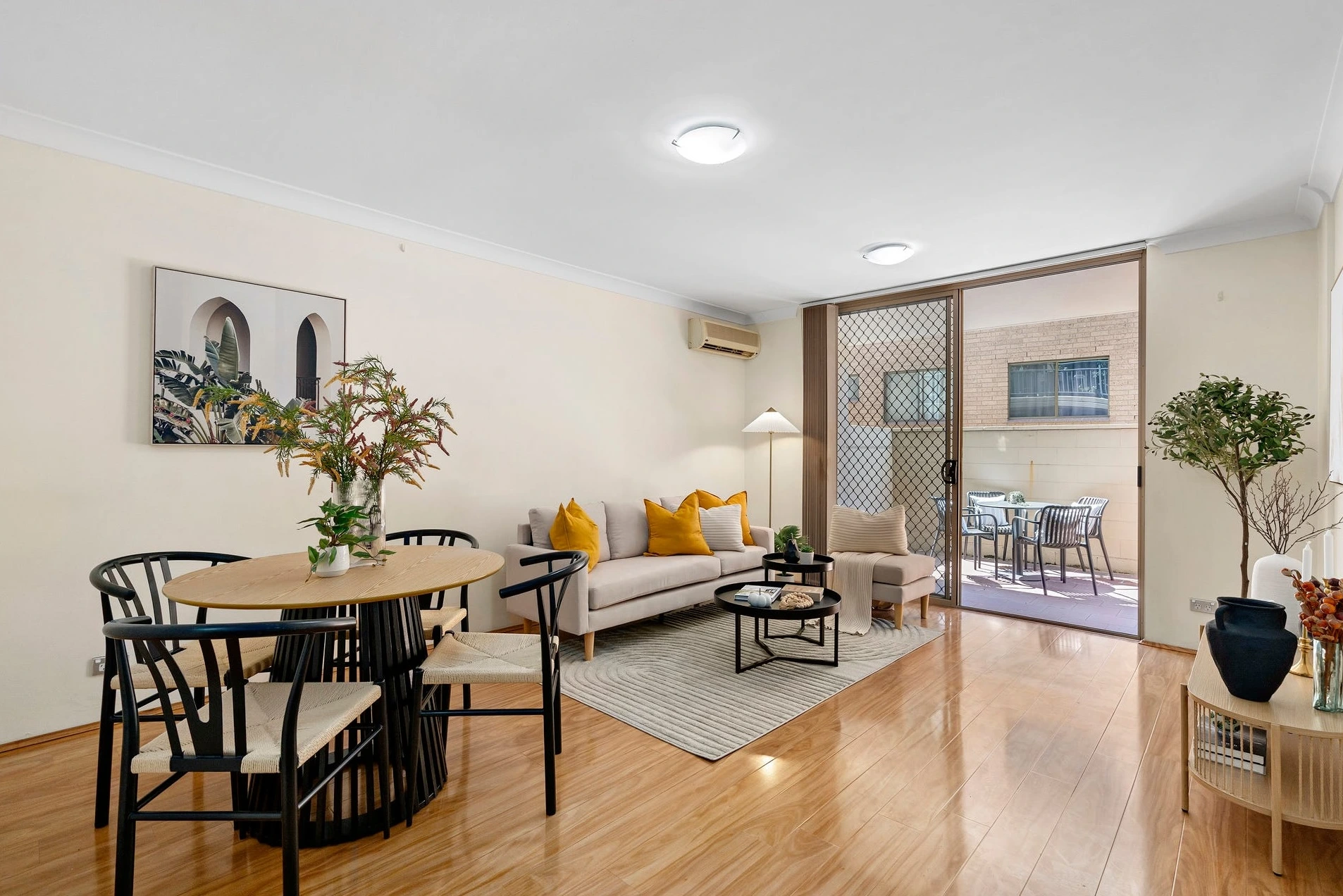
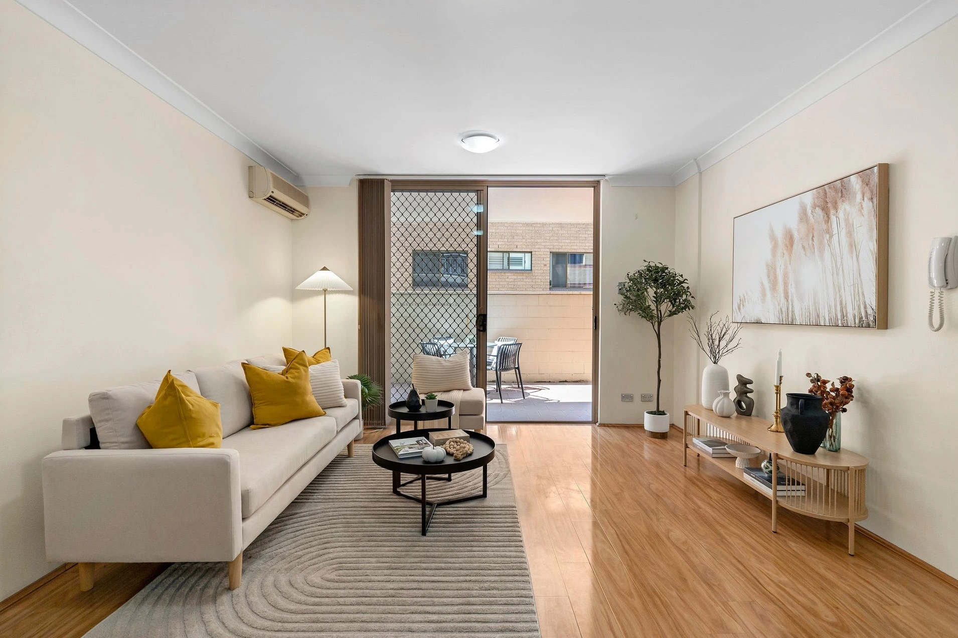
That’s why we genuinely enjoy projects like 18 Sorrell Street. On the surface it’s straightforward: cream walls, timber floors, open-plan living. But the styling here is what makes it quietly powerful — clean lines, controlled colour, and confident contrast that turns “ordinary” into “intentional.”
Now, back to the strategy.
The challenge: “ingredients” don’t sell — emotion sells
On paper, the property had everything buyers want: open plan living and dining, air con, two bedrooms with built-ins, ensuite, secure basement parking, and the big card — a north-facing courtyard in a resort-style complex with pool and lift access. But in real life, “features” are not a vibe. And without a vibe, a listing becomes “nice… next.”
The risk here was obvious: this could easily photograph as beige walls + timber floors + brick outlook, and the courtyard could read like a big tiled afterthought. Useful, yes. Memorable? Not automatically.
So we treated this the way we treat every project: not as styling, but as campaign engineering — shaping what buyers feel, where they pause, and what they remember later when they’re comparing ten apartments in their head on the drive home.
Step 1: Make the living zone instantly clear
We anchored the lounge with a soft, light sofa and a textured rug with gentle curved patterning — not for decoration, but to zone the space and soften the lines. Then we introduced a controlled hit of colour: mustard cushions (warm, optimistic, modern) against the neutral base. It’s not “random colour.” It’s a mood cue. It quietly tells the buyer: this home has energy, but it’s not chaotic.
The coffee tables stayed visually light — nested round tables in black — so the centre of the room feels open and the walkway to the courtyard stays effortless. No bulky shapes, no heavy “furniture obstacles.” We kept the styling restrained: a book, a tray, a small sculptural piece. Enough to feel curated, not enough to feel like someone’s already living there (because buyers don’t want to move into your life — they want to move into theirs).
Even the console is doing a job: the timber slatted front adds rhythm and texture, and the minimal top styling lets the eye breathe. That’s the secret sauce in “simple” homes: you don’t add more. You add the right things — and then you stop.
Step 2: Turn the courtyard from “extra space” into “the hero”
A north-facing courtyard in Parramatta CBD is a serious advantage — but only if buyers feel it. So we staged it like it’s used every day, not once a year at Christmas when you’re feeling ambitious.
A compact outdoor setting, clean black lines, simple cushions, a small centrepiece — and, crucially, enough empty floor space for the imagination to do its job. Suddenly that courtyard reads as morning sun, late lunches, and “we could have friends over.” It stops being tiles and walls. It becomes a habit. A lifestyle.
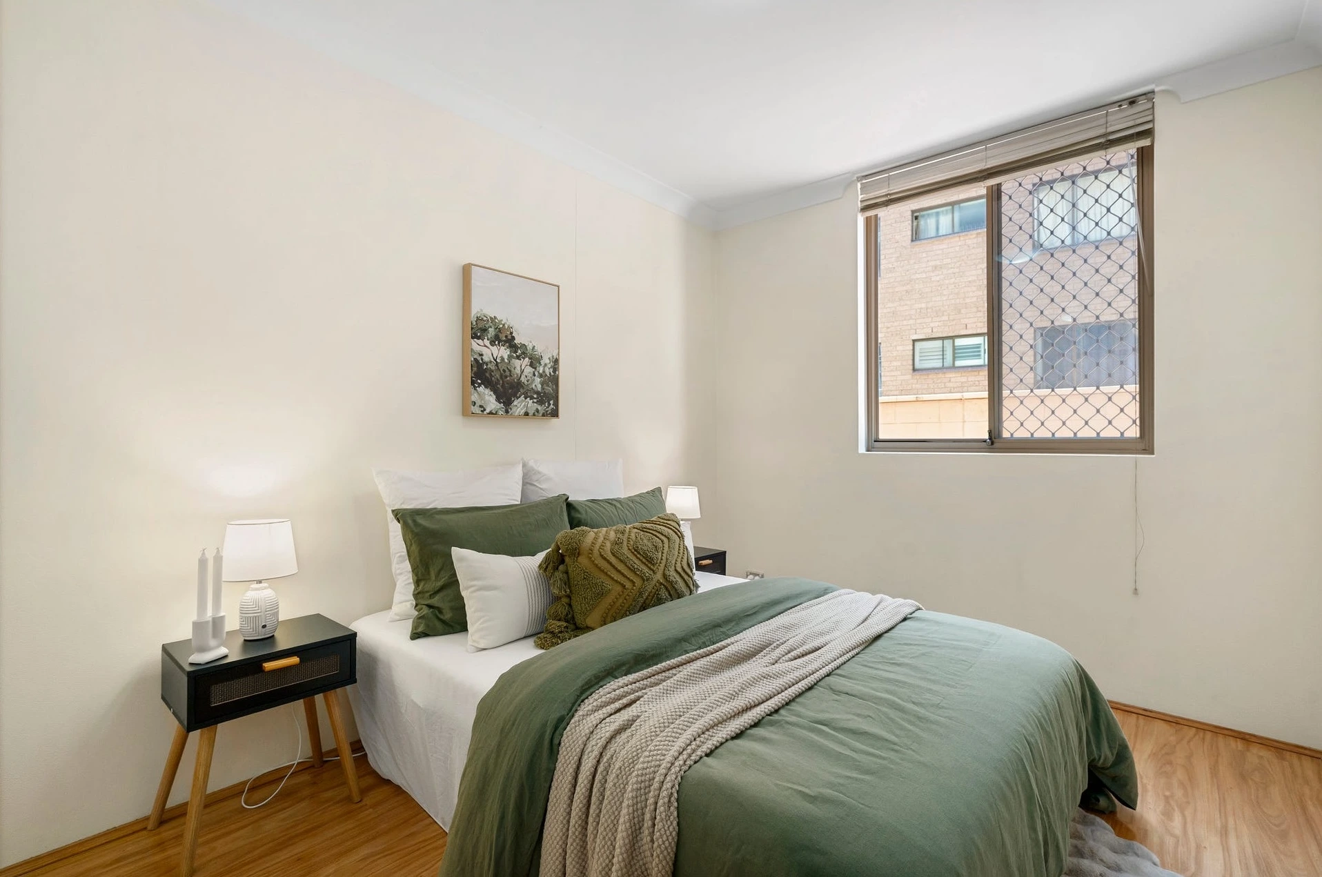
Step 3: Bedrooms that feel different — and deliberately so
In the main bedroom we went deep and grounded: olive/forest bedding, layered cushions, a textured throw. It’s calm, grown-up, and quietly confident. The black bedside tables with timber legs introduce structure and contrast, while the soft lamps create symmetry (and that “hotel-ready” feeling buyers love but can’t always explain).
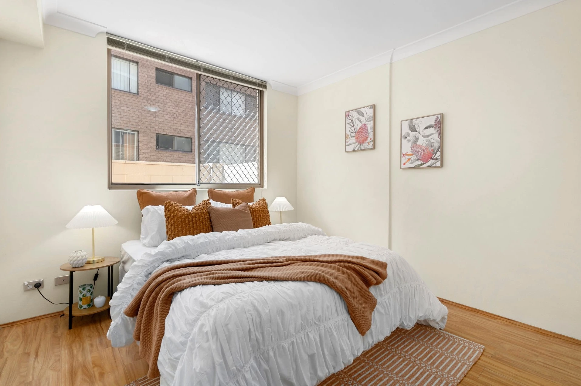
The second bedroom shifts tone: crisp whites with rust-toned accents and a woven rug. It reads as flexible — guest room, teen room, or a home office that doesn’t feel like a sad desk in a corner. Two bedrooms shouldn’t look like copy-paste. They should suggest two different lifestyles — so two different buyers can see themselves winning.
Step 4: Bathrooms that feel clean, cared-for, and ready
White tiled bathrooms can feel sterile fast. We pushed it to “clean and cared-for” with fresh towels, a small plant, and restrained accessories. Not trendy. Not loud. Just polished — the visual equivalent of a shirt ironed properly before an interview.
And that’s the whole point of this job.
This wasn’t about luxury. This was about confidence.
Buyers walked in and didn’t have to “work” to imagine the home. The layout made sense. The courtyard made sense. The place felt calm, balanced, and modern — moments from Westfield, the station, nightlife, parks, and the light rail.
This is why we put Parramatta projects in the portfolio. Because the win isn’t the postcode or the price bracket. The win is taking something everyday… and making it feel wanted.
💬 “It stopped feeling like ‘an apartment’ and started feeling like a lifestyle. Buyers stayed longer — and asked better questions.” — Agent
In fast-moving areas like Parramatta, Home Staging Sydney is less about “luxury styling” and more about shaping buyer certainty. Great Home Staging Sydney creates flow, calm, and visual clarity — so a property feels easy to say yes to. For apartments like 1/18 Sorrell Street, Home Staging Sydney works because the strategy is disciplined: a neutral base, controlled colour accents, lifestyle-led courtyard staging, and rooms that photograph cleanly without feeling empty. When agents want stronger opens, longer buyer dwell-time, and more emotionally engaged inspections, Home Staging Sydney becomes one of the simplest levers to pull — without changing a single wall.
🏙️ 2-bed Parramatta courtyard apartment — north-facing outdoor space, CBD convenience.
🎨 Styling theme: modern neutrals + mustard & olive accents, clean black lines.
🧠 Feel: calm, intentional, “easy to live in” (not overstyled, not empty).
⚡ Result: stronger engagement at opens — buyers lingered and pictured the lifestyle.
💬 Reaction: “It started feeling like a lifestyle.” — Agent